How to Use Figma Variants for Clear UI States
A practical method for choosing variant properties, avoiding unnecessary combinations, and keeping component sets clear for design and development.

Create variants for predictable visual differences in one component family. Name each independent axis, such as size and state; do not create every theoretical combination. Use boolean, text, instance-swap, or slot properties for other kinds of customization, and test the component as an instance before publishing it.
Searching for “figma how to use variants”? Use Figma variants when related versions share a purpose but differ in predictable ways. First list the real decisions a designer needs to make, then assign each independent decision its own property. A button could have Type=Primary, Size=Medium, and State=Default. Build only combinations used by the product; do not turn every theoretical pairing into a component. Keep copy and optional icons as content properties, and test the finished set through instances in realistic screens.
This distinction matters because a component library is an interface for designers as much as it is a pile of reusable artwork. A set with clear names and supported values makes choosing a component routine. A set that mixes unrelated differences forces people to search, guess, or detach instances. The example below follows Figma's current guidance and separates what changes visually from what should be editable as content. For the broader component vocabulary see what components in Figma are; for implementation handoff see the Figma-to-Tailwind workflow.
What Figma variants solve
A variant is one version of a component inside a component set. The set groups related versions; variant properties name the ways they differ. Figma's guide to creating and using variants gives size, state, and color as examples. A designer can insert one family and change an intentional choice in the properties panel instead of hunting for a nearly identical asset. Figma requires a unique combination of property values for every variant in the set.
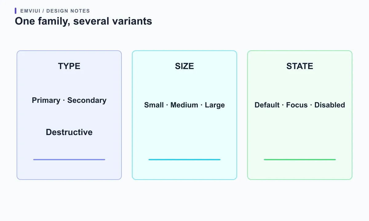
Use one set when alternatives share anatomy and job. Primary and secondary buttons may share label placement and icon space but signal different emphasis. Small and medium buttons may serve the same action with different dimensions. Checked and unchecked boxes are versions of one control. A promotional card and a settings form are not one family merely because both contain copy and a button. Ask whether a user can describe the relationship simply: “these are versions of the same control.” If changing an option changes the content structure, interaction model, or purpose, consider a separate component.
Variants communicate selectable design configurations; they do not specify every behavior, prove accessibility, or force implementation constraints. Add a short description to say when an option belongs and what the consumer should avoid. Figma's component management tips recommend descriptions and documentation links to explain appropriate use. A designer may still edit layers beyond the exposed properties, so names and documentation guide rather than lock down every decision.
Choose independent properties before drawing more variants
Start with an inventory of actual decisions. For a button, write down intent (primary or secondary), size (small or medium), and interaction state (default, focus, pressed, or disabled). Separate these only when teammates need to make each choice independently. Figma's newer variant fundamentals recommend separate properties for separate differences instead of one combined option such as “Primary Large.” The names become controls in a small interface; make them short, stable, and easy to scan.
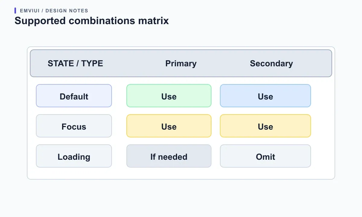
Do not automatically create the full Cartesian product. Three types, two sizes, and five states could produce thirty combinations, yet the product may need only twelve. Perhaps destructive actions exist in one size, or a disabled loading state is not supported. Figma states that variants must have unique combinations, but does not require a version for each theoretical pairing. Write down supported combinations first. Leave unsupported ones out on purpose; add them later if a real screen calls for them. This avoids both an oversized set and the misleading impression that every possible configuration is valid.
Before building, read a proposed instance aloud: “Button, type secondary, size small, state focus.” If the model sounds unclear, revise it. “Type” answers what the action means; “Size” answers its dimensions; “State” answers its current interaction or availability. Do not quietly mix a color theme or content option into “State.” If a difference exists only for one exceptional drawing, it may not need to become a property. Validate the model against a few real screens rather than designing for imagined flexibility.
Map button states and sizes without hiding combinations
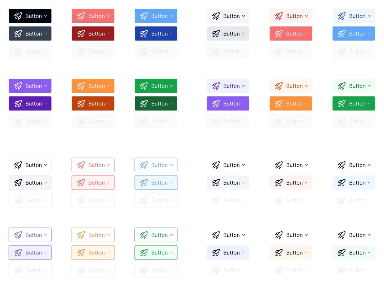
Draw a small matrix of the combinations the interface uses. The specimen below shows button appearances and muted disabled examples; use it to discuss which changes are meaningful, not to claim every hue needs a property. Start with one primary and one secondary type, two sizes, and the states your interface supports. Compare variants side by side at the same zoom. Label baselines, icon alignment, and padding should remain consistent where appropriate; changing emphasis should not accidentally change geometry.
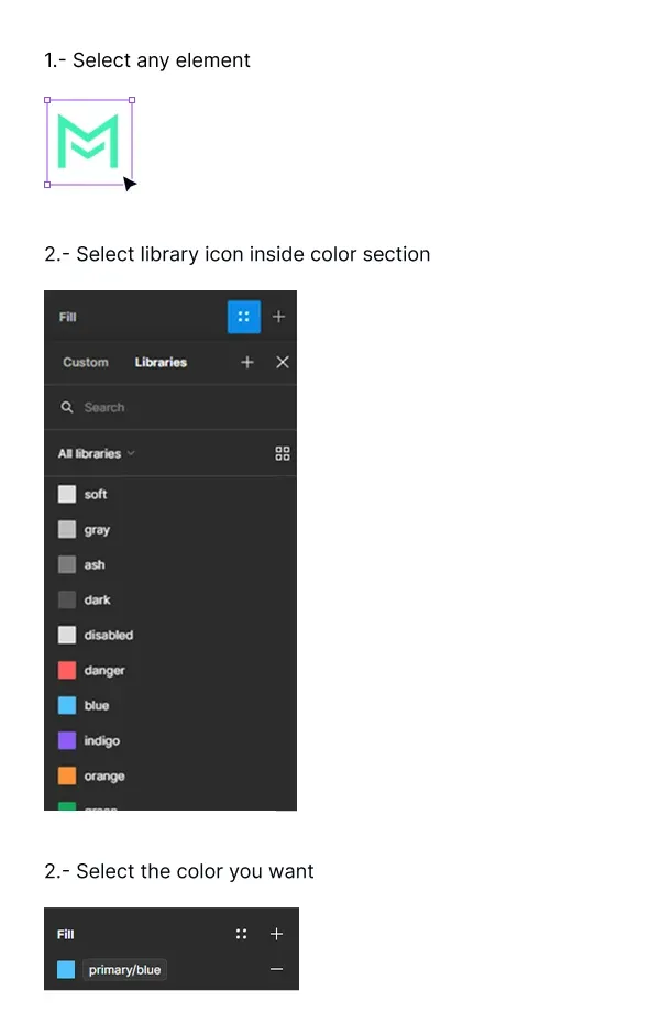
Make the common version the default. Figma uses the top-left variant to represent the set in the Assets panel, so put the most typical example there. Name the set Button; let properties describe its choices. A user should find the family once and configure an instance without guessing which of many nearly identical assets is current. If the set needs a special rule—such as “destructive is only for irreversible actions”—put that rule in its description and link to product guidance.
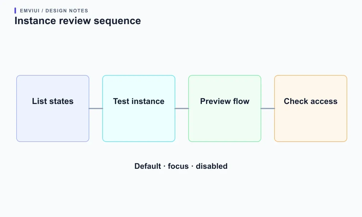
Review focus and disabled states deliberately. A focus treatment should be visible against its actual surroundings; disabled content should not be the only place an explanation appears. Assess real foreground and background pairs rather than assuming a color label guarantees contrast. A Figma variant makes a state selectable; it does not certify the eventual interface. The kit can show intent, while implemented markup still needs keyboard, contrast, and assistive-technology checks.
Finally, try a longer label and a leading icon in the component. Confirm that resizing and text edits do not break alignment. If you need a responsive variant, make sure it reflects an intentional change to composition or behavior rather than a frame-size accident. The asset specimen is a visual reference for discussion; it is not a screenshot of another product and should not be read as a complete accessibility specification.
Use other properties for other kinds of change
Variants are not the only way to make a component flexible. Figma defines boolean properties for showing or hiding layers, text properties for editable strings, instance-swap properties for replacing nested instances, and slot properties for flexible content. Use a variant for a meaningful visual configuration; use a boolean for an optional icon, text for the label, instance swap to choose a nested icon, and a slot when inserted content needs to vary. This keeps a set from multiplying just because copy or a glyph changes. Figma's component property reference describes these controls and how they appear for consumers.
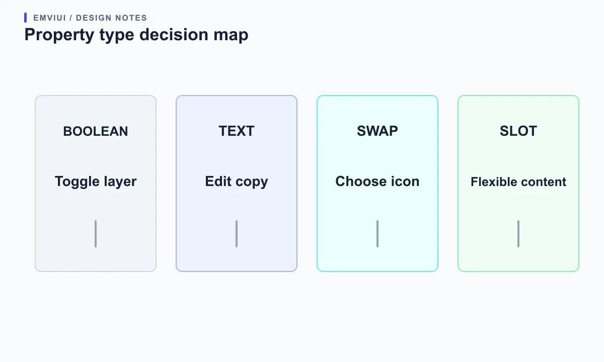
Suppose a button has three labels, two optional icons, and four states. Encoding every label and icon as a variant creates dozens of choices without describing a coherent design system. Expose copy as text, choose icon visibility or instance swap separately, and keep type and state as variants. Separate properties still do not enforce every product rule: the user might choose an unsupported icon combination. Document constraints and test representative instances. Properties guide consumers; they do not prevent every other layer from being edited.
A slot helps where the content arrangement itself must vary, such as a card with optional body content or a list of repeating tasks, but it is not permission to place anything anywhere. Define the expected content and boundaries. If the slot changes the component's purpose, make a separate family. Match the property type to the choice being made: select a known configuration, toggle a layer, edit copy, swap a nested asset, or compose flexible content.
Name properties and values so the set stays readable
Figma may derive property names from component naming syntax, but automatic names can be generic. Rename them in the set's properties panel to Type, Size, or State, rather than leaving “Property 2.” Use the same vocabulary throughout the file. If three button families use Variant=Primary, Style=Brand, and Emphasis=Strong for the same idea, consumers must learn three taxonomies for one decision.
Check each pair of variants for a unique combination. If two versions both say Type=Primary, Size=Medium, State=Default, Figma can report a conflict even when their pixels differ. The controls cannot tell them apart; this is not a visual judgement. Change values to express a real distinction, move one option to another family, or remove a duplicate. Do not invent a meaningless value just to silence an error. Put the most frequently changed choice first, choose a useful default, avoid undocumented abbreviations, and keep capitalization consistent.
Large sets also have a practical cost: Figma notes that importing an instance with variants brings the variants from that set into the file. Do not add speculative combinations “for flexibility.” Create versions that real screens use, then ask whether grouping still makes them easier to browse. Split a set when its name no longer describes a coherent purpose, its controls are hard to understand, or exceptions have become the ordinary way to use it.
Prototype meaningful states and test the instance
Interactive components can connect variants within a component set for prototypes. Figma's interactive components guide describes buttons changing on hover and checkboxes moving between checked and unchecked variants. This makes a flow easier to demonstrate, but it does not replace an interaction specification. Decide which states the control needs; do not add focus, loading, error, pressed, and disabled to every family by habit.
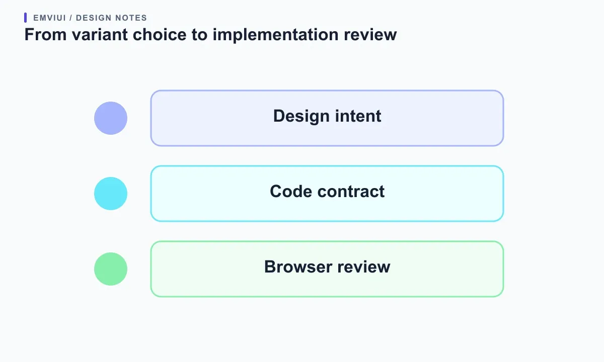
Test an instance, not just the master. Place it in a realistic frame, change every exposed property, use a longer label, and try the optional icon. Confirm overrides behave as expected when you switch variants and preview prototype connections. Figma says interactive component connections use variants in the same set; inserting a set instance also brings its variants into the file. A teammate who did not build the master should be able to find the set and configure an instance without verbal coaching.
Review accessibility separately. A focus state should remain visible against adjacent surfaces. A disabled control should not be the only place where a reason is explained. Icon-only controls need an accessible name in the implemented interface. These checks concern product behavior and code, not guarantees supplied by Figma. The design can communicate intended states; developers must still verify semantics, keyboard operation, contrast, and screen-reader output.
Decide when a responsive version or separate component is justified
Do not create a device variant automatically. Many components resize with Auto Layout and content rules. Add a breakpoint variant only when the component's composition or behavior intentionally changes. Figma's responsive component guidance describes variants associated with breakpoints for that use. Document when each applies and verify the change does not hide content or leave confusing overrides. If options serve different jobs, the property panel is hard to scan, or exceptions dominate, split the family. A navigation control and a destructive confirmation button may share foundations without being one component.
Use actual design work as evidence. Review several screens, count which values appear, and notice combinations that never occur. Ask another designer to insert the component without coaching. If they cannot predict what each property changes, simplify or rename the choices. If they detach instances repeatedly to make adjustments the system should support, expose an appropriate property or document the boundary. The goal is not the smallest component count; it is a safe, discoverable choice.
Published libraries are interfaces that consuming files depend on. Test existing instances before renaming or removing property values, and tell teams when a change affects their work. Figma's component-management advice suggests considering less disruptive transitions before breaking changes. Keep compatibility when practical; when it is not, explain the migration. For a broader starting point, see how to evaluate a free Tailwind UI kit.
Use EmviUI as a practical reference
EmviUI is a Figma UI kit and design system with editable components, variables, and Tailwind-aligned foundations; its public catalogue includes button variants. That makes it a useful reference for inspecting how a kit groups visual choices before adapting the model to your own product. It cannot decide which states your interface supports or certify accessibility. Start with one button in an EmviUI screen: identify type, size, and state, then compare those labels with the API of the corresponding code component. The current product overview is at emviui.com.
For a short exercise, choose one primary action, one secondary action, and one destructive action. Record the sizes actually used, then list the states the interface requires. Create only supported combinations; keep labels and icons separate when they are content choices. Put instances in a dashboard form, a modal, and a narrow mobile frame. Ask a teammate to change the controls and explain the result. If they can do so without opening the master, the property model is working.
EmviUI can speed up the first pass by providing editable button examples and related UI patterns. It does not choose your product's variants, guarantee that every pattern meets your accessibility needs, or turn a Figma component into production code automatically. Keep the set tied to an implementation contract: names that map to code props, supported values only, notes for exceptional combinations, and a concise change log as the library evolves.

Pablo Mayoral
Senior UX/UI & Web Designer with 10+ years of experience. Creator of EmviUI (10k+ components Figma design system), UImand, and Vitamin Bootstrap. Currently designing digital products at CQMRewards.