What Is a Component in Figma? Reuse, Variants & Libraries
A Figma component is a reusable design element. Its instances help a team repeat a pattern and update it in a controlled way.
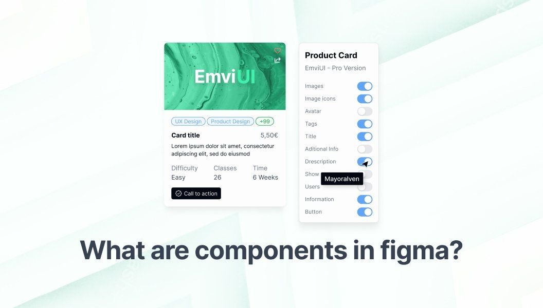
A component in Figma is a reusable source element. Instances refer back to it, variants organize options, and libraries share approved assets between files.
A component in Figma is a reusable design element, such as a button, input, navigation item, or card. A main component defines the source; an instance is a linked copy placed in a screen or another design.
Main components and instances
When you change a main component, its instances can receive the update while keeping appropriate instance content or property choices. This helps a team improve a repeated pattern once and review its effect across screens. An instance stays connected to its source.
Variants and component properties
Variants group related versions into a component set. A button might have properties for type, size, or state. Use properties to name meaningful differences clearly.
- Variants: related forms such as default, hover, and disabled.
- Text properties: editable text that varies between instances.
- Boolean properties: an on/off option for a layer or feature.
- Instance swap: a choice of nested component, such as an icon.
Figma's guides cover variant fundamentals and component properties. Keep a set focused instead of making combinations nobody needs.
Components in a file and shared libraries
You can use components within a file. A library lets a team publish components, styles, and variables for other files. Teammates can review library changes before applying them. Figma's library guide explains sharing and updates; check current plan requirements for a team workflow.
A simple component workflow
- Find a repeated pattern and define its purpose.
- Build the source with clear layer names and layout behavior.
- Add variants only for differences teammates need.
- Use instances in screens and keep overrides intentional.
- Document stable patterns and publish a library if other files need them.
- Review library changes before applying them.
Components make dashboards and mobile kits easier to adapt. See our guides to dashboard UI kits and Figma mobile UI kits.
Common component mistakes
- Making a component for every one-off decoration.
- Combining unrelated options in an unclear property.
- Using vague names that are hard to browse.
- Adding variants that create a confusing set.
- Publishing without explaining intent, states, or update expectations.
Frequently asked questions
What is an instance in Figma?
An instance is a reusable copy of a main component. It stays linked to the source so updates and permitted property changes can be managed consistently.
What is the difference between a component and a variant?
A component is a reusable design element. A variant is one version in a component set, such as a button size or state.
Can I make Figma components without a paid plan?
You can create components and variants in a file. Sharing a published library between files may depend on the current plan, so check Figma's library documentation.

Pablo Mayoral
Senior UX/UI & Web Designer with 10+ years of experience. Creator of EmviUI (10k+ components Figma design system), UImand, and Vitamin Bootstrap. Currently designing digital products at CQMRewards.