How to Create Spacing Variables in Figma: Padding and Gap
Learn how to create spacing variables in Figma, bind padding and gap, test source changes and recover detached bindings with a practical card example.

Create number variables, bind them to the intended Auto Layout padding and gap fields, and verify a reversible source-value change. Separate fixed gaps from automatic distribution and recheck bindings after canvas spacing adjustments.
To create spacing variables in Figma, create number variables, give them meaningful names and bind them to Auto Layout padding or gap fields. Verify the connection by changing one variable and checking the intended frames. Keep fixed spacing values separate from automatic distribution, and inspect bindings again after manual canvas adjustments.
This tutorial builds a fictional project-summary card with a heading, supporting text and a button containing an icon. Its names, values and review exercises are proposed examples. The goal is a small spacing setup another designer can inspect and safely reuse, rather than a complete multi-brand token architecture.
Separate padding from gap
Identify the owner of each empty area before creating variables. In our card, the outer frame owns the inset around its content. A vertical content stack owns the separation between heading, description and action. Inside the button, a different horizontal stack owns the distance between icon and label. Draw those three boundaries on a duplicate before choosing numbers.
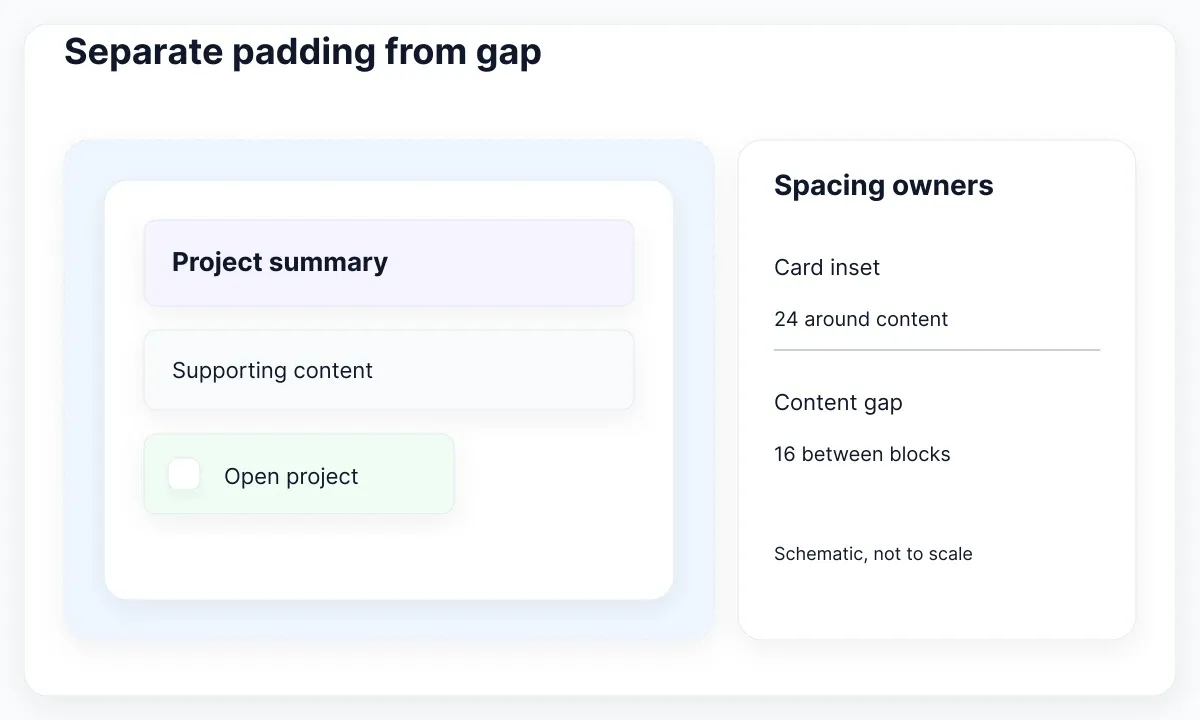
Figma’s Auto Layout guide distinguishes padding around children from gap between them. Apply that distinction to this proposed recipe: card padding 24, content gap 16, button horizontal padding 16, button vertical padding 12 and icon gap 8. These are exercise values, not Figma defaults or universal design requirements.
Do not treat two equal numbers as one permanent responsibility. The card inset and content gap may happen to match in a later revision, yet changing the space around the card should not necessarily move the icon away from its label. Start with the relationships you want to preserve, then decide which consumers should share a value.
Write a short owner map: Card → inset; Content → vertical rhythm; Action → internal spacing. This makes review easier when the card is nested in a page. The distance between neighboring cards belongs to their parent layout, so changing the card’s padding is the wrong repair for an oversized page gutter.
Create a small spacing collection
Create only the variables needed for the first card. A manageable initial set is space/8, space/12, space/16 and space/24. Keep a note beside the exercise explaining that the suffix names the current proposed value. If the team prefers size names, document their meaning rather than expecting every designer to interpret “medium” identically.
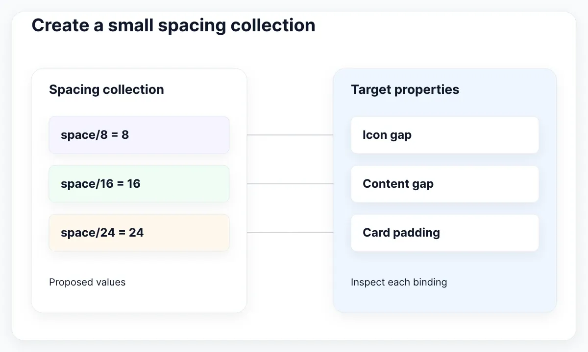
Open Variables, choose the intended collection, create a Number variable and enter its name and value. Figma documents creation and property scopes in its variable-management reference. Limit these exercise variables to Auto Layout gap and padding where appropriate. Scope helps the picker; it does not decide which frame should own a relationship.
For a first implementation, direct bindings are easier to inspect than several layers of aliases. Add a role such as card/inset only when it expresses a useful independent decision. Our proposed acceptance rule is simple: another designer should identify the source for each of the five spacing fields without opening unrelated collections or reading a separate architecture document.
Keep the sample scale and the card on the same review page. Include a note saying which uses are approved and which remain experimental. Avoid creating ten unused steps just to make the table look complete. For the distinction between a stored value and a reusable treatment, continue with variables and styles in Figma.
Before adopting the collection, add a second consumer: a short project note with a different amount of content. Assign the same proposed card inset, but give its content stack a separate review. Ask whether changing the inset should affect both cards. If the answer is yes, record that shared responsibility. If only the summary card needs a denser arrangement, change its binding or introduce a documented role instead of changing the shared source for every consumer. This two-consumer exercise exposes accidental coupling while the setup is still small enough to understand. Keep both fixtures beside the variable table for later revisions.
Bind the field and test one change
Select the actual Auto Layout frame that owns the spacing. In the fictional card, bind the outer inset first and leave the content gap unchanged. This is a useful controlled experiment: the reviewer can explain exactly which empty area should change before touching the variable. If the prediction is unclear, revisit the owner map.
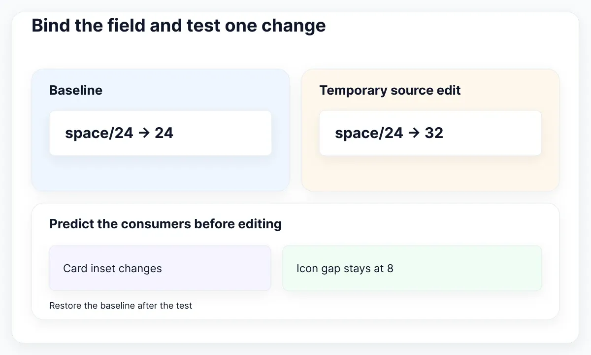
Click the numeric property field and press = to open the variable picker, then select the intended number variable. The application reference lists supported fields and alternate picker methods. Verify the variable identity in the field. Merely typing the same visible number does not establish the connection you are trying to review.
Temporarily change the exercise’s space/24 value from 24 to 32. Predict that the bound inset changes while the independently bound icon gap remains at 8. Inspect another card using the same variable, then restore 24. This temporary edit is a test fixture; do not silently redefine a shared production scale to perform it.
Record the field, variable name, original value, temporary value and observed consumers. A screenshot of the finished card does not establish the binding. If the content does not resize as intended after the inset changes, investigate its sizing separately with the nested Fill Container workflow. Keep spacing and sizing diagnoses distinct.
Choose a fixed gap or automatic distribution
Use a fixed gap when the design calls for a particular separation between neighboring items. Our icon and label should remain a compact action unit even when the surrounding card becomes wider. Giving that internal row automatic distribution would express a different relationship, potentially making available space determine the separation you intended to keep stable.
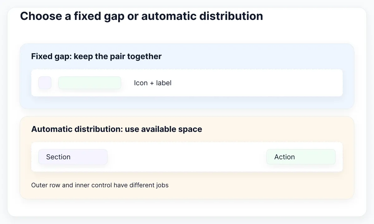
Figma’s horizontal and vertical flow reference documents numerical gaps and Auto spacing. Auto distributes available space according to the chosen option; it is not a numeric spacing token. In the proposed comparison, duplicate an action row and widen both copies. Keep a fixed gap in one and use automatic distribution in the other.
Compare the result with the intended job. A row that places a section title at one edge and an action at the other may benefit from distribution. The internal icon-label pair usually needs its own fixed relationship. Keep the pair inside a nested action frame so that the outer row and inner control can express different decisions.
Do not add density modes just because the first variable table is small. If compact and comfortable spacing are actual product requirements, specify which relationships change and review both. The Figma modes documentation explains alternate values. A narrower frame alone is not evidence that the intended mode was selected; inspect the applied context and test it deliberately.
Find a detached spacing variable
When one card stops following the spacing source, reproduce the discrepancy in a disposable copy. Select the same owner frame in a working and a failing sample. Compare the binding identity before comparing appearance. Two fields can display 24 while only one still references the variable. A matching screenshot can conceal that maintenance difference.
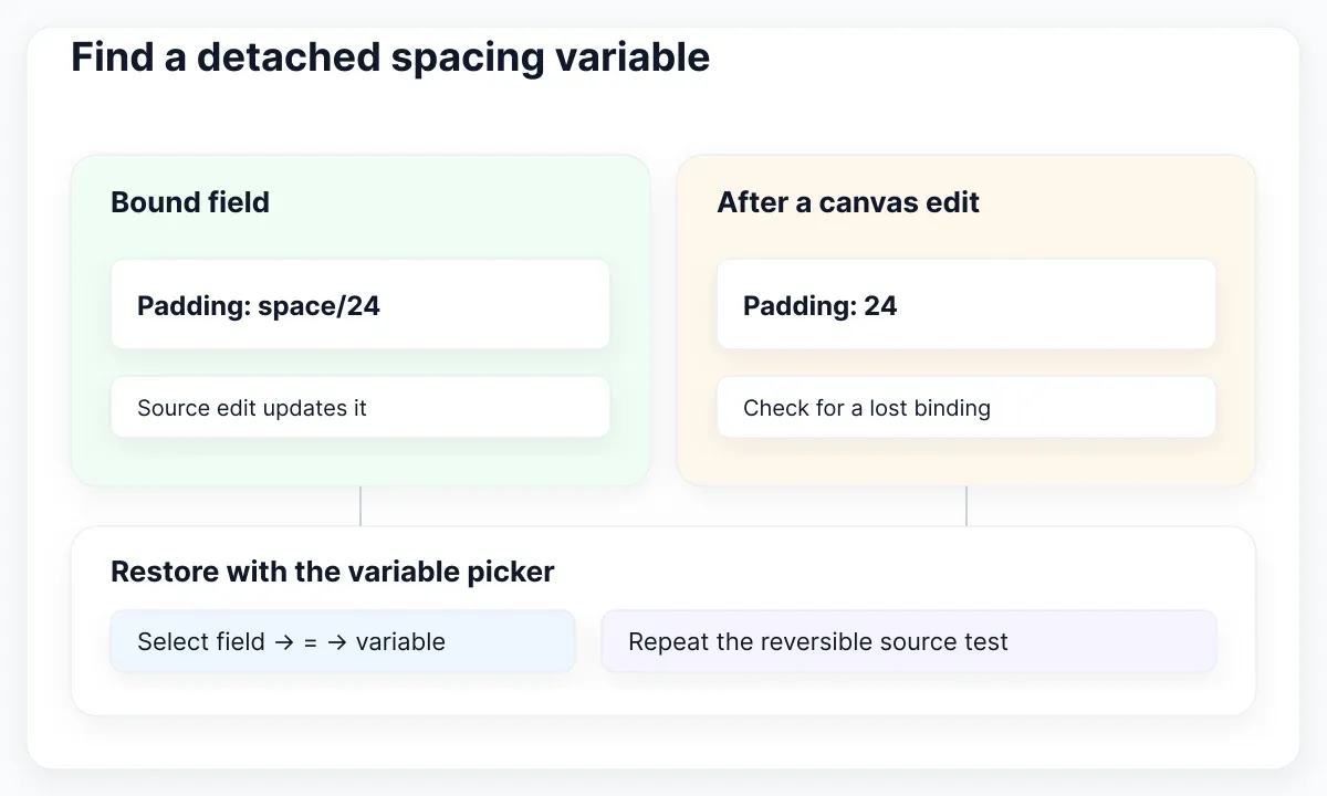
Figma explicitly notes in the detach-variable guidance that changing Auto Layout padding or gap with on-canvas controls detaches applied number variables. After an exploratory drag, inspect and reapply the intended binding. Do not assume a drag that ends at the original value has restored the original relationship.
Use a three-step recovery exercise: note the working variable, make one manual spacing adjustment, then restore the binding using the picker. Repeat the temporary source-value change on a local sample and confirm that it responds again. Keep the original reference untouched until the recovery is understood. This tests the relationship rather than asking someone to memorize a screenshot.
If the variable is absent from the picker, check the selected property, variable type and scope, then whether the relevant library is available. If the binding exists but the value surprises you, inspect the applied mode before renaming variables or rebuilding the card. Record the smallest cause you observed; several simultaneous edits make the fix difficult to explain.
Review the real EmviUI button specimen
The real EmviUI specimen below provides repeated icon-and-label buttons in different visual treatments. Use it to choose a concrete control for the exercise: compare the space around the content with the gap inside it. The EmviUI site describes an editable Figma UI kit and design system with variables and Tailwind mapping.
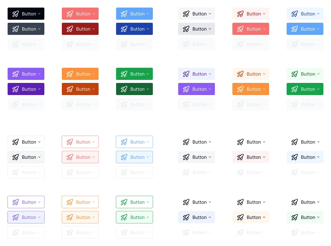
The screenshot does not reveal exact padding values, variable names or bindings. Our 16/12/8 button recipe is an independent teaching example, not a claim about those assets. Open the editable component before documenting its structure. Preserve the intended icon-label relationship while testing a longer label such as “Create project workspace.”
Reuse one visual treatment as a starting specimen and add a longer Spanish label beside it. Check whether the control has enough room, whether its content stays recognizable and whether its parent still places it correctly. If typography is the underlying issue, the text-role variable guide addresses that separate responsibility.
Write an explicit implementation note
Deliver a small mapping table rather than a page of unexplained numbers. Include owner frame, Figma variable, target CSS property, proposed unit and review status. For this exercise, the outer card maps to padding and its content stack maps to gap. Keep both rows even if a later design temporarily gives them the same value.
The MDN gap reference describes gutters in supported layout containers; the padding reference describes the inner area around content. In the CSS example, explicit pixel units preserve the proposed exercise measurements. This is a hand-written mapping for review, not an automatic export or a promise that every application should use pixels.
Check the implemented card with its actual font and content. A correct numerical mapping can still accompany a fixed-height box that clips a longer description. Ask a developer to identify which selector owns each relationship and change only one value at a time. Keep any breakpoint or density decision explicit in the implementation note.
.project-card { padding: 24px; }
.project-card__content { display: flex; flex-direction: column; gap: 16px; }
.project-card__action { display: inline-flex; align-items: center; gap: 8px; padding: 12px 16px; }
Accept the spacing change with a repeatable review
Prepare three fixtures: the ordinary project card, a card with a two-line heading and a card with the longer action label. Keep the same width while testing content changes, then keep the same content while testing a narrower width. This separates a spacing-source problem from a layout that simply needs a different arrangement.
Give the reviewer a concrete checklist: identify each owner, find each binding, perform one reversible source edit and explain the affected consumers. Then inspect any manual overrides and repeat the control with translated copy. Accept the setup when another designer can predict the result and restore the baseline using the written notes.
Record the file, component, variable collection, selected context and unresolved exceptions. A spacing variable becomes valuable when the next consumer can use it correctly. Preserve that small record with the component so a future change has an observable starting point instead of relying on memory or an isolated polished screenshot.

Pablo Mayoral
Senior UX/UI & Web Designer with 10+ years of experience. Creator of EmviUI (10k+ components Figma design system), UImand, and Vitamin Bootstrap. Currently designing digital products at CQMRewards.