Tailwind CSS Navbar Components for a Responsive Menu
Use one set of destinations across narrow and wide layouts. See how to wire the compact menu and test what happens to keyboard focus when the header changes width.
A responsive Tailwind navbar pairs a single semantic link list with a compact disclosure button. Choose the breakpoint with real labels, start with visible links, and test focus when the panel closes or the layout switches.
The essential components of a responsive Tailwind CSS navbar are a navigation landmark, one list of links and a compact menu button. Lay the links out in a row when the header has room. At narrow widths, use a real button to reveal the same links in a panel that pushes the page down. Tailwind handles the layout. A small controller keeps the panel, the button’s expanded state and keyboard focus in sync. Start with visible links so visitors can still navigate if the controller fails to load.
Start with one list of destinations
Take a fictional site for Fieldnote, a workspace for field research. Its primary destinations are Projects, Field guides and Support. The brand link returns home, and an account link opens the workspace. Put those destinations in a single navigation landmark. Decide whether the account link belongs to the primary list based on how important it is at narrow widths. Here it stays in the list so people can reach it in either layout.
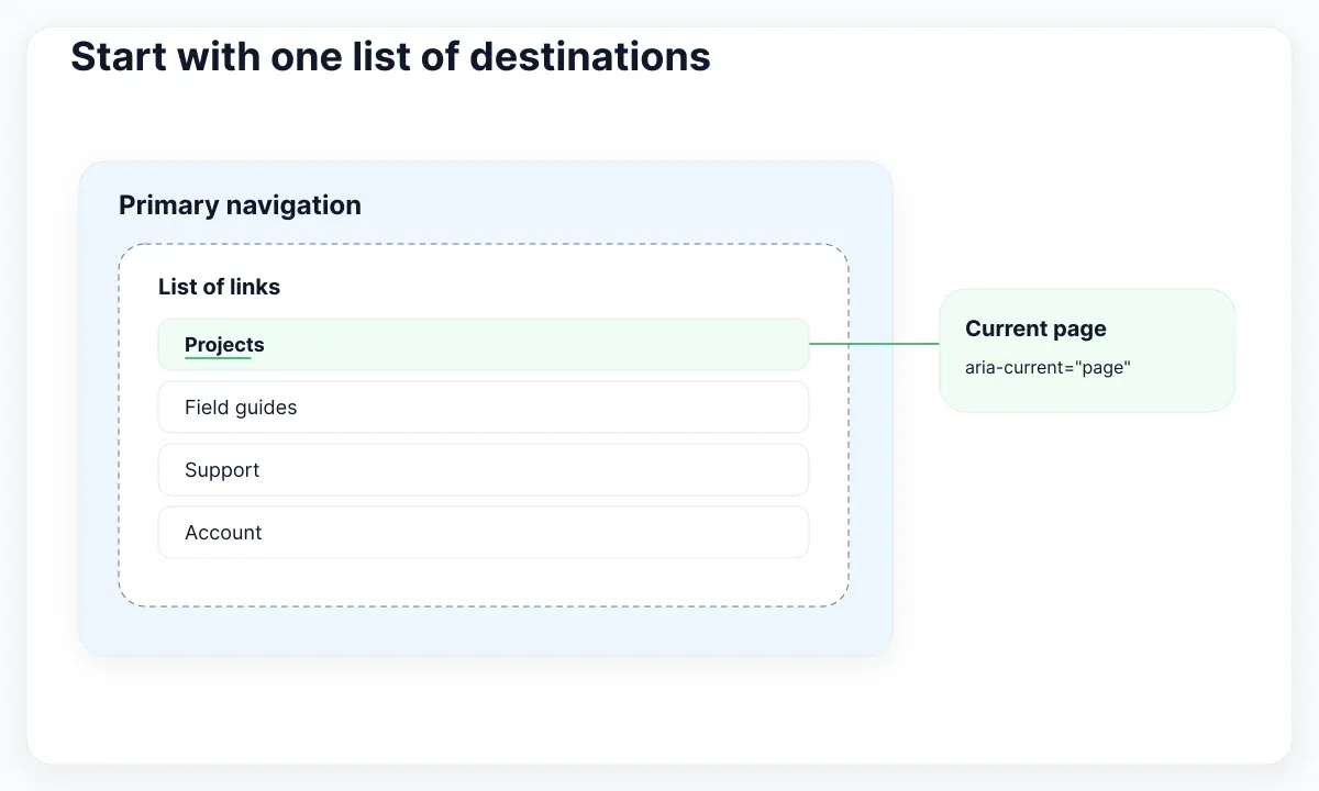
Use a nav element for the primary navigation, a list for the group and anchors with real URLs for destinations. Give the current destination aria-current="page" and a visible marker, such as an underline, whenever the URL matches. Give other landmarks distinct labels if the page also has a footer navigation. The HTML standard for navigation defines the landmark, and the WAI navigation example shows current-page and disclosure states in a realistic set of links.
A button performs the show or hide action. A link navigates. Keep both jobs explicit even if the product calls the entire header a menu. The WAI example uses ordinary link navigation and explains the additional keyboard expectations of the ARIA menu widget. With ordinary links, a visitor can Tab through the panel the same way they Tab through links elsewhere on the site.
Choose the breakpoint with real labels
Start with the vertical list and add the horizontal layout at the first width where the full set fits comfortably. Measure the brand, the translated labels, the link padding and the gap before the account action. For Fieldnote, test “Field guides” and “Guías de trabajo de campo” with the actual font. A desktop mockup with short placeholders can make a breakpoint look viable until the Spanish labels arrive.
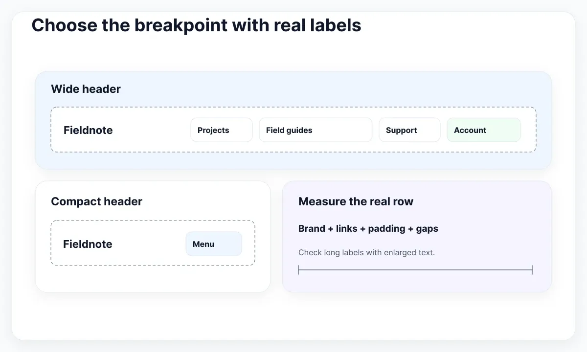
In the example, md:flex-row changes the list direction while md:flex-wrap lets longer labels move to a new row. Tailwind’s default md starts at 48rem. Treat that value as a starting point. If the product has a custom breakpoint, change the media query in the controller alongside the CSS configuration. If the navigation lives inside a narrow shell, check the width of that shell as well as the viewport. A viewport breakpoint assumes that the header has the corresponding space available. See Tailwind’s responsive utilities and the guide to flex layouts and overflow.
Check the row just below and above its switching point. Then enlarge the text and verify that the account link remains reachable without horizontal scrolling. A second line on desktop can be acceptable if the header has room to grow. If wrapping makes the header hard to scan, move the switch up and keep the compact layout longer. For a systematic check, combine WCAG’s reflow guidance with the Tailwind font-size and zoom exercise.
Connect the button to the panel
Keep the list visible in the initial HTML. Put its layout classes on the list and the hidden state on the containing panel. This gives visibility a single owner. A layout rule on the element that owns hidden can override its effective display, so avoid putting flex directly on that wrapper. The HTML rules for hidden explain that rendering styles can override the attribute. Tailwind documents the relationship between its display utilities and the rendered layout.
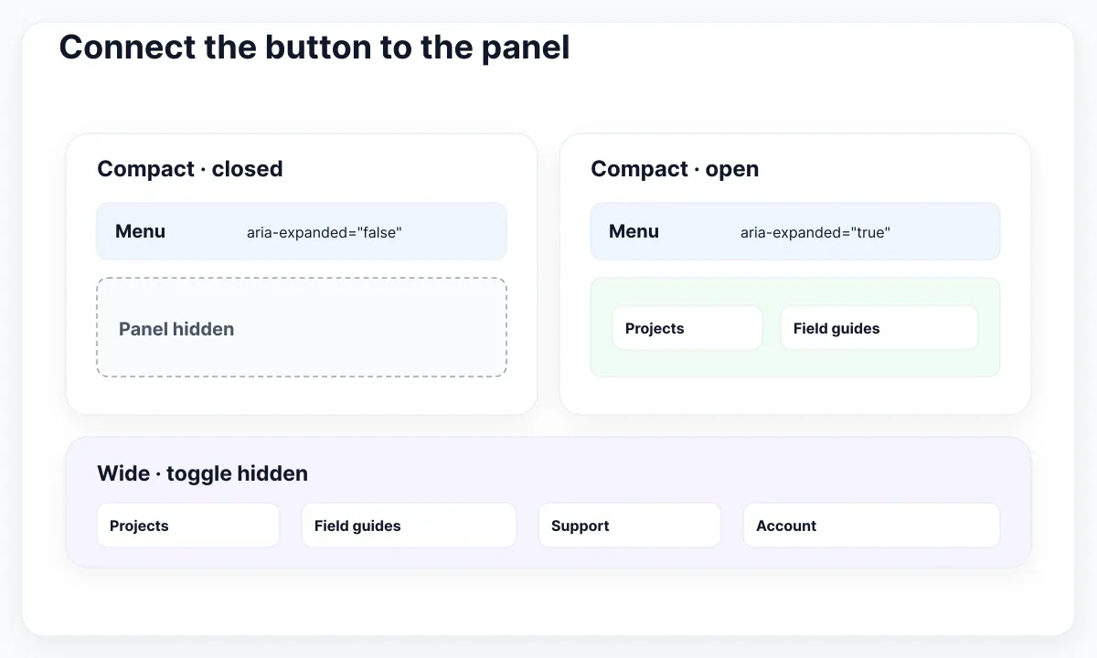
The abbreviated markup below assumes the Projects page. Use unique IDs if the same component can appear more than once. The compact toggle starts hidden and the list starts visible, so the base page remains usable without JavaScript. Once the controller loads it reveals the toggle at narrow widths and collapses the list. See the WAI disclosure pattern for activation and the expanded state.
<nav id="site-nav" aria-label="Primary"
     class="grid gap-4 p-4 md:grid-cols-[auto_1fr] md:items-center">
  <div class="flex items-center justify-between gap-4">
    <a href="/">Fieldnote</a>
    <button type="button" id="nav-toggle" hidden
            aria-expanded="false" aria-controls="nav-panel"
            class="min-h-[44px] rounded-xl border px-4">Menu</button>
  </div>
  <div id="nav-panel">
    <ul class="flex flex-col gap-2 md:flex-row md:flex-wrap md:justify-end">
      <li><a href="/projects" aria-current="page"
             class="block rounded-xl px-3 py-2 underline">Projects</a></li>
      <li><a href="/guides" class="block rounded-xl px-3 py-2">Field guides</a></li>
      <li><a href="/support" class="block rounded-xl px-3 py-2">Support</a></li>
      <li><a href="/account" class="block rounded-xl px-3 py-2">Account</a></li>
    </ul>
  </div>
</nav>
The button keeps the visible name “Menu” in both states. Its expanded property communicates the change, and the controls attribute points to the panel. In the finished component, make the control comfortably large and leave enough separation between its hit area and any adjacent controls. WCAG 2.2’s minimum target size guidance explains the 24 CSS pixel minimum, spacing and exceptions. The sample uses a minimum height of 44 CSS pixels for the toggle as a design choice and gives the text horizontal padding.
Keep focus when the layout changes
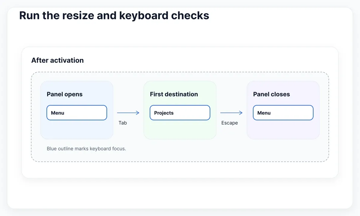
Opening leaves focus on the button. Tab then enters the list in document order. Escape from inside the open panel closes it and moves focus back to the button. If focus is elsewhere on the page, leave Escape alone. This is an inline disclosure. The rest of the page remains available, so it needs neither a focus trap nor a backdrop.
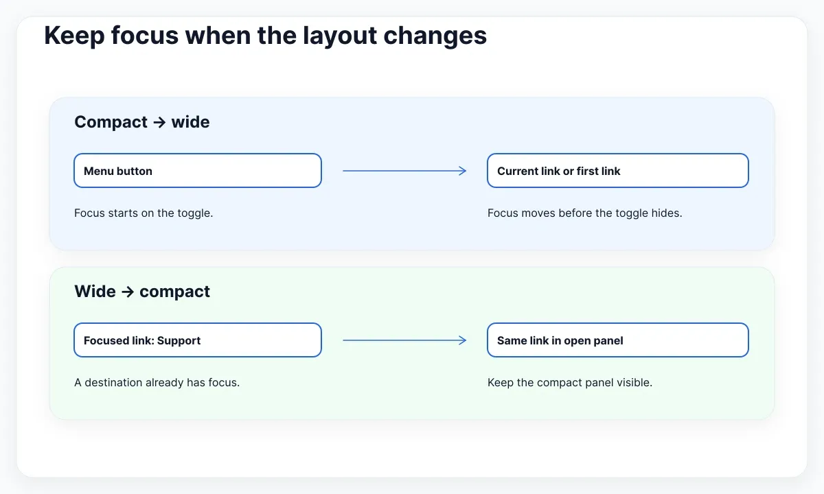
At a width change, inspect the currently focused element before hiding anything. When the desktop layout appears and focus is on the disappearing toggle, move focus to the current link or first link. When the compact layout appears and a link already has focus, keep the panel open so the link stays visible. If focus is outside the navigation, start compact mode closed and leave focus where it is. This yields a predictable result even when a person resizes the browser mid-task.
const nav = document.querySelector("#site-nav");
const toggle = nav.querySelector("#nav-toggle");
const panel = nav.querySelector("#nav-panel");
const wide = matchMedia("(min-width: 48rem)");

function setPanel(open) {
  panel.hidden = !open;
  toggle.setAttribute("aria-expanded", String(open));
}

function syncLayout() {
  const active = document.activeElement;
  if (wide.matches) {
    setPanel(true);
    if (active === toggle) {
      (panel.querySelector('[aria-current="page"]') || panel.querySelector("a")).focus();
    }
    toggle.hidden = true;
    return;
  }
  toggle.hidden = false;
  setPanel(panel.contains(active));
}

toggle.addEventListener("click", () => setPanel(panel.hidden));
nav.addEventListener("keydown", (event) => {
  if (event.key !== "Escape" || wide.matches || panel.hidden) return;
  if (event.target !== toggle && !panel.contains(event.target)) return;
  event.preventDefault();
  toggle.focus();
  setPanel(false);
});
wide.addEventListener("change", syncLayout);
syncLayout();
Load this controller after the markup, for example from a deferred script on pages that include the header. Keep the CSS and JavaScript breakpoint values together in the component’s documentation. If the header is mounted repeatedly by an application, register its listeners when it mounts and remove them when it unmounts. A single static header on a conventional page needs only the initial setup shown above.
For a client-routed site, handle successful navigation with the app’s page-focus policy. If the router places focus on the new page heading, collapse the old panel after focus has moved. For a normal page load, the browser loads the new document and the controller initializes afresh. Avoid closing just because the pointer leaves the panel. Someone can move a mouse away while reading or navigate by touch, where hover is unavailable.
Review the EmviUI compact and wide specimens
The EmviUI Figma kit provides compact navbar specimens with a brand and a hamburger control, alongside desktop specimens that explore where link groups sit relative to a prominent action. Use the compact specimen to decide where the trigger belongs. Use the wide specimen to compare the balance of left-, center- and right-aligned link groups when you swap the sample titles for real content.
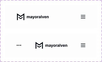
For Fieldnote, adapt the simplest compact variant with the brand at the left and the button at the right. Keep the accessible “Menu” label if the visual design uses only the icon. Add frames for the revealed panel and the same panel with keyboard focus on Support. Annotate the anchor order in the file and specify whether the panel pushes content down. The kit gives the team a common layout reference. Validate the states and focus behavior with the rendered header.
Keep the visual current-page marker separate from the focus indicator. A person can be on Projects while Tab has moved to Support. Underline Projects and draw the focus ring around Support so both cues can coexist. See WCAG focus visibility and the Tailwind color guide for focus and states. Try the design with a pale background and a dark header if both exist in the product, since the same ring color can look different on those surfaces.
Run the resize and keyboard checks
Use a page with enough content to scroll and put a focusable control immediately after the header. Test once with JavaScript disabled, once with a mouse or touch, and once using the keyboard alone. Inspect the accessibility tree with the panel open and closed. A closed panel should expose no navigation links, while the button remains available and reports its collapsed state.
| Test | Expected result |
|---|---|
| Disable JavaScript at narrow width | The links remain visible and the toggle stays hidden. |
| Activate the toggle with Enter and Space | Both inputs open the panel. Focus stays on the button. |
| Press Escape from a panel link | The panel closes and focus returns to the button. |
| Widen with focus on the toggle | The current link or first link receives focus. |
| Narrow with focus on a link | The panel stays open and the focused link remains visible. |
| Narrow with focus in the main content | The panel closes and focus stays in the main content. |
Record the measured width, locale, zoom level and focused element for each failure. If the list scrolls sideways, start by checking long labels and the width of its parent. If Tab enters a closed panel, inspect the actual DOM and computed display rather than the screenshot. If Escape works but focus disappears, check whether the toggle was already hidden when the event handler tried to focus it. These observations point to different fixes even when the symptom is simply “the navbar broke.”
Repeat the checks with the production build and the longest localized label. If the header is sticky, scroll with focus on the first control below it and confirm that the focused control stays in view. Finish by following Support from a narrow layout and checking that the destination loads and that Back restores a usable page. That test connects the header’s appearance to the task it exists to support.
Hand off the navbar as behavior
Give implementation one small inventory with the route, its label in each locale, its order, and the rule for when it receives the current-page marker. Separately list the three states shown in the diagrams. A single inventory keeps a rename or route change from reaching only one layout. Include a screenshot just above the switching point with the longest realistic label, so the reviewer can reproduce the configuration that motivated the breakpoint.
Agree on a failure fixture before styling is considered complete. For example, change “Support” to “Technical support for researchers” and open the site at a compact width with the text enlarged. Reveal the links, Tab to the long label, widen the browser, then shrink it again. The long label may wrap and the header may grow. The destination should remain readable and the same focused link should survive both changes. Save the observed result with the component alongside the static Figma frames.
For the review, assign one person to take the keyboard and another to watch the live DOM. After the first resize, ask the tester which element they expect to activate with Enter. Compare that prediction with the actual focus indicator and the browser’s active element. A mismatch often catches a stale focus ring in a screenshot-based review. Then repeat with the pointer parked outside the header so that hover styling cannot be mistaken for keyboard focus. If the header is reused on a second page, verify that exactly the link for that page carries the current-page attribute. A shared list should follow the route on every page that mounts it.

Pablo Mayoral
Senior UX/UI & Web Designer with 10+ years of experience. Creator of EmviUI (10k+ components Figma design system), UImand, and Vitamin Bootstrap. Currently designing digital products at CQMRewards.