Tailwind CSS v4 Dark Theme: Light, Dark and System
A three-choice appearance setting with one resolver, a root selector and a concrete review of reloads and device changes.
Separate the selected preference from the resolved theme. Use one root data-theme selector, keep explicit choices ahead of the device preference, and follow system changes only in System. Review persistence, first appearance and the control in a real implementation.
A Tailwind CSS v4 dark theme needs two separate decisions: which appearance the person selected and which appearance the page should render now. Keep a light, dark or system preference, resolve it to light or dark, then use that result to activate the dark utilities. This makes manual overrides and later operating-system changes predictable.
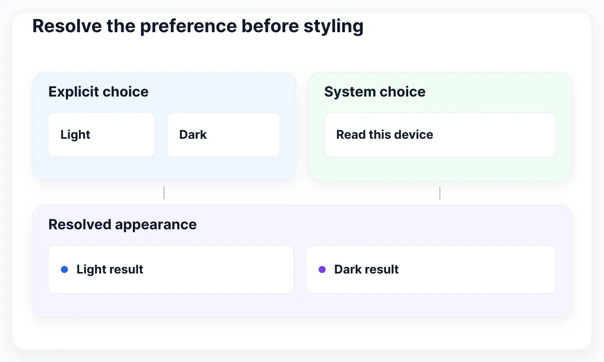
Resolve the preference before styling
Start with a tiny decision table. For an explicit light choice, render light regardless of the operating system. For an explicit dark choice, render dark. Only the system choice delegates the result to the device preference. Keep that choice visible even when the page currently looks dark.
This guide proposes an appearance setting for Harbor, a fictional booking workspace. Its staff may work on a shared reception computer in the morning and a personal laptop later. The exercise is about a local browser preference, not an account setting that automatically follows someone across devices. No Harbor product or user study exists.
| Saved choice | System appearance | Rendered result |
|---|---|---|
| Light | Either | Light |
| Dark | Either | Dark |
| System | Light | Light |
| System | Dark | Dark |
Do not replace the selected value with the resolved result. If System becomes Dark in the settings field, a reviewer can no longer tell whether the person requested darkness or delegated the decision. Later, when the operating system changes, the interface may appear to ignore what its own field says.
Use plain labels: Light, Dark and System. A short explanation such as “System follows this device” makes the scope concrete. In the acceptance notes, distinguish selecting Dark from selecting System while the device happens to be dark. Those are different states even when their screenshots match.
For the system signal, MDN documents matchMedia() and its matches property. Harbor reads the color-scheme query as an input to the resolver. The recommendation here is to give that resolver one owner, rather than letting the header, settings page and individual cards each decide independently.
Connect one selector to the page
Choose one activation contract and use it everywhere. The proposed Harbor implementation sets data-theme on the root element to the resolved value. A component does not need to know whether darkness came from a saved preference or the operating system; it only needs the active appearance.
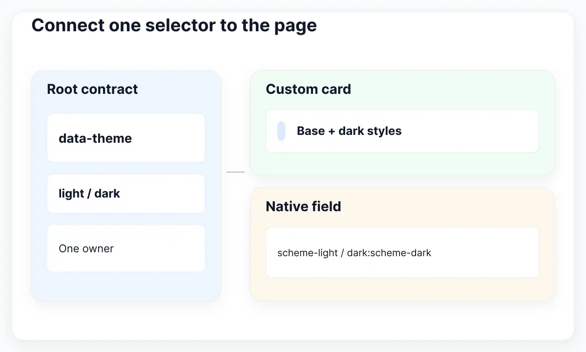
The Tailwind dark-mode documentation shows overriding the dark variant with an attribute selector. The following CSS follows that documented form. Keep it in the global stylesheet that actually enters the build, not in an unused file next to a design export.
@import "tailwindcss";
@custom-variant dark (&:where([data-theme=dark], [data-theme=dark] *));
Now give one specimen an explicit treatment for each appearance. For example, a booking card can use bg-white text-slate-900 border-slate-200 in its base state and dark:bg-slate-900 dark:text-slate-100 dark:border-slate-700 for its dark state. Treat these as a starting proposal; validate the resulting combinations in the actual card.
Separate browser-owned controls from your custom surfaces. Tailwind’s color-scheme utilities can align native rendering with the active appearance using scheme-light dark:scheme-dark on the root. This does not repaint every custom component. Review a date field, a select and your own card rather than assuming one property completes the whole interface.
Prove the connection before expanding it. Manually set the root attribute to light, inspect the card, then set it to dark. If neither treatment changes, inspect the stylesheet and selector before investigating storage. If only a nested card behaves differently, look for another data-theme boundary inside the page.
Keep complete class names in the source example and avoid building dark utilities by joining fragments at runtime. For a broader review of field and status treatments, continue with Tailwind CSS color classes for forms, focus and status. The preference resolver should remain understandable without reading every component’s visual classes.
Offer light, dark and system choices
Use a control that exposes all three choices in words. For this exercise, a labeled native select keeps the setting compact and leaves room for explanatory text. Do not represent System as an unlabelled third position in a sun-and-moon switch.
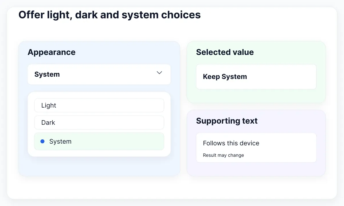
MDN’s select reference describes the control and its options. The proposed field is labeled Appearance, with option values light, dark and system. Its selected value reflects the choice variable. Bind its change event to chooseAppearance(event.target.value) after the control exists, and initialize its value from choice.
The state functions below form an original small controller for this article. They validate incoming values, preserve a usable in-memory choice when saving fails, and write only the resolved appearance to the document. They are an integration sketch, not a framework package or a claim of production testing.
const system = window.matchMedia("(prefers-color-scheme: dark)");
let choice = "system";
try {
  const stored = localStorage.getItem("appearance");
  if (stored === "light" || stored === "dark") choice = stored;
} catch {}

function applyAppearance() {
  const resolved = choice === "system"
    ? (system.matches ? "dark" : "light") : choice;
  document.documentElement.dataset.theme = resolved;
}
function chooseAppearance(next) {
  if (!["light", "dark", "system"].includes(next)) return;
  choice = next;
  try {
    if (next === "system") localStorage.removeItem("appearance");
    else localStorage.setItem("appearance", next);
  } catch {}
  applyAppearance();
}
system.addEventListener("change", () => {
  if (choice === "system") applyAppearance();
});
applyAppearance();
Place the setting where people can find it again. In Harbor, a persistent Appearance field belongs in personal settings, with a clear route from the account menu. If a quick setting is also available in the header, both controls should display the same choice and call the same controller.
Keep saving failure separate from changing appearance. MDN documents localStorage persistence and access restrictions. A restricted browser may reject access. The controller still updates the current page, but cannot promise persistence after reload. If that distinction matters to the product, provide a concise save-status message rather than silently claiming a durable account preference.
Keep system changes conditional
React to a device change only while System is selected. An explicit choice is an override, so a later operating-system change should not take control back. This condition belongs in the controller, not in the visual styling of an individual button.
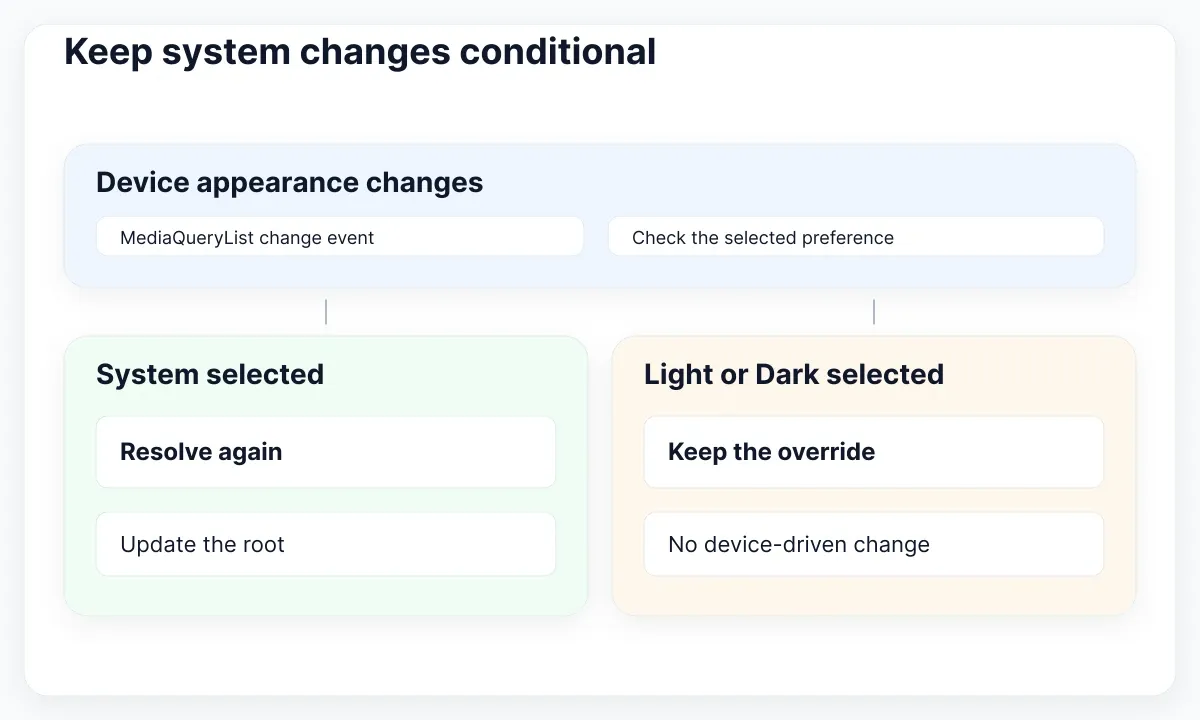
The MediaQueryList change event lets the controller receive a changed query result. In the sketch, the listener calls applyAppearance only for the system choice. Switching from Dark to System immediately resolves the current device state; it does not wait for another device change.
Use a short review sequence. Begin with a dark device appearance and select Light in Harbor. Change the device to light and back to dark; Harbor should remain light. Select System and confirm that the current device state takes effect. Change the device again and observe that Harbor now follows it.
Keep the settings text truthful during this sequence. The field should continue to say System while the page changes between light and dark. If you add supporting text such as “Currently dark,” render it separately from the selected choice. That lets a person understand the cause without losing the original setting.
In a component framework, register the listener once at the appropriate application boundary and remove it when that owner is destroyed. Avoid adding another listener every time settings opens. The standalone sketch assumes one page-lifetime controller; a component adaptation needs lifecycle cleanup.
Also decide the scope of synchronization. This example does not coordinate multiple tabs or a server profile. Write those as separate requirements if Harbor needs them. A local setting that works within one tab is a valid bounded feature, provided the interface and handoff do not promise more.
Test reloads and the first appearance
Test a reload as a separate transition. A theme that looks correct after a click can still begin with the wrong surface before its preference is applied. Review a fresh navigation, a reload and a return visit, with the saved choice recorded for each case.
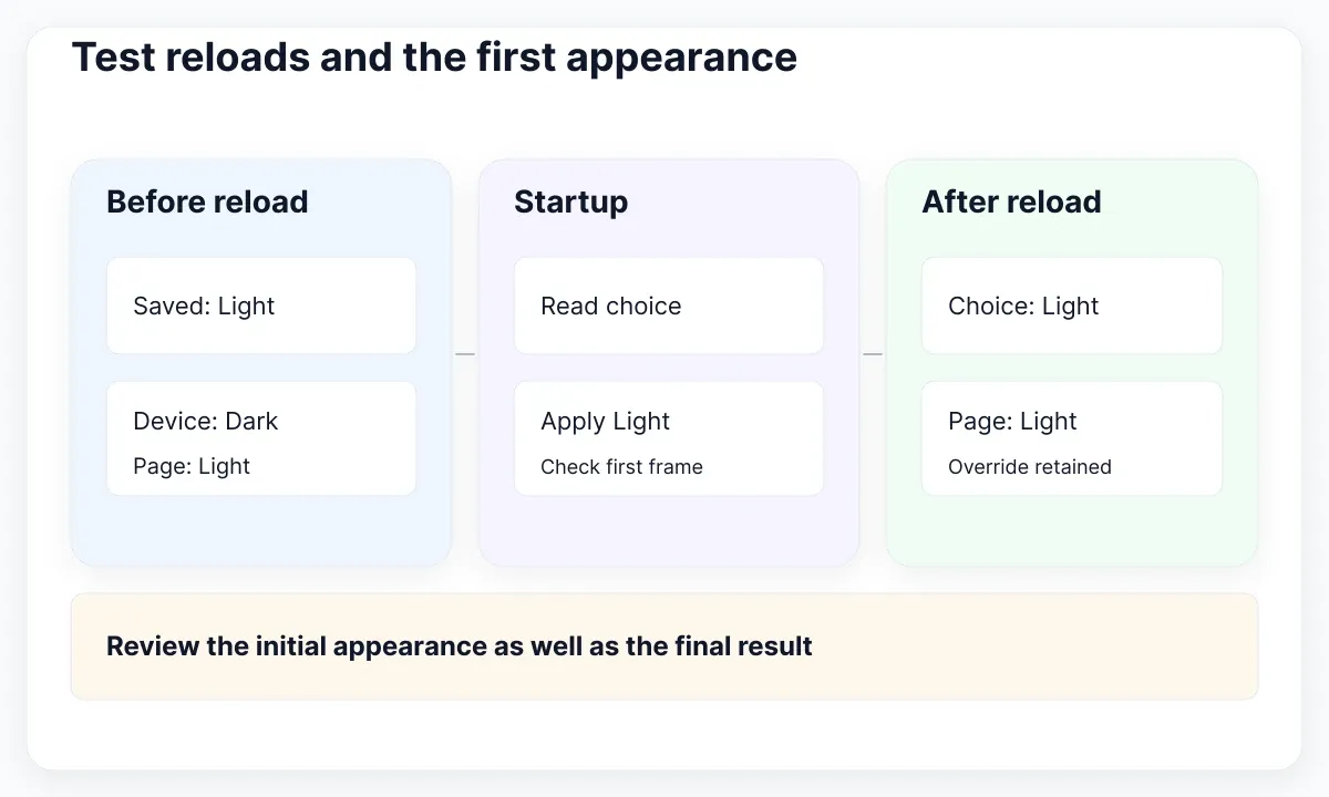
Run the initial resolution early enough for your delivery model, and keep it consistent with the interactive controller. For a client-rendered page, the small startup step can apply the root attribute before the main content paints. Under server rendering, agree how the server output and client initialization share the preference without producing contradictory initial markup.
The sketch does not prescribe a framework-specific hydration repair. If the server cannot read browser storage, document the initial fallback and inspect the first rendered frame. Do not scatter suppression flags or duplicate scripts across pages to hide a disagreement that still exists in the preference model.
| Review case | Expected observation |
|---|---|
| Saved Light, dark device | Light survives reload |
| Saved Dark, light device | Dark survives reload |
| System, device changes | Page follows while open |
| Storage denied | Choice works for this page session |
| Unknown saved value | Resolver uses System |
Capture evidence with the same booking record and viewport. A before-and-after comparison becomes misleading if the page also changes content, width or validation state. In the review log, record the selected choice, resolved theme, device appearance and whether navigation occurred.
For a useful failure report, describe the transition: “Saved Light, device Dark, reload flashes dark before becoming light.” That gives development a reproducible starting point. “Dark mode is broken” cannot distinguish initialization, selector, storage and component-surface failures.
Review an EmviUI control in both themes
Use the real EmviUI select-dropdown specimen below to review label, current value, helper text and open-menu hierarchy. Its supplied examples contain generic labels and platform options. They provide a visual starting point for the proposed Appearance setting, not a working theme controller.
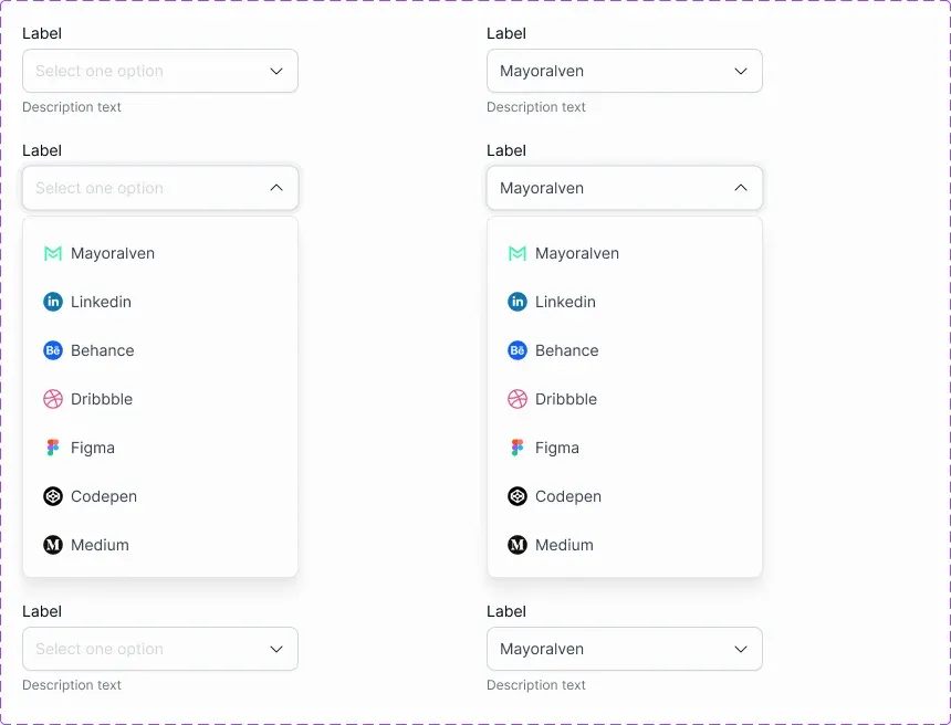
EmviUI describes its Figma kit and dark-mode support. Replace the specimen’s generic wording with Appearance and the three choices, then compare the closed control with its open list on the intended surfaces. Keep its helper text readable in both themes and make the current value easy to distinguish from the field label.
Check the actual rendered text combinations. WCAG’s minimum text-contrast criterion requires 4.5:1 for ordinary text and 3:1 for qualifying large text, with specified exceptions. A dark-looking palette is not evidence that these pairs pass. Measure the label, selected value and supporting text against their immediate backgrounds.
Walk through keyboard selection and focus in the implementation, including when the menu is open during an appearance change. The static specimen cannot demonstrate those behaviors. Record a concrete outcome for each state instead of marking the entire control approved from one attractive screenshot.
Keep the design handoff small: the decision table, the root-selector contract, the three field values and the reload cases. For design-side binding problems, the next useful step is tracing Figma variable bindings and mode inheritance. That investigation complements the browser preference model without replacing it.
Finish with one acceptance sentence: Harbor preserves an explicit choice, follows the device only in System, and presents a readable, operable setting in either resolved appearance. Attach the observed cases and unresolved limits. That is a more useful delivery record than counting how many dark color classes the page contains.
For a practical sign-off, ask a second reviewer to repeat one override case without seeing your setup notes. Give them the starting device appearance and the selected setting, then ask what should happen on reload. If the expectation differs, revise the wording or the decision table before adding more visual polish. This proposed walkthrough checks whether the contract is understandable; it does not substitute for usability research with the people who will use the product.

Pablo Mayoral
Senior UX/UI & Web Designer with 10+ years of experience. Creator of EmviUI (10k+ components Figma design system), UImand, and Vitamin Bootstrap. Currently designing digital products at CQMRewards.