Tailwind CSS Components Examples: Three Dialog Patterns
Three dialogs for different tasks, with concrete rules for saving, cancelling and restoring keyboard focus.
These Tailwind CSS components examples show three dialogs with different jobs: confirmation, editing, and details. Start with the native HTML dialog opened by showModal(), give it a visible name, and use Tailwind for the panel, backdrop, focus treatment, and layout. Decide separately where focus starts, how dismissal works, and what counts as success.
These Tailwind CSS components examples show three dialogs with different jobs: confirmation, editing, and details. Start with the native HTML dialog opened by showModal(), give it a visible name, and use Tailwind for the panel, backdrop, focus treatment, and layout. Decide separately where focus starts, how dismissal works, and what counts as success.
The examples use a fictional Fieldnote workspace. Imagine a project named Launch checklist with several saved views. The team needs to let a member remove a view, rename the project, and read why access is restricted. Each action changes the conversation with the interface. Giving all three dialogs identical buttons and dismissal behavior would hide decisions the team needs to make before styling.
Choose the right interruption
A modal is useful when a person needs to finish or explicitly leave a short task before returning to the page. The WAI modal dialog pattern describes a dialog that keeps keyboard navigation within it and makes the rest of the interface unavailable while it is active. If someone only needs to know that a save succeeded, keep them in the current task and deliver a status message. If they need to compare several views while editing, give them a full page or another design that leaves the necessary context available.
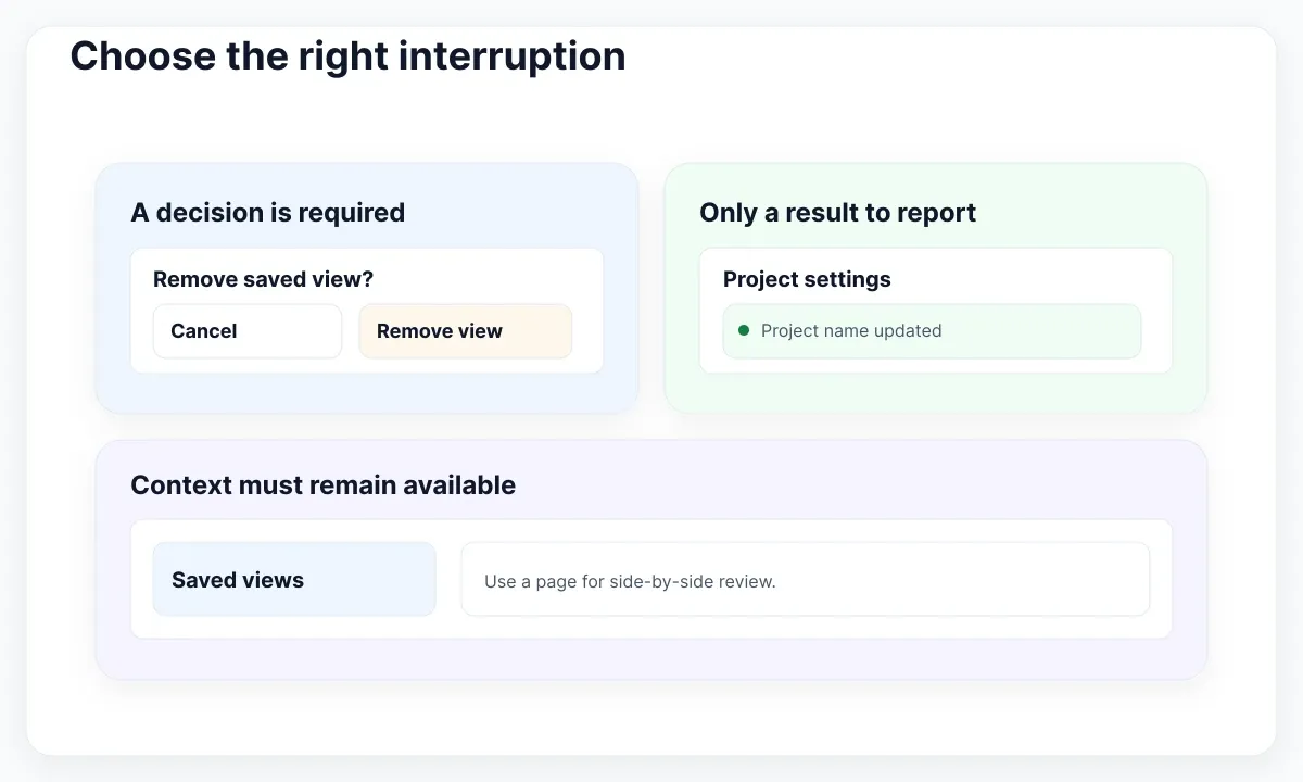
In Fieldnote, removing a shared saved view needs a decision because the view disappears for the team. Renaming the project needs one field and a save outcome. Reading access details needs a way to leave after reviewing the reason. A small status strip on the project page handles the fourth case: after an ordinary rename, tell the person it succeeded without reopening a modal. The WAI guidance on status messages explains how a change can be announced without moving focus. Mount the status region ahead of time and test the announcement when its text changes.
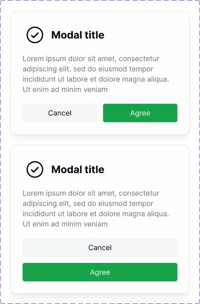
Use the EmviUI Modal component as a starting point in Figma for a title, description and actions. The pool specimen shows side-by-side and stacked buttons with sample text. Duplicate those two arrangements and swap in real wording, including the full Spanish action label. The preview can help you choose a layout. The browser implementation still needs its own focus, dismissal and save rules.
A second useful test is to ask whether the same person can finish without reopening the dialog. When a save produces a background status, make its subject clear: “Project name updated” is more informative than “Done.” When a permission explanation is relevant on every visit, put the short reason next to the blocked action and make the longer details optional. A modal is then a deliberate choice made by the reader.
Confirm an irreversible change
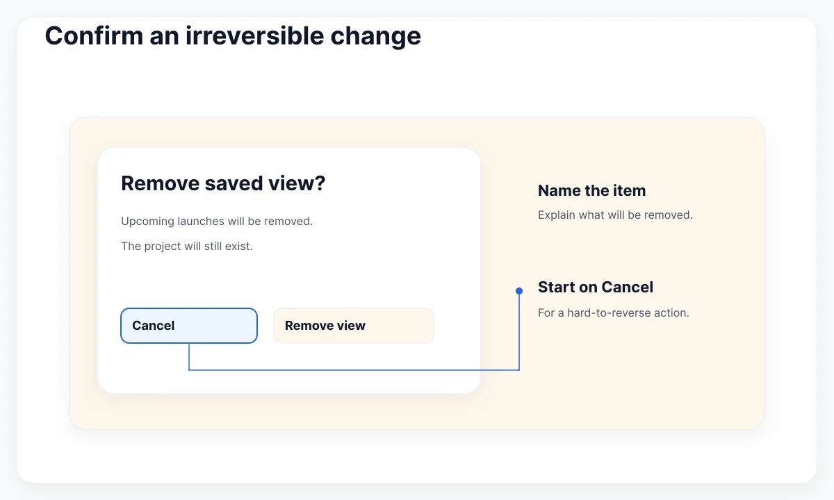
Name the exact item and consequence before asking for a destructive decision. A title like “Remove saved view?” and a sentence like “Launch checklist will still exist. This removes the shared view ‘Upcoming launches’” explain the scope without requiring people to interpret a warning icon. Use “Remove view” on the committing action and “Cancel” on the safe exit. For a hard-to-reverse action, the APG initial focus guidance suggests considering the least destructive action. Here, start on Cancel.
The small archive example below demonstrates the browser contract without touching data. The HTML dialog specification defines modal opening and the special dialog form method: submitting the form closes the dialog and records the activated submit button’s value without submitting a network form. A real irreversible operation should have its own explicit request and success check. The two buttons in the demo do not archive anything.
<button id="open-archive" type="button">Archive project</button>
<dialog id="archive" aria-labelledby="archive-title"
  class="m-auto max-h-[calc(100dvh-2rem)] w-[calc(100%-2rem)]
         max-w-md overflow-y-auto rounded-xl bg-white p-6 text-slate-900
         backdrop:bg-slate-900/50">
  <h2 id="archive-title">Archive this project?</h2>
  <p>This demo only records your choice.</p>
  <form method="dialog" class="mt-4 grid gap-3 sm:flex sm:justify-end">
    <button value="cancel" autofocus class="rounded-lg px-4 py-2
      focus-visible:outline-2 focus-visible:outline-offset-2">Cancel</button>
    <button value="archive" class="rounded-lg bg-slate-900 px-4 py-2 text-white
      focus-visible:outline-2 focus-visible:outline-offset-2">Archive</button>
  </form>
</dialog>
<script>
  const modal = document.querySelector("#archive");
  document.querySelector("#open-archive").addEventListener("click", () => {
    modal.returnValue = "";
    modal.showModal();
  });
</script>
The opening button remains outside the panel. Do not set the open attribute yourself to simulate showModal(): the two paths do not give the same modal behavior. The Tailwind state variants reference documents the backdrop and focus-visible styling hooks used here. The styling helps people locate the active control; the native element handles the modal boundary. Check the focus outline on the dark action as well as the light action, and test the full pair of focus and error styles using the Tailwind form color and focus guide.
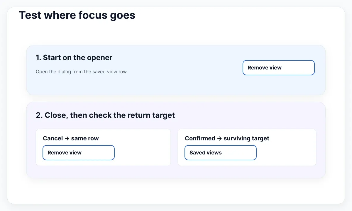
For a real shared view, close after success, refresh the list, then move focus to a sensible surviving control if the row that opened the dialog no longer exists. A nearby “Saved views” heading that can receive programmatic focus or the next surviving row action gives users a predictable place to continue. Do not try to focus a detached button. Escape and Cancel should leave the view unchanged. For an ambiguous timeout, reconcile the result before offering a retry that could repeat the operation.
Test the keyboard path with two different openers, for example the same command in a row and in a project toolbar. After cancelling from the toolbar, focus should return there, not to the first matching row. After confirming from a disappearing row, choose the return target only after the list update. Write down which element receives focus in each case so the design remains clear when another screen reuses the same dialog.
Keep an edit recoverable
A rename dialog has a different starting point: put focus in the labelled project name field with the current value intact. Keep the text when a save fails. Place a field error beside the input for a rejected name; use a short explanation with a recovery action for a network problem. A failed request should never look like a completed rename. Use a normal form submit handler for the real save and close only when the operation succeeds.
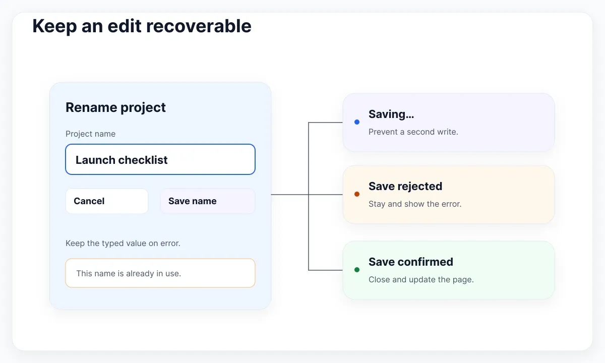
Specify the pending state before coding. A second submission while the first is unresolved should not dispatch a second write. Keep a visible message such as “Saving project name…” and define whether the action can be interrupted. Closing a panel does not cancel a request already accepted by the server. If you let someone dismiss while saving, make the outcome visible on the page and reconcile the displayed name. Try a slow response with Tab, Shift+Tab and Escape so focus and status remain understandable even when the main button cannot submit again.
An explicit Cancel can discard a single unsaved rename if that is the documented product rule and the loss is small. For a longer or costly draft, decide how to preserve it or provide a safe review before leaving. Avoid piling a second generic confirmation on top of every minor edit. For a practical way to compare abandonment, failure and retry paths before building them, see the Figma prototype exercises for recovery.
For the first test, enter a name that the server rejects, such as one already used in this workspace. Confirm that the editable text stays in the input and the error names the problem. Correct the value and try again. Then test a lost connection with a valid name. Keep the problem and action separate: a duplicate needs a different name; a lost connection needs a way to retry or check whether the server applied the edit.
Make details readable on mobile
A read-only access explanation needs a heading, paragraphs and a Close action. With several sections, start focus on a heading or other static element at the top that has tabindex="-1", rather than jumping to the last button and scrolling the beginning out of view. The APG guidance for substantial dialog content describes this option and cautions against making an entire structured body one long accessible description. Keep the heading as the accessible name and let readers navigate the paragraphs and lists.
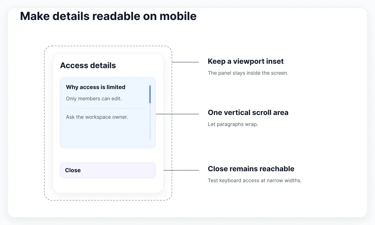
At narrow widths the panel should shrink within the viewport; tall content should scroll vertically. The Tailwind overflow reference explains the vertical scrolling utility used by the example. For the short demo, the whole dialog scrolls. For the longer details specimen, start with a flex column, a fixed-in-layout heading and footer, and one scrollable middle region with min-h-0 and overflow-y-auto. Avoid combining that region with an independently scrolling outer panel. Check that the heading and footer can still fit in a very short viewport; if they cannot, let the whole panel scroll instead.
Test a long workspace name, a longer translation and zoom before treating a single mockup as sufficient. Use the WAI Reflow explanation for the 320 CSS pixel equivalent width check on vertically scrolling content. At that width, neither a long label nor a wrapped action group should force a sideways scroll. The guide to Tailwind typography and reflow gives a separate procedure for testing text size and spacing.
Start with a generous max width on desktop and no fixed height for the body text. If you make the footer persistent, tab through the links near the bottom of the scroll area and confirm their focus indicators are visible. On a phone, open the keyboard in the rename example as well: the usable height may shrink even when the width does not change. Check that someone can reach an action without dismissing the keyboard or dragging the page behind the modal.
Test where focus goes
Run the same sequence for each dialog: open with the keyboard, inspect initial focus and the announced name, reach every interactive control in both directions, exit, and verify where focus lands. Repeat with a pointer and a narrow viewport. Check that the background does not take focus while the native modal is open. Test the highest-cost branch in each example: removal of the trigger, failed rename with text preserved, and a long details panel with controls below the fold.
Write results as observable outcomes. “Works on mobile” is hard to reproduce; “at 320 CSS pixels, the Close action remains reachable by keyboard and the content does not need horizontal scrolling” gives the next reviewer something to repeat. Record the browser, viewport, zoom, locale and starting fixture. Reset the project and saved view between runs so that the second attempt starts with the same available actions.
Use a simple acceptance log with columns for opening control, expected first focus, closing action and expected return target. Add rows for Escape, Cancel, successful removal and a rejected save. A rejected save should leave the user inside the dialog with a clear error and a usable input; a successful removal should land on the surviving target. This log makes keyboard behavior reviewable alongside the Figma specimen.
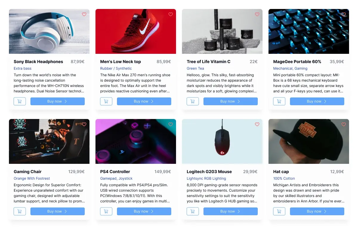
The EmviUI card grid illustrates a common variation of the same test: several nearly identical controls sit next to different items. If you adapt these cards to add a Quick details button, open the second card and dismiss it. Focus should return to that exact button, even if the first card has the same visible label. Repeat after filtering the grid so that the opening card no longer exists and confirm the fallback leads to the updated results.
Pablo Mayoral
Senior UX/UI & Web Designer with 10+ years of experience. Creator of EmviUI (10k+ components Figma design system), UImand, and Vitamin Bootstrap. Currently designing digital products at CQMRewards.