Figma Prototype: How Interactive Design Flows Work
Learn what a Figma prototype is, how frames and interactions connect, and how to validate an onboarding flow before engineering builds it.
A Figma prototype is an interactive map of design frames: triggers such as clicks or taps connect one frame to another through actions and transitions. In an onboarding example, it can demonstrate interest selection, a dropdown choice, and confirmation before development, while leaving validation rules, data persistence, and production logic to engineering.
A Figma prototype is an interactive connection between design frames. It lets someone click, tap, open, select, and move through a proposed interface so a product team can experience a flow before the application is built. It is not the finished application and does not implement the underlying business logic.
That distinction answers the practical question behind “what is a Figma prototype?” A designer creates screens in Figma, defines a starting point, adds hotspots and triggers, then connects those elements to destination frames with actions and transitions. A reviewer can run the result in Present mode, test the intended journey, and identify interaction or usability problems early.
This article uses one concrete example throughout: a four-step onboarding flow in which a user sees interest choices including Figma, React, and Prototyping, presses Continue, chooses an option from a dropdown, and reaches a confirmation screen.
Figma prototype: the mental model
Think of a prototype as a directed map, not a miniature coded product. Each frame is a possible visual state. Each connection says, “When this event happens on this object, show that state.” The prototype makes the route observable without pretending that the route is implemented.
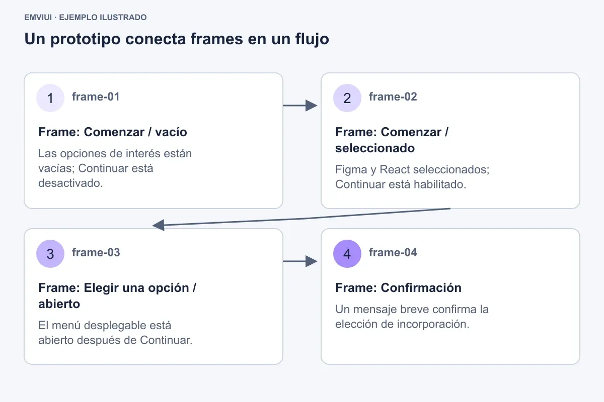
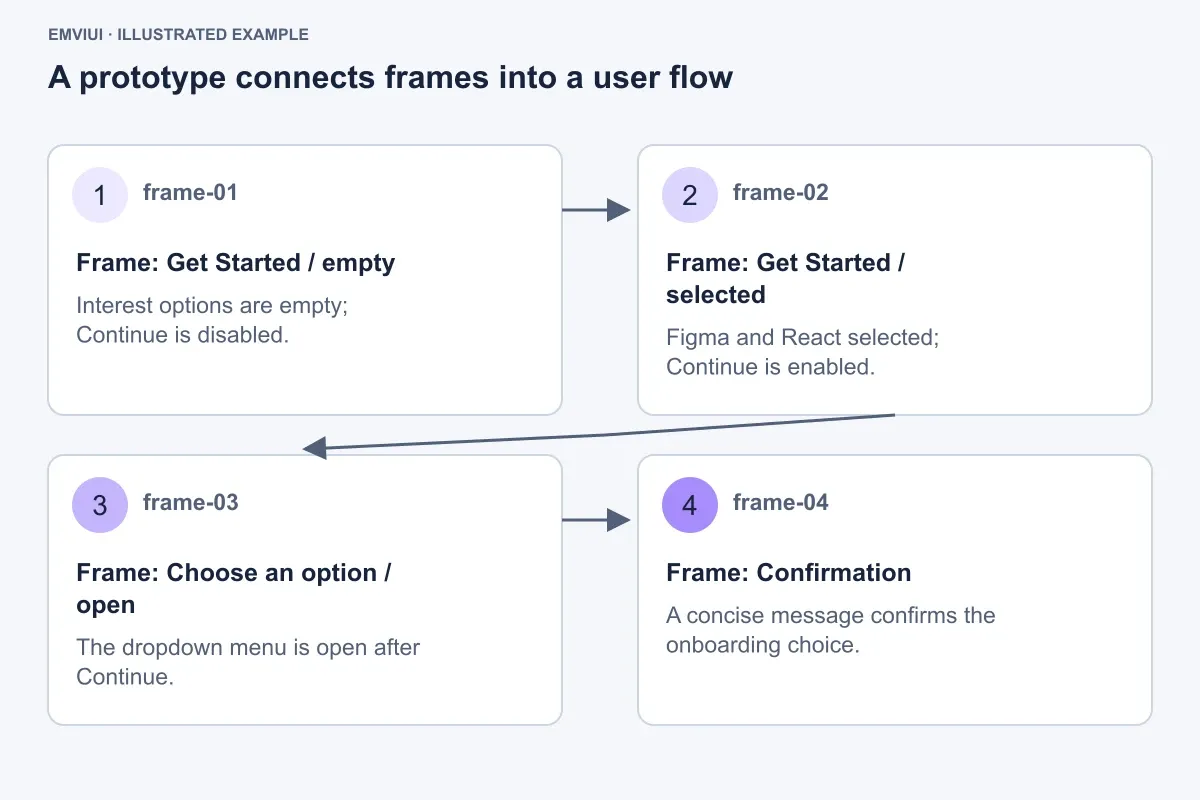
For the onboarding example, draw four mobile frames as a representative overview of the complete six-state implementation, at an illustrative size of 390 × 844 px. Place them horizontally on the canvas with a 96 px gap so the flow reads from left to right:
- Get Started / empty: the interest-selection card displays unselected options and an inactive Continue action.
- Get Started / selected: Figma and React are selected, with Continue enabled.
- Choose an option / open: a select field is expanded and its menu is visible.
- Confirmation: a concise completion message confirms the onboarding choice.
The arrows between these frames are prototype connections. They do not represent API calls, database writes, validation code, or a production navigation stack. They represent the experience you want to test: what appears after a person takes a visible action.
| Prototype concept | Onboarding example | What it communicates |
|---|---|---|
| Frame | Get Started / selected | The complete visual state shown to the participant |
| Hotspot | Continue button | The area available for interaction |
| Trigger | On tap | The event that starts the connection |
| Action | Navigate to | The operation Figma simulates |
| Destination | Choose an option / open | The frame displayed next |
| Transition | Instant or Smart Animate | How the destination appears |
This mental model is useful for both product designers and frontend engineers. Designers can specify an intended journey without overbuilding it. Engineers can see the visual states and expected transitions while recognizing which behavior still needs implementation.
The anatomy of one Figma prototype interaction
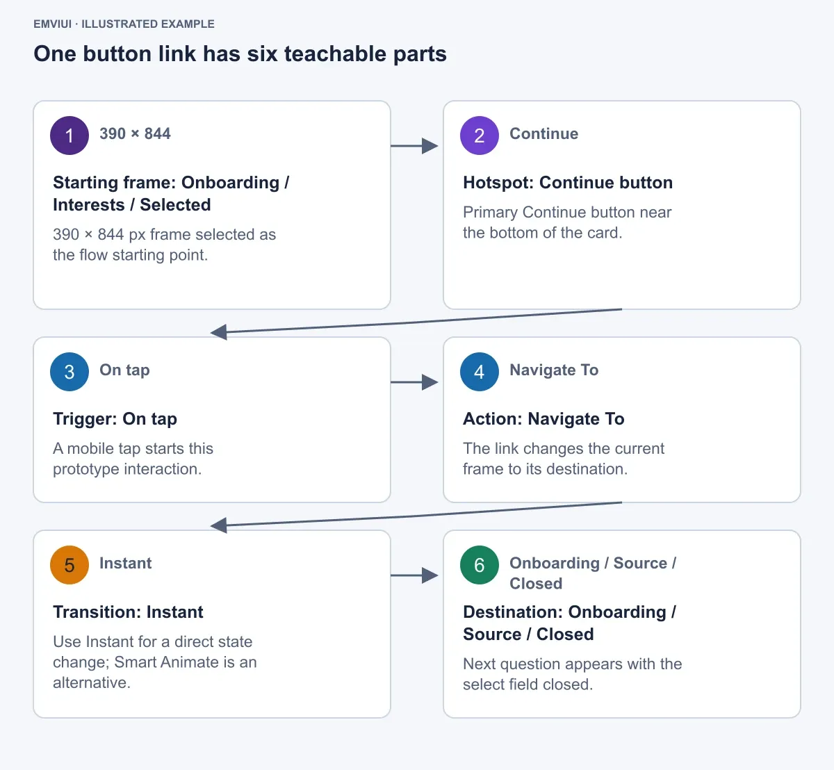
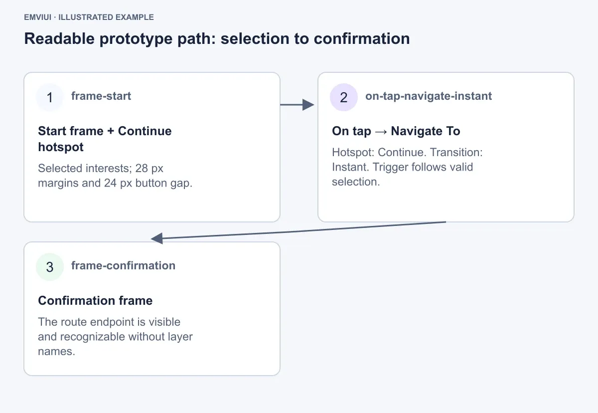
A single connection is easier to reason about when you name its parts. Start with the selected onboarding frame and the Continue button. The button is the interaction source; the next onboarding frame is the destination.
- Starting frame: the 390 × 844 px frame named
Onboarding / Interests / Selected. - Hotspot: the primary Continue button near the bottom of the card.
- Trigger:
On tapfor a mobile flow. A desktop test could use a click-equivalent interaction. - Action:
Navigate to. - Destination:
Onboarding / Source / Closed, a frame with the next question and a closed select field. - Transition:
Instantfor a direct state change, or a short Smart Animate transition if the movement itself communicates continuity.
In Figma, select the Continue layer, open the Prototype tab, drag the connection handle to the destination frame, and configure those values. Set the selected frame as the flow starting point. The first frame in the canvas is not automatically the correct entry point; the starting-point setting is part of the prototype definition.
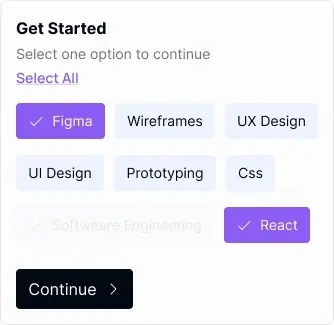
The visible card can be based on the supplied EmviUI multi-select reference. Its asset is a 334 × 325 px card with the heading “Get Started,” the instruction “Select one option to continue,” a purple underlined “Select All” link, selected purple Figma and React chips with white checkmarks, pale-blue unselected chips for Wireframes, UX Design, UI Design, Prototyping, and Css, a faded Software Engineering option, and a dark Continue button. Treat it as a component reference to recreate or adapt in your Figma file, not as a screenshot of a prototype.
For a responsive mobile recreation, place that card inside the 390 px frame with 28 px side margins, giving it a 334 px content width. Keep the card's illustrated 334 × 325 px geometry when presenting the reference specimen. If you adapt it for a production layout, record the new dimensions rather than silently mixing the reference size with the prototype frame.
Build the onboarding flow as connected states
Now construct the worked example in a deliberate sequence. The objective is not to make every chip genuinely compute a selection. The objective is to show the participant what selection feedback, continuation, choice, and completion should look like.
- Create the empty frame. Name it
Onboarding / Interests / Empty. Use a white 390 × 844 px mobile frame. Position the 334 px-wide onboarding card 28 px from the left edge and 64 px from the top. Use a 24 px gap between the instruction and the chip grid, a 16 px row gap in the option grid, and a 24 px gap before Continue. In this state, keep the chips unselected and show the primary action in its inactive visual treatment. - Create the selected frame. Duplicate the empty frame and name it
Onboarding / Interests / Selected. Change the Figma and React chips to the solid purple selected style with white checkmarks. Keep Wireframes, UX Design, UI Design, Prototyping, and Css pale blue and leave Software Engineering visibly faded. Change Continue to the dark enabled treatment. This frame is the destination for the visible selection interaction and the source for the next navigation. - Connect a selection. If the goal is a simple demonstration, for component variants, configure the Figma and React chip hotspots with
On tap → Change towhen those chips are variants in a component set; use Change to for the variant change, and use Navigate to to reach the selected frame. If the chip is not built as a component, connect its layer to the duplicated selected frame withNavigate to. The visual outcome is similar, but the component-state approach is easier to maintain.
- Connect Continue. On the selected frame, connect Continue with
On tap → Navigate tothe closed select frame. Set the transition to Instant while validating the information architecture. A more expressive transition can be added after the route is clear. - Build the closed select state. Name the destination
Onboarding / Source / Closed. Use a labeled select field, a closed chevron, the placeholder “Select one option,” and helper text below it. Keep the same 28 px side margins and align the field to the card content edge. - Build the open state. Duplicate the closed frame as
Onboarding / Source / Open. Expand the menu below the field and show the option list. Connect the closed field to this frame withOn tap → Navigate to, then connect one option, such as Figma, to a selected-value frame. - Finish the route. In the selected-value frame, replace the placeholder with the chosen value and connect the next Continue action to
Onboarding / Confirmation. The confirmation frame can use a centered completion message and a single secondary action, but it should not imply that a database record was actually created.
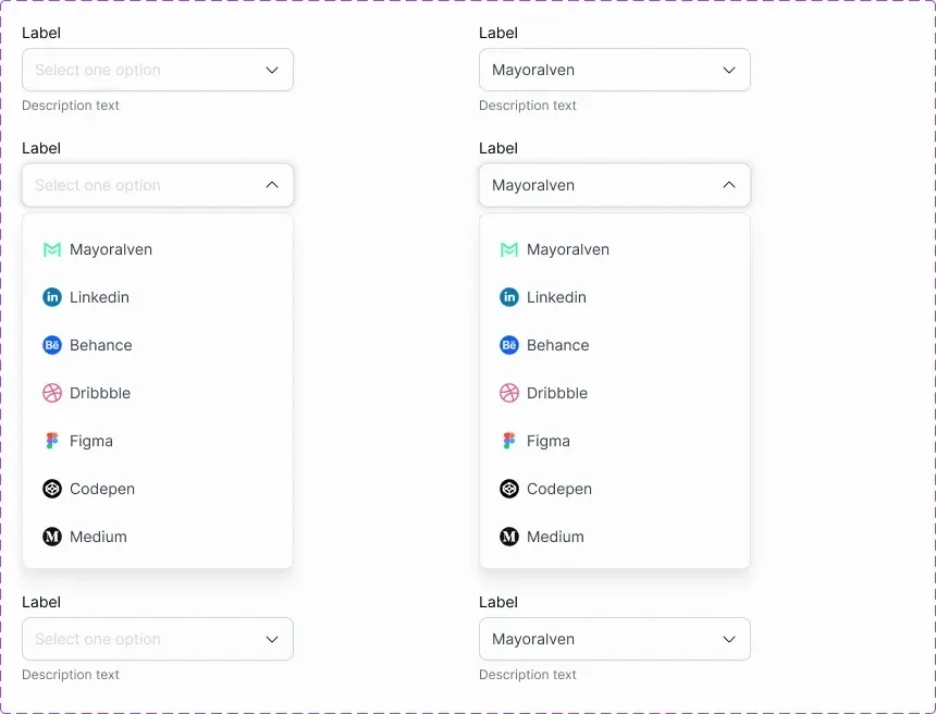
The supplied EmviUI select reference is useful for the middle of this flow. It shows four labeled select fields in a two-column arrangement across three rows; closed controls display “Select one option” or the selected value “Mayoralven,” with chevrons and “Description text” beneath. Two middle selects are expanded into white menus with soft shadows and options including Mayoralven, Linkedin, Behance, Dribbble, Figma, Codepen, and Medium, paired with recognizable colored icons. Use the closed and expanded appearances as separate prototype states, rather than treating one static image as a working dropdown.
Use component states to show feedback
A prototype becomes useful when it communicates the states people need to understand. Figma can display those states through component variants, variant properties, duplicated frames, or combinations of the two. It does not automatically decide whether a user is allowed to proceed.
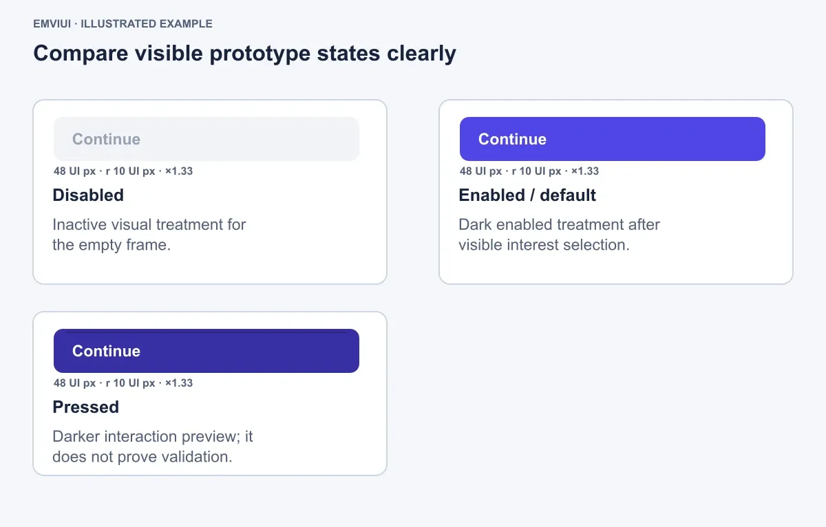
For the worked card, create a chip component with an illustrative 32 px height, 12 px horizontal padding, and a 10 px corner radius. Define variants named Unselected, Selected, and Disabled. Use the reference's visual direction: pale blue for unselected chips, solid purple with a white checkmark for selected chips, and a visibly faded treatment for Software Engineering. Keep these values as an explicit example, not a universal component prescription.
Create a Continue component with Disabled, Enabled, and Pressed variants. In the empty frame, show Disabled. In the selected frame, show Enabled. Link the Enabled variant to the next frame. A Pressed variant may use a darker version of the button treatment for a brief interaction preview, but it does not prove that the system has validated a minimum selection count.
What the example can and cannot simulate
It can simulate the visible result of selecting Figma and React, opening a menu, choosing an option, and reaching confirmation. It can help reviewers judge wording, hierarchy, focus, route order, and perceived feedback. It cannot independently enforce “select at least one,” persist the selection across sessions, fetch dropdown data, handle keyboard semantics, or submit a real account record. Those requirements need implementation and engineering tests.
This separation prevents a common review failure: stakeholders approve a polished path while assuming that its visual links represent complete product behavior. Label prototype-only assumptions in frame descriptions or handoff notes. For example, write “Selected frame represents the valid state for review; production validation remains to be implemented.”
Make the flow readable and testable
Visual polish is not separate from prototype comprehension. If spacing, contrast, or state changes are ambiguous, a participant may test the design rather than the intended interaction.
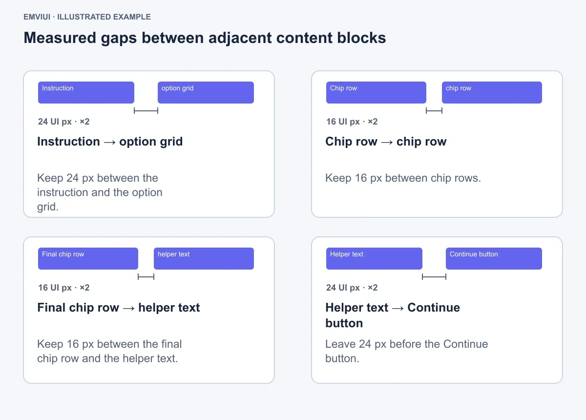
Use the onboarding card as a measurable specimen. In the 390 × 844 px frame, keep 28 px horizontal margins, 64 px top placement, 24 px between the instruction and option grid, 16 px between chip rows, 16 px between the final chip row and helper text, and 24 px before the Continue button. These are illustrative working values for this example. Their purpose is to make the visual construction reproducible and to expose crowded areas during review.
Check each state at the same zoom and viewport:
- Can a reviewer identify the current frame without reading the layer names?
- Does the selected purple chip differ clearly from the pale-blue unselected chip?
- Is the faded Software Engineering option visibly unavailable without being mistaken for ordinary text?
- Does the dark enabled Continue action have enough contrast against its surrounding surface?
- When the dropdown opens, does the menu remain aligned with the field and avoid covering the option the user needs?
- Does the confirmation frame make the end of the route obvious?
Run the prototype from the intended starting point, not from whichever frame is selected on the canvas. Test the empty path, the selected path, the open menu, an option choice, and the final confirmation. Then invite another person to use it without narrating the intended clicks. Their hesitation often reveals a missing affordance or a misleading state faster than a designer reviewing the canvas alone.
For engineers, attach concise interaction notes to the relevant frames. State the trigger, expected destination, transition, and unresolved behavior. A note such as Continue: enabled after valid selection; validation and persistence TBD is more actionable than “make this work.”
What a Figma prototype validates—and what it does not
A Figma prototype is strongest at validating the experience a person can see and perform. In the onboarding example, it can answer whether the user understands the “Select one option to continue” instruction, notices selected chips, recognizes Continue as the next step, understands the dropdown's contents, and knows when the flow is complete.
It can also expose content and transition problems before code exists. Reviewers may discover that “Figma” appears both as an interest and a dropdown option, that a disabled option needs explanation, or that the confirmation screen does not tell the user what happened. Those findings are valuable precisely because changing frames is cheaper than changing a released product.
It does not validate real loading behavior, server errors, authentication, persistence, data permissions, latency, browser accessibility APIs, keyboard focus management, screen-reader announcements, or responsive behavior across every device. A prototype can represent these concerns with additional frames and notes, but representation is not implementation.
The handoff should therefore contain two layers: the interactive artifact and an implementation boundary. The artifact demonstrates the intended route. The boundary identifies production responsibilities such as selection rules, menu filtering, error handling, focus order, analytics, and data storage. This makes the prototype credible rather than overclaiming what Figma has built.
For further workflow context, see what components in Figma are, how Figma variables support design systems and prototyping, and how UI design prototyping tools fit into product work. The short version remains simple: connect frames, define meaningful interactions, show the required visual states, test the route, and document the behavior that still belongs to engineering.

Pablo Mayoral
Senior UX/UI & Web Designer with 10+ years of experience. Creator of EmviUI (10k+ components Figma design system), UImand, and Vitamin Bootstrap. Currently designing digital products at CQMRewards.