How to Fix Position in Figma: Anchors, Overlays and Scroll
Diagnose the event that moves a Figma layer, inspect its real parent and verify anchoring, overlay placement and prototype scroll behavior separately.
Diagnose the event that moves a Figma layer, inspect its real parent and verify anchoring, overlay placement and prototype scroll behavior separately.
To fix position in Figma, first identify when the layer moves: while resizing its parent, while rearranging content, or while scrolling a prototype. Inspect its actual parent in Layers, then change the rule responsible for that event. Constraints control anchoring during frame resizing; auto layout controls content flow; prototype scroll position controls what remains visible during scrolling. A fixed width is not a fixed scroll position.
This guide answers how to fix position in Figma through a small support-page example: a navigation bar, an overlapping status badge and a floating help button. The examples are recommended diagnostic exercises, not screenshots of Figma's interface. Work in a copy, change one setting at a time and record the condition that reproduces the problem.
Identify the event that moves the layer
Write the expected relationship before touching coordinates. For example: “The help button keeps a 24 px gap from the viewer's bottom and right edges.” That is a different requirement from “The status badge remains attached to this card.” A shared word such as fixed can hide different reference frames.
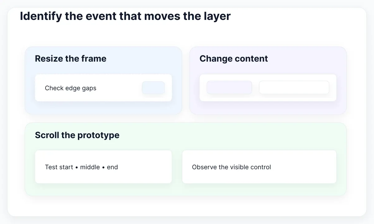
Duplicate the failing screen and label it with the reproduction condition. Start at its original dimensions, resize only its width, restore it, then resize only its height. Next change one content item, and finally run the prototype and scroll. The first action that causes the failure identifies which branch to inspect. Keep zoom unchanged during these tests.
Use a compact observation record: selected layer, direct parent, triggering action, expected reference edge and observed result. “Button disappeared after scrolling” is useful; “Figma position broken” is too broad. If the entire preview only looks smaller, use the Figma zoom diagnosis before changing layout.
Our support-page exercise deliberately separates the three elements. Repair the navigation's placement first, then the badge, then the help button. If you change all of them together, a successful preview will not reveal which rule solved which problem, and the next screen may repeat the same mistake.
Inspect the parent before changing offsets
Select the failing layer in the Layers panel and trace the hierarchy upward. Name the immediate container and the intended screen container. Check whether they are actually the same object. A button may appear visually inside a card while belonging to a different frame, so its apparent neighbors are not enough to establish its positioning relationship.
For the status badge, write a simple tree: Screen → Card → Badge. For the help control, write Screen → Help button. These are proposed structures for this exercise. The badge follows one piece of content; the floating action belongs to the screen experience. Copying the badge's layout solution onto the help control would give it the wrong responsibility.
Compare the broken specimen with a working one of the same kind. Record parent type and layout settings before moving layers. Use short, meaningful layer names while diagnosing, such as Card/body and Card/status. Avoid reorganizing unrelated navigation or component names during the repair; the useful diff should show the small structural change that matters.
If the problem exists only in one instance, compare that instance with another before editing the main component. For content substitutions and property conflicts, our variant and override troubleshooting guide covers the separate investigation. A positional repair should not silently erase a meaningful instance override.
Anchor to the intended frame edge
When the failure happens during resizing, inspect the eligible layer's constraints. Figma's constraint documentation distinguishes edge anchoring, centering, stretching between opposite edges and proportional scaling. Choose the relationship that matches the stated requirement, rather than selecting Scale because the screen itself changes size.
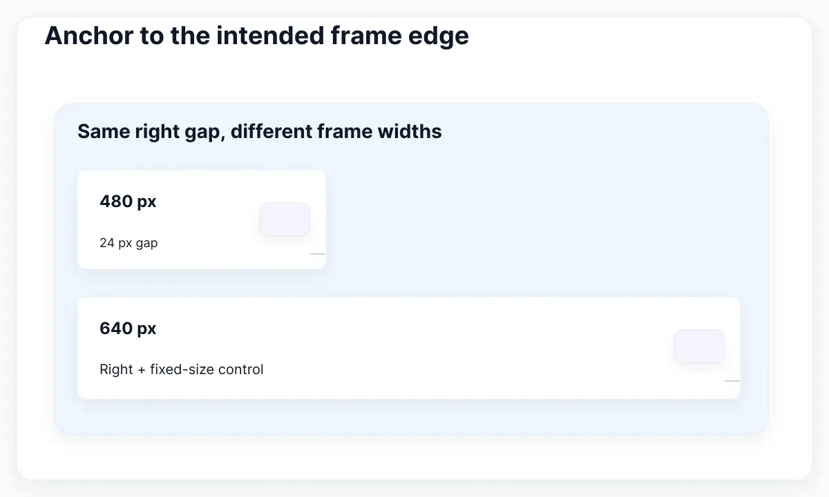
Try this exercise with a plain frame 480 px wide and a 48 px control positioned 24 px from its right edge. Change the frame to 640 px wide. With a right-edge relationship, the intended gap remains 24 px and the control stays 48 px wide. These are illustrative dimensions, not recommended universal spacing or a required device size.
Repeat with a banner intended to span the container. Its requirement is to keep both side gaps, so inspect a relationship to both sides instead of treating it like the small control. Test each axis separately: maintaining a right gap says nothing about maintaining a bottom gap. Record horizontal and vertical decisions explicitly.
Do not judge the repair solely by the initial screenshot. Two settings can look identical at one size and diverge at another. Keep the start and end dimensions in the specimen description and compare distances after resizing. If your goal is ordinary content resizing in auto layout, the Fill Container guide covers that sizing contract.
Reserve free positioning for real overlays
A layer in a normal auto layout flow is arranged by its container. Figma's auto layout guide explains that Ignore auto layout, formerly called absolute position, removes a child from that flow while keeping it in the frame. It can then use constraints. Enable it when the intended relationship is an overlay, not simply because dragging a flowing item feels restrictive.
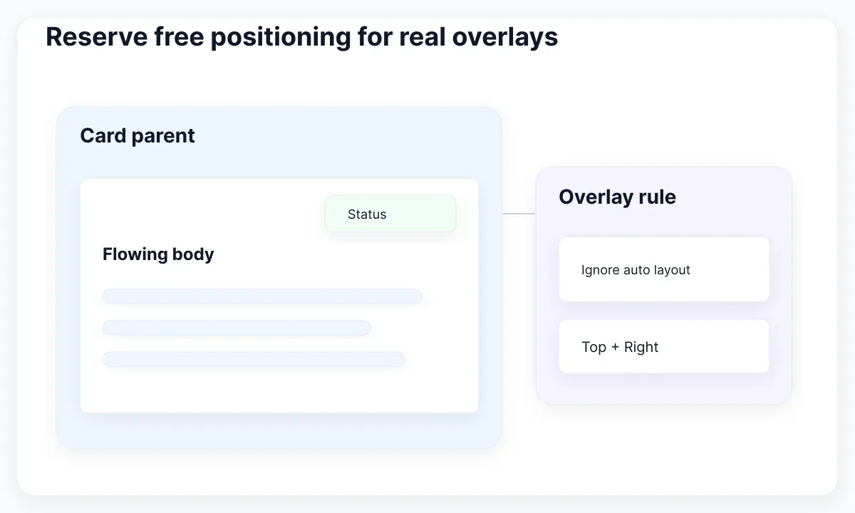
In our card example, the status badge overlaps the card's upper-right area. The body remains ordinary flowing content. Test a short body, a longer body and a hidden optional detail. The badge should stay associated with the card while the body changes. The exercise makes the proposed overlay relationship visible without converting every child into a manually placed object.
Allocate a clear area for the badge in the design review. A free-positioned badge can collide with longer content because the two do not negotiate space through the flow. Ask whether the overlap is useful, whether the content remains readable and whether the same status could be an ordinary row instead. That decision is a design recommendation, not a Figma limitation.
For the navigation links, prefer a layout relationship you can explain through alignment and spacing. Keep a copy with the original content so you can compare. If the menu needs a different narrow-screen composition, show that alternative deliberately; a collection of independent offsets is a poor record of the intended reflow.
Fix the floating action in the prototype
Use a bounded viewing frame with content extending beyond it, and set the appropriate overflow in Prototype. The scroll and overflow documentation distinguishes Scroll with parent, Fixed and Sticky. Fixed stays in place during scroll; sticky starts in the flow and sticks later. Check which behavior the reader task actually needs before selecting either.
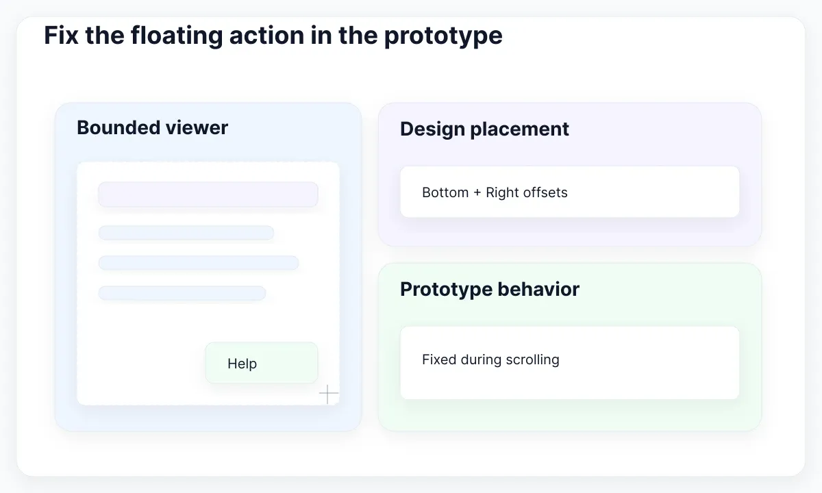
Our help action should be available throughout the support page. First confirm that the page really scrolls and that the control is nested in the intended frame. Then set its scroll position. For a child of an auto layout frame, Figma documents the prerequisite of absolute positioning, now represented by Ignore auto layout in the design workflow.
A fixed control can still be positioned outside the visible viewer. Figma's scrolling tutorial demonstrates this case and uses Bottom and Right constraints to recover a floating button. In our exercise, use the written bottom-right relationship, then test a taller and a shorter viewer rather than dragging the control upward until one preview looks correct.
Check the first view, a middle scroll position and the end of the content. The help control should be visible in all three, and the last useful content should remain reachable. If the action becomes hidden only inside a nested panel, isolate that panel's scrolling case in another specimen instead of changing the whole page.
Use an EmviUI navigation specimen carefully
The real EmviUI mobile navigation specimen below shows a brand area and menu control in two arrangements. Use it as a visual reference for deciding which elements belong to the bar. The image does not show its constraints, a fixed prototype state or working keyboard behavior; inspect the actual design file for those properties.
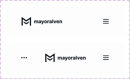
The EmviUI component catalogue includes navigation and button building blocks. Start the support-page exercise with a navigation specimen and a help-control instance from your chosen file. Keep component appearance separate from screen placement: place the instance into your test hierarchy and document the relationship at that level.
For a useful acceptance case, change the brand label and compare a wide and narrow view. Ask which element should retain an edge gap and which should share available space. Add a long translated label during review. These content choices make the placement rule visible; the pictured mobile specimen alone cannot establish that your adapted navigation handles them.
EmviUI supplies a practical starting point for visual consistency. It does not automatically diagnose the surrounding frame, choose the scrolling policy or certify an accessible implementation. Retain the repaired specimen next to its acceptance conditions so teammates can reuse the design decision as well as the component's appearance.
Separate Design, Sites and browser behavior
Confirm which Figma product you are editing. The Figma Sites positioning guide documents Relative, Absolute, Fixed and Sticky options for webpage elements. These product-specific controls should not be used as instructions for a missing menu in Figma Design. Label the target product in the repair note and use its matching documentation.
For handoff, describe behavior in plain terms before suggesting CSS. MDN positioning documentation explains how CSS positioned elements use containing blocks and scroll relationships. A developer should verify the actual DOM, containing block and scroll container. Matching a Figma control name is insufficient evidence that a browser implementation has the same behavior.
Include a small contract: which element anchors the control, which edges keep an offset, when it should move, and what may scroll behind it. For the help button, add the short-viewer case and the last-content case. For the badge, add the longer-card case. These are more useful than a single X/Y coordinate copied from the default frame.
Review obstruction in the implementation. W3C's Focus Not Obscured guidance explains the minimum requirement that focused controls are not entirely hidden by authored content. A floating action or sticky bar needs keyboard testing in the browser. A clean Figma preview can support a design discussion but cannot establish conformance for an interactive page.
Keep a repeatable placement test
Finish with a specimen another designer can reproduce. Keep the broken copy, the repaired copy and a short decision note. Record the event, reference container and rule changed. If the original bug returns after a component update, the same small test should reveal whether the structure, placement rule or content assumption changed.
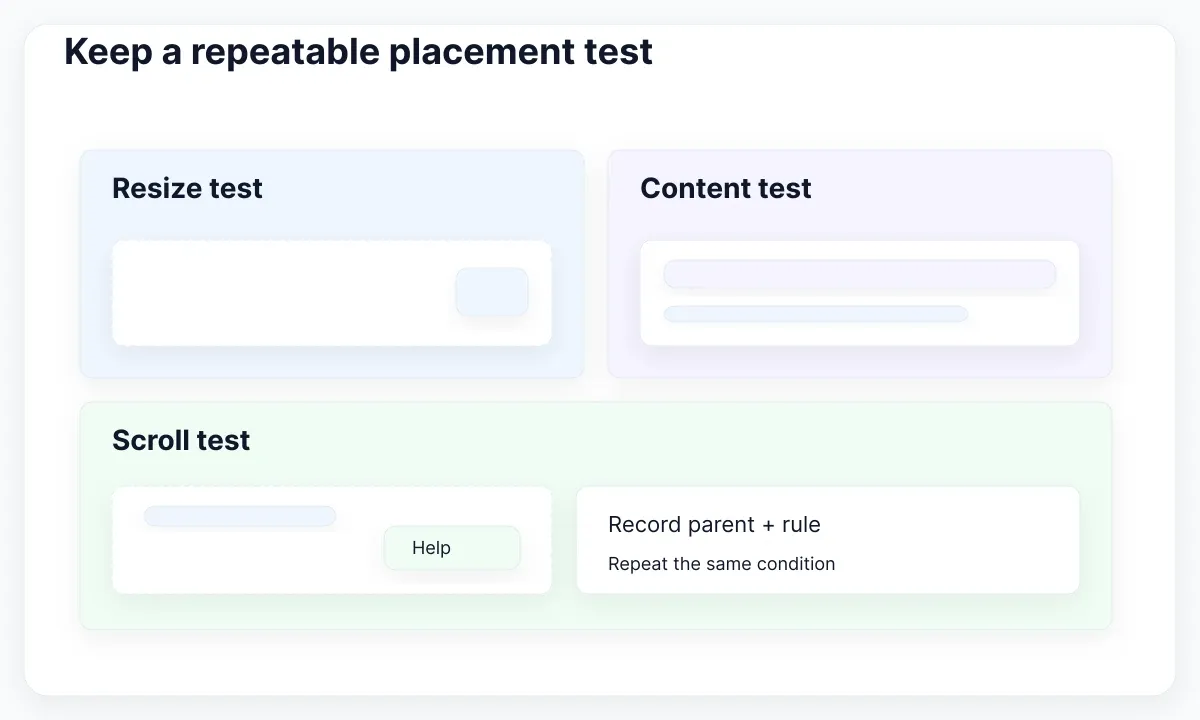
- Restore the original frame size and reproduce the failure.
- Check the direct parent and intended reference edges.
- Change one layout or scroll rule in a copy.
- Test narrow, wide, short and long-content cases.
- Run the prototype at the beginning, middle and end.
- Record the result and handoff acceptance conditions.
For this exercise, success means the badge remains attached to its card, navigation remains understandable as content changes, and the help action stays visible without blocking the task. If one case fails, name it explicitly. Avoid a blanket “responsive fixed” label when only one screen dimension was checked.
Escalate a suspected tool defect only after isolating a minimal example. Preserve the steps, expected result and actual result without unrelated library content. The repair should leave behind a clear positioning decision: a layer belongs to a particular container and reacts to a particular event. That explanation makes the next screen easier to build and the next regression easier to locate.

Pablo Mayoral
Senior UX/UI & Web Designer with 10+ years of experience. Creator of EmviUI (10k+ components Figma design system), UImand, and Vitamin Bootstrap. Currently designing digital products at CQMRewards.