How to Fix Figma Zoom: Canvas, Editor and Prototype Views
Recover a useful Figma view by identifying the affected surface, using one explicit control and comparing the same frame and component measurements.
Recover a useful Figma view by identifying the affected surface, using one explicit control and comparing the same frame and component measurements.
To fix Figma zoom, first identify what changed: the canvas view, the editor interface, or a prototype player. For a lost canvas view, select the intended frame in Layers and choose Zoom to selection; enter a known percentage when you need a repeatable comparison. If the sidebars changed size, check interface or browser scaling. If only the prototype looks wrong, check its player scaling and device settings before editing the design.
This guide answers “how to fix figma zoom” with a controlled recovery workflow. The aim is to regain a useful view while preserving the design. We will use a fictional settings page and a reusable button as examples. The diagram screens are explanatory specimens, not screenshots of Figma's current menus.
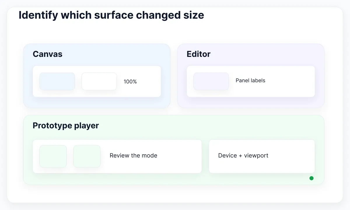
Identify which surface changed size
Describe the symptom using a visible reference. Did the button on the canvas get larger while the sidebar stayed familiar? Did the sidebar text also change? Does the problem appear only after opening Present? These observations send you to different controls, even when everyone initially calls the problem “zoom.”
Make a small comparison record before touching anything: file and page, selected layer, canvas percentage, browser or desktop app, and whether a prototype is open. A screenshot containing the affected surface helps another designer understand the same symptom. Avoid sharing customer data; a duplicate specimen with fictional content is usually enough for this investigation.
Separate the viewing task from the editing task. “I need to see the whole settings screen” is a viewing task. “The settings screen must fit a narrower product viewport” is a design task. Changing a frame's width to solve the first can accidentally create the second. Write your intended outcome in one sentence so you can verify it after changing the view.
For example, imagine that a Save button seems enormous after a trackpad gesture. Compare the visible frame with its recorded width and height. If those properties are unchanged, investigate the view before resizing the component. If an accidental edit changed the dimensions, treat that as a separate recovery problem and review the edit history available to your team.
Recover the intended canvas frame
Start with the object you actually need to review. Find the named screen in the Layers panel, select it, and use the canvas zoom menu. Figma's zoom documentation distinguishes fitting the page from fitting a selection; Shift+1 and Shift+2 are the documented shortcuts for those commands.
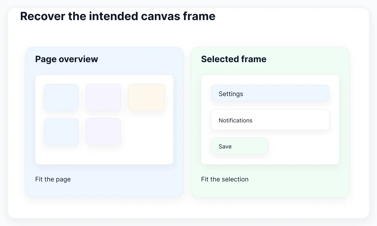
Use the menu first if you are unsure about keyboard input. For our fictional Settings / Notifications screen, select the top-level screen rather than the entire page's collection of explorations. A page-wide overview can be appropriate for finding work, but a single-screen review needs a more bounded target. A tiny-looking frame in an overview is not sufficient evidence that its actual dimensions are wrong.
The selection guide explains selecting objects through the Layers panel and canvas. Check the selected name and boundary before running the command. If you fit a small nested icon when you intended to fit the screen, the resulting close-up may look surprising but is consistent with the selected target. Reselect the parent you wanted and repeat.
For a repeatable review, enter a known canvas percentage and record it. Compare the same frame in the same window arrangement before judging spacing. If two screenshots were made with different viewing conditions, their apparent control sizes cannot establish a component regression. Save the measurements beside the screenshots rather than relying on visual memory.
If you can see the target but it is off-center, treat position as another observation. Figma documents keyboard canvas navigation in its keyboard guide. Try a deliberate navigation action after checking selection; do not substitute moving design layers for moving the viewport. The acceptance result is straightforward: the intended frame is visible, selected correctly, and its design properties remain unchanged.
Check component measurements before resizing
The real EmviUI button specimen below provides a useful reference for comparing related controls. It shows multiple visual treatments, icons and labels. It does not show your current canvas percentage, the measurements of your selected instance, or the physical size of a control on a user's device.
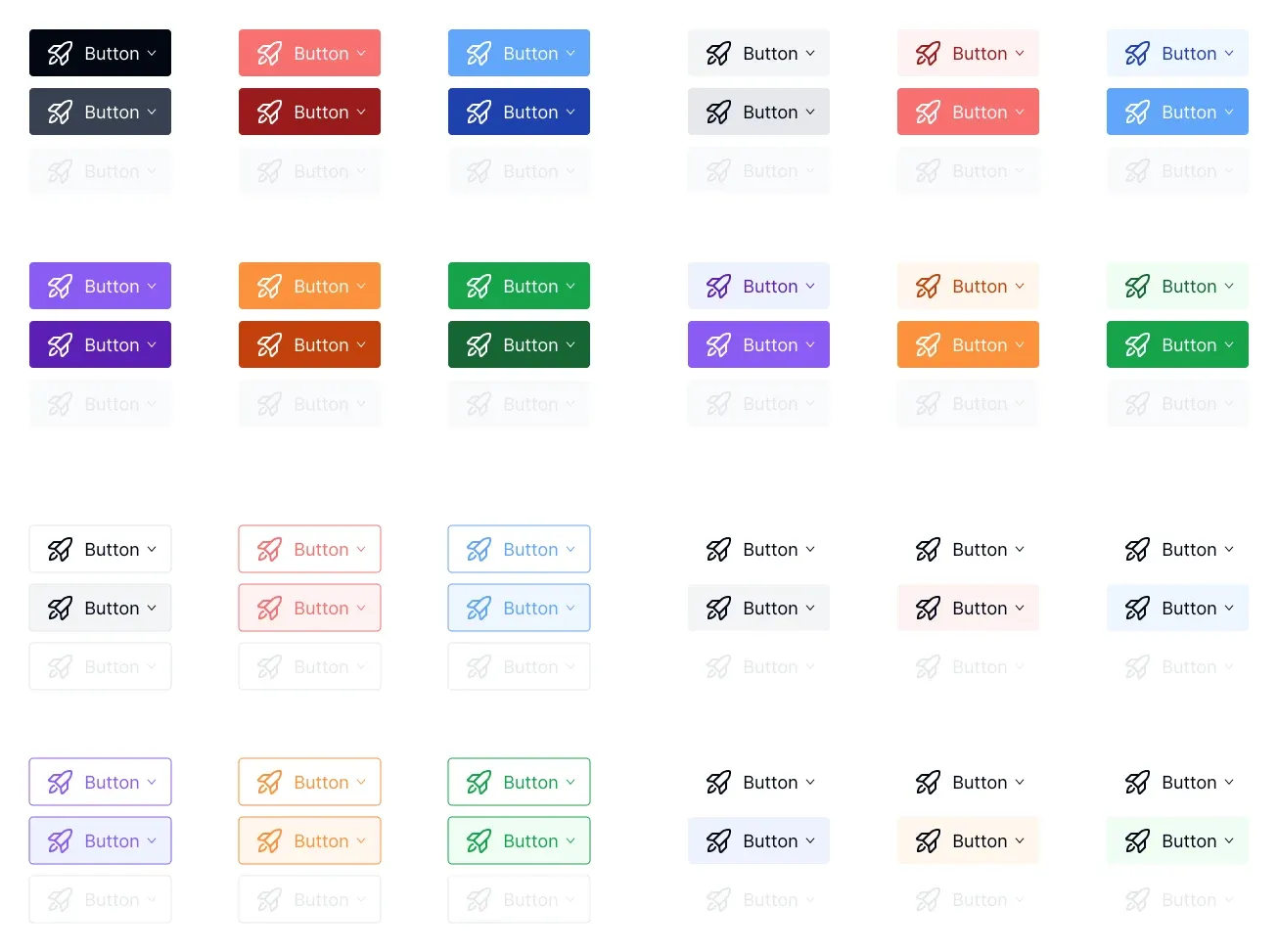
Use one instance as your diagnostic anchor. In a working copy, note its width, height, text role and padding before adjusting the view. Return to that instance afterwards and compare the recorded properties. This makes the test concrete: a view recovery should not quietly become a component redesign. If the intended task is resizing, write a different acceptance case for that change.
The EmviUI component catalogue offers reusable visual starting points. In this workflow, a consistent button gives you a familiar object to inspect while correcting the viewing environment. EmviUI does not control Figma zoom, browser magnification, monitor settings, or prototype player options. Its usefulness here is keeping the design specimen stable while you investigate those controls.
Consider a team review of a proposed 40-unit-high Save button. One colleague sees it as small in a broad canvas overview; another sees it large in a close-up. The productive question is whether both are reviewing the same component properties and intended product context. Increasing its height merely to make the overview screenshot readable would change the design for the wrong reason.
Inspect the localized label separately. “Save changes” and “Guardar cambios” can place different pressure on an actual button container. Correcting zoom cannot settle whether the label fits. Keep a content-fit test in your component review and a view-recovery test in this investigation. For the wider layout task, continue with our responsive web design workflow.
Separate editor scaling from canvas zoom
If panels and toolbar labels are the affected objects, investigate the editor interface. Figma documents desktop UI scaling in its interface scale guide; browser use has a separate viewing environment. Identify which application owns the control before changing it.
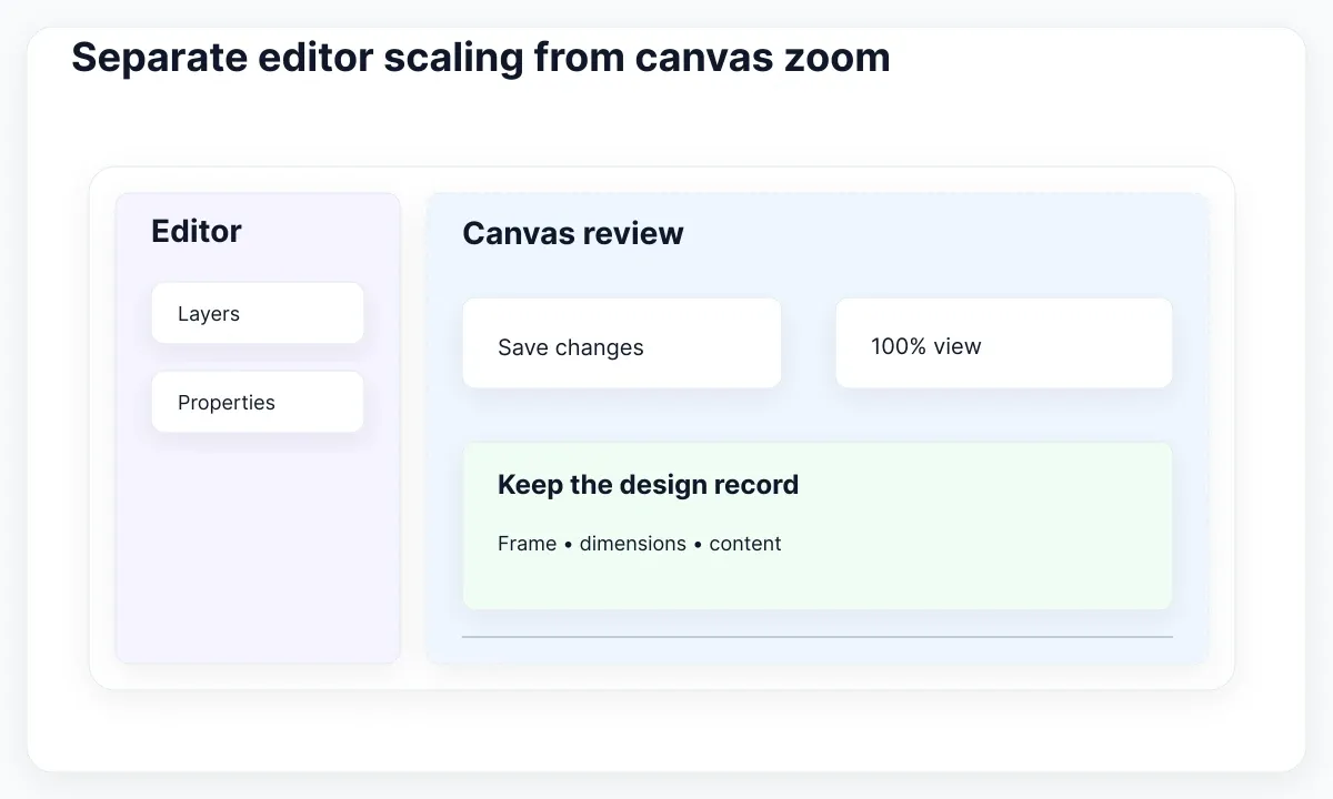
Write down a baseline that is comfortable and readable for you. The baseline need not be identical to a colleague's: accessibility needs, monitor arrangement and personal preferences can differ. What matters for diagnosis is knowing which control changed. Do not make small text a requirement just to imitate someone else's screenshot.
Change one setting and compare the same visible references: sidebar label, canvas percentage and selected button. If you alter both browser scaling and canvas zoom together, you lose the ability to tell which adjustment helped. After finding a comfortable editor view, return to the frame review using its stored measurements.
When moving between displays, repeat the observation rather than declaring the design broken. Record which display, window arrangement and application were involved. If only your working environment changes, keep the component untouched while comparing the two situations. A useful issue report states the environment difference and the visible result, instead of asking someone to “make it look normal.”
For handoff, do not annotate a screenshot with “this is the final size” unless you also provide the design dimensions and intended context. A screenshot is a communication aid. Your specification should identify the relevant component, frame and layout behavior so engineering can review those requirements without depending on your editor magnification.
Choose the right prototype viewing mode
A prototype has its own player settings. Figma's prototype playback guide documents Actual size, Fit width and Responsive options. Responsive relies on the design's constraints and Auto Layout; a scaled image of a desktop screen is not by itself evidence of a responsive layout.
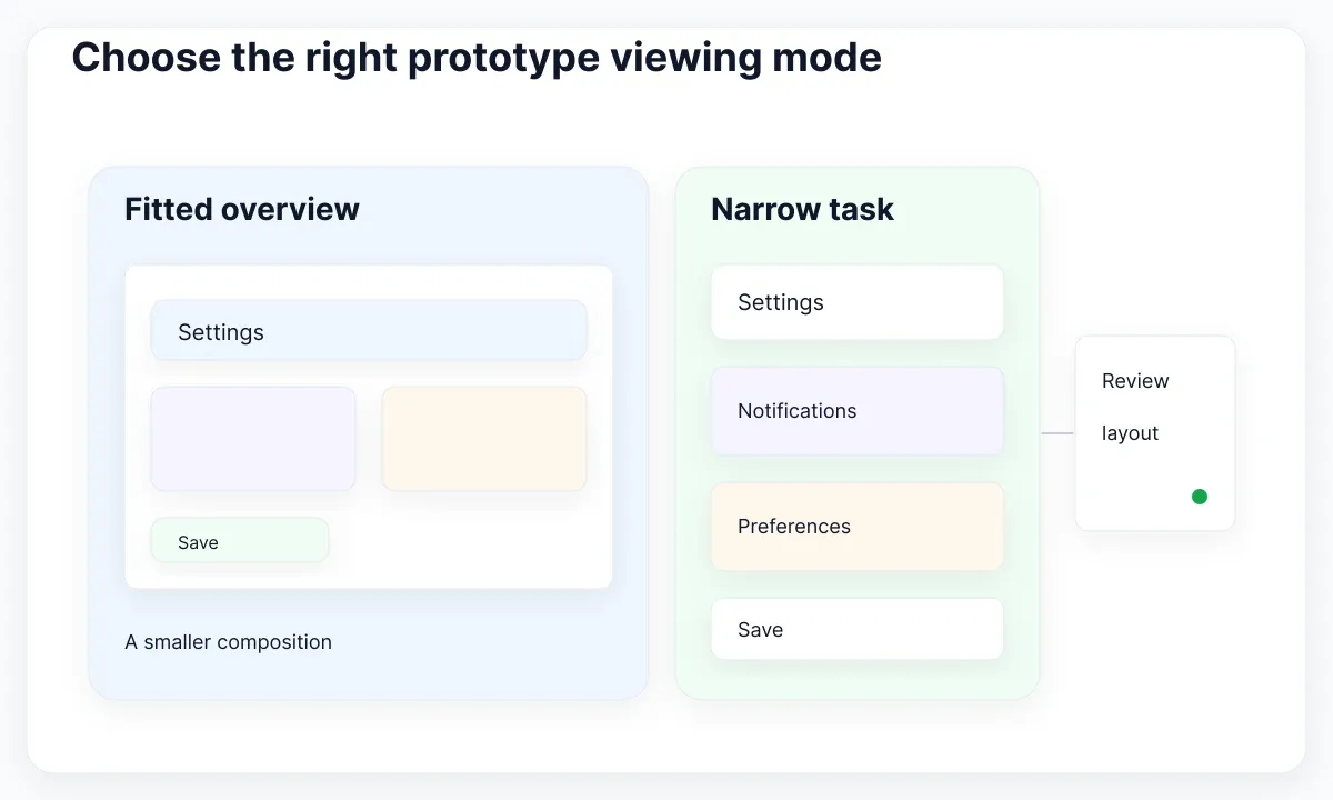
Choose the question before choosing the mode. For a broad visual walkthrough, fitting a screen may be useful. For checking a constrained viewing area, review the appropriate layout behavior. For inspecting a particular frame at its full design size, consider Actual size and expect that a smaller viewing window may crop the frame. Record the mode so reviewers know what they are seeing.
Our fictional settings screen contains a heading, a notification group and Save. In a scaled overview, all three may remain visible because the whole composition is smaller. In a narrow-layout review, the requirement could be that text wraps and the action remains reachable. Those are different acceptance results. Do not approve mobile behavior merely because a fitted desktop composition appears to fit your laptop window.
Check the configured device alongside the player. Figma's prototype device settings guide describes where to inspect device and orientation settings. Match the intended review context with your frame and device choice before diagnosing unexplained margins or cropping. A decorative device container should not become an unspoken assumption about the viewport being tested.
Share a review note containing the flow, frame, device choice, player mode and task. Ask a reviewer to complete the task rather than only comment on the picture. Our prototype workflow guide helps connect this viewing setup with meaningful interactions. Keep zoom recovery bounded; prototype behavior deserves its own review.
Test input separately from the zoom command
When a command works through the menu but fails from the keyboard, investigate input before changing the file. Figma's keyboard layout documentation explains that shortcuts depend on keyboard layout. Check the layout configured in Figma and the keys actually available on your keyboard.
Run a small test in a safe specimen: select the same named frame, invoke the menu command, then try the corresponding shortcut. Record each result. This distinguishes an unavailable or intercepted key combination from a view command that itself fails. Avoid changing several operating-system shortcuts during the same test; it makes the result harder to interpret.
Use the same principle for gestures. Compare one deliberate mouse or trackpad action with the explicit menu control, and note where your pointer was. If an unexpected gesture repeatedly causes the symptom, choose a more predictable input route while investigating it. You do not need to keep reproducing an uncomfortable interaction to finish a design review.
If all view controls respond slowly rather than selecting the wrong view, consult the Figma lag diagnosis. Responsiveness and magnification are separate observations. Report which one you have measured so a teammate does not spend time changing zoom settings when the actual problem is delayed input.
Verify recovery with a small review record
Finish by checking the same specimen that started the investigation. The named frame should be visible, the editor should be readable, and the recorded component dimensions should match your intended design. Open the prototype separately and confirm its recorded viewing mode.
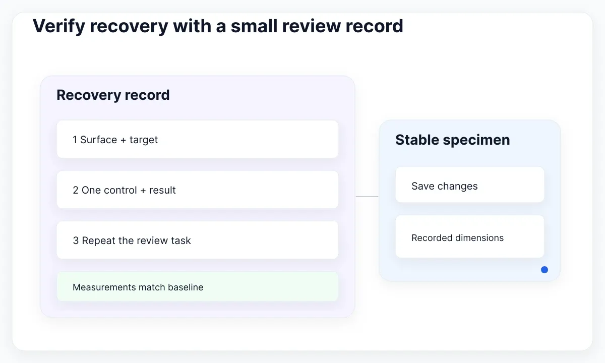
- Record the application, file, page and target frame.
- Identify whether canvas, editor or player is affected.
- Use one explicit control and observe its result.
- Compare the component properties with the baseline.
- Repeat the review task and document remaining differences.
If recovery fails, provide a minimal reproduction with fictional content, expected result and actual result. Include which menu action worked, which input failed, and whether another file shows the same symptom. This evidence helps narrow the issue without inventing a universal fix. Keep the original design intact until you have identified an actual editing requirement.

Pablo Mayoral
Senior UX/UI & Web Designer with 10+ years of experience. Creator of EmviUI (10k+ components Figma design system), UImand, and Vitamin Bootstrap. Currently designing digital products at CQMRewards.