Troubleshoot Variant Properties: State, Size, Icon & Overrides
Diagnose duplicate combinations, lost copy, nested icon bindings and sizing errors with a repeatable instance-level repair workflow.

Start with a fresh instance and change one input at a time. Distinguish duplicate variant tuples from unsupported choices, inspect layer names and bindings, and test sizing separately. Check the repair on existing customized instances before publishing the library update.
To troubleshoot conflicting variant properties, reproduce one failing transition on a fresh instance before editing the library. Compare the property values, the affected layer, and the overrides before and after that change. A duplicate variant combination, an unsupported product choice, an inherited override, and a sizing error require different repairs. Changing several properties together makes those causes harder to distinguish.
This guide follows a fictional export button whose label, size, icon, and loading appearance interact unexpectedly. The diagnostic method also applies to alerts and other nested components. It assumes you already understand how to create variants; use our guide to Figma variants and UI states for the setup. The workflow below is an editorial recommendation built on the linked Figma documentation, rather than a claim that every component fails in the same way.
Capture one failing transition
Make a small diagnostic page containing a fresh instance, a copy with the failing customization, and the expected result. Figma's instance property controls consolidate exposed choices, but an instance can also carry edits to other layer properties. Record both kinds of change; a clean properties panel does not establish that an instance is untouched.
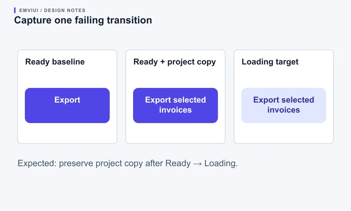
Start with the export button at medium size, ready state, and no icon. Change its label to “Export selected invoices,” enable the leading icon, then switch to loading. Suppose the label returns to generic copy. Repeat the sequence on the fresh instance using only the label edit. If that also fails, icon visibility probably is not the trigger. If it succeeds, add the icon change and repeat. This controlled sequence is more informative than dragging every control until the button looks correct.
Keep a compact record: source component, library file, starting tuple, customization, single action, expected result, actual result. Name the affected layer explicitly. “The Label string resets after Ready → Loading” gives a teammate something reproducible; “variants are broken” does not. Preserve the failing copy while working on another instance so that the evidence survives the repair.
Distinguish a reproducible failure from a one-off customization. A fresh instance that behaves correctly while an older customized instance fails suggests investigating that instance's history. A clean instance that fails repeatedly points you toward the component definition or the proposed configuration. These are diagnostic clues, not automatic proof of a software bug.
Separate duplicate tuples from unsupported choices
A variant tuple is the complete set of variant property values. Figma's variant documentation requires each tuple to be unique. Two visually different variants with identical values can trigger a conflict. Separately, a product may deliberately omit a combination; Figma does not require every theoretical combination to exist.
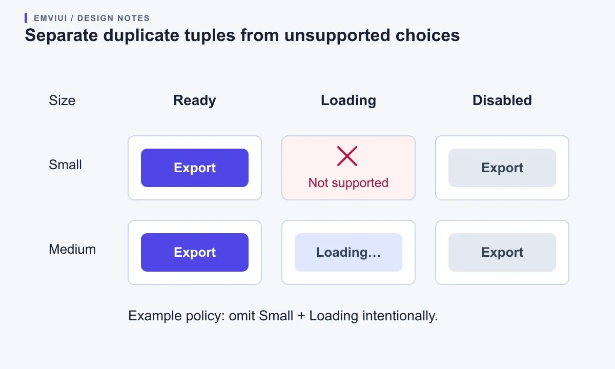
Write the tuples as rows before changing artwork. For example, two rows reading Size=Medium, State=Ready identify a duplicate even if one drawing contains an icon. Decide whether that icon difference belongs to a separate configuration or to an editable content property. Give the variants meaningful distinguishing values, or consolidate the duplicate after checking existing uses. Adding “Version2” merely hides an unclear model.
Now mark the supported choices. Your product may allow ready, loading, and disabled at medium size, but only ready and disabled at small size. Treat “small + loading” as an explicit design decision to resolve, rather than immediately adding another drawing. Ask whether the product actually needs that state, whether the layout can support it, and what implementation should do when it is requested.
Use a repair table with four columns: symptom, evidence, cause being tested, and next action. A duplicate-tuple warning points toward identity values. A valid tuple with incorrect copy points toward bindings or overrides. A missing product combination needs a documented policy. Keeping these cases separate prevents a structural redesign from becoming the default response to an isolated instance problem.
| Symptom | Evidence to collect | Next check |
|---|---|---|
| Duplicate-value warning | Full tuples of both variants | Identity values |
| Copy resets | Fresh-instance transition | Names, hierarchy, text binding |
| Unexpected appearance | Result before and after resetting fill | Local override |
| Narrow layout breaks | Same properties at two parent widths | Sizing relationship |
Trace overrides through matching layers
When switching variants, Figma attempts to preserve overrides using layer names and, for non-text changes, matching original property values. Text preservation also considers similar hierarchy. The override preservation guide describes these conditions. Inspect corresponding layers in the source and target variants before assuming a preserved or lost change is arbitrary.
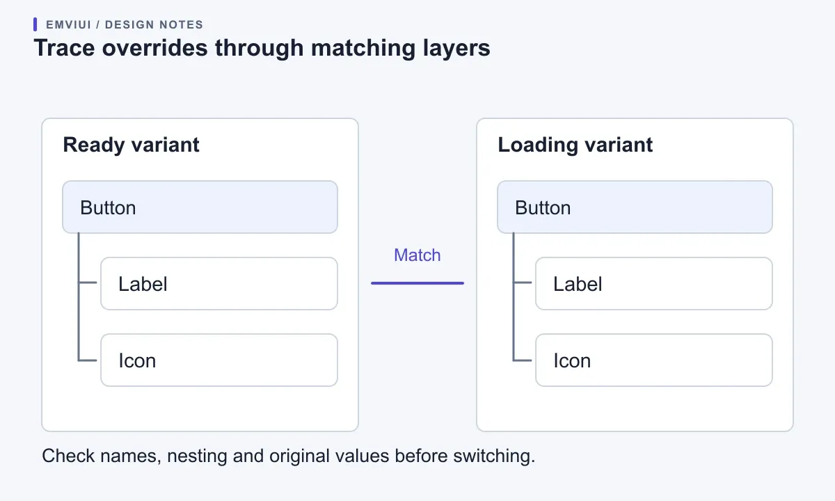
For the export button, compare the actual text layer in Ready with its counterpart in Loading. If one is called Label and the other Caption, test a naming correction on a working copy. If their hierarchy differs, inspect the nesting as well. Do not rename every child in a published set during diagnosis: that would introduce another possible cause while changing existing consumers.
Use a second experiment for appearance overrides. Apply a distinctive temporary fill to a copy, switch variants, and record whether it persists. Compare the original fills of the corresponding layers. A retained customization can be just as troublesome as a discarded one if the target state is supposed to communicate a different appearance. The desired behavior should be written down before you judge the result.
Reset only the property under investigation when possible, then repeat the transition. Keep a separate untouched copy for comparison. If resetting the fill repairs the state, explain that local customization in the diagnosis. A blanket reset may make the component look right while removing useful copy or icons, leaving the team without an explanation of what went wrong.
Inspect nested icons and property bindings
Figma distinguishes text, boolean visibility, instance swap, and variant properties in its component property reference. Use that distinction to inspect the failing control. A property named “Icon” might control visibility, swap the nested asset, or choose a variant; its name alone does not tell you which operation it performs.
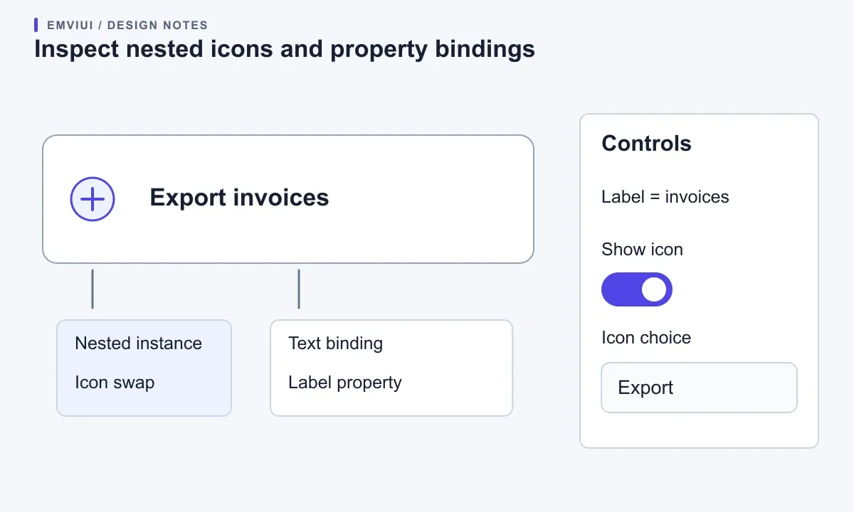
Trace each exposed control to the layer it changes. In the export example, identify the nested icon instance, its visibility binding, and the label's text binding. Toggle icon visibility while leaving the chosen icon unchanged; then swap the icon while leaving visibility unchanged. If only one operation fails, you have narrowed the repair to a particular binding or nested component.
Check whether parent and child controls are competing to describe the same choice. A parent “Status” value and a nested alert's “Tone” value may be independent, or they may represent one decision twice. Write their intended relationship down. If a loading button should always show a progress indicator, decide which component owns that rule and which choices remain available to consumers.
Preferred instance values can make an icon list easier to navigate, but they are suggestions rather than a complete compatibility rule. Figma lets consumers find alternatives beyond the preferred list. Treat the list as guidance, and include a specimen showing the icon dimensions and alignment your family expects. Verify the nested asset itself before changing the whole parent set.
Distinguish resizing from responsive variants
A button that overflows its parent may have a sizing problem even when its variant properties are correct. Figma's Auto Layout guide explains layout and sizing relationships. Diagnose geometry separately from state selection so that a repair to one does not conceal the other.
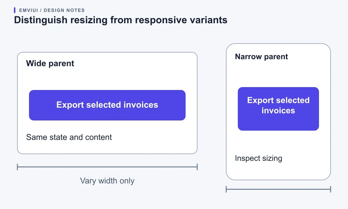
Place the same configured instance in a wide parent and a narrow parent. Keep state, size, icon, and copy constant. Note the first width at which the problem appears, then inspect the parent, button, label, and icon in turn. If only the long label fails, test its resizing behavior before inventing a “mobile loading” variant. Our nested Auto Layout sizing guide develops that geometry check.
Next repeat the original state transition at both widths. This creates two controlled questions: does width alone cause the problem, and does state selection cause it at a stable width? If both are involved, keep both observations in the repair record. Avoid describing the issue as responsive until you know what changes with the parent and what changes with the variant.
A distinct responsive variant is reasonable when the intended composition changes, such as a toolbar becoming a stacked action group. It deserves a specific expectation for copy, icon placement, and transitions. If the component simply needs to grow with content, a new variant may multiply maintenance without addressing the faulty sizing relationship.
Use EmviUI to build a repair specimen
The EmviUI component catalogue lists buttons, inputs, alerts and toasts, and accordions. The asset shown here is an EmviUI alert/toast specimen with multiple visual treatments. It offers a useful reference for discussing which differences are intentional; it does not show a diagnosed Figma error or establish how those controls behave in code.
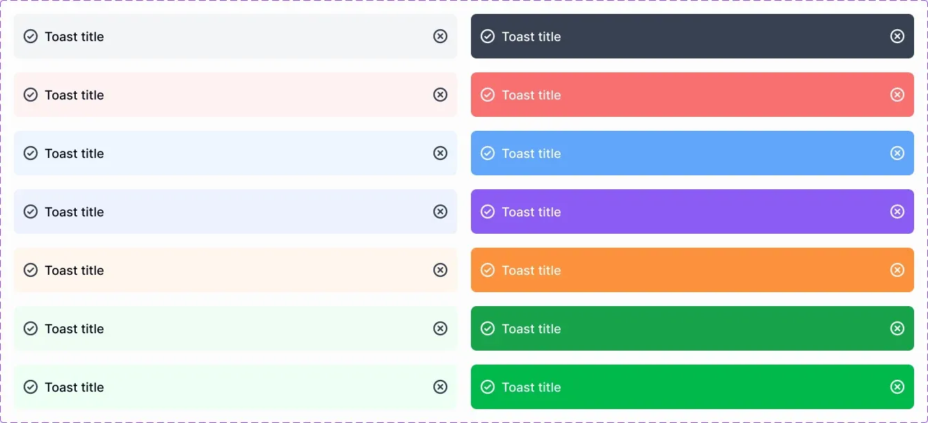
In your working library, build a small review page around the component family you actually use. Put the existing alert treatment beside an instance with project copy and an instance after a tone change. Annotate which parts should change and which should survive. For example, a billing message may need to retain its wording while switching from informational to error treatment. Decide whether the icon also changes with that semantic choice.
Using an existing EmviUI family can give the review a concrete interface starting point. You still need to inspect the actual bindings, supported combinations, and overrides in your file. The kit cannot decide your product's status rules or automatically repair customizations added later. For the boundary between supplied assets and ongoing governance, see UI kit versus design system scope.
Release the fix with a migration check
Validate a repair against existing consumers as well as fresh instances. Figma's component management guidance identifies property removal, layer renaming, and variant restructuring as potential breaking changes. A fresh instance succeeding does not establish that older customized instances will survive the update.
Prepare three acceptance cases: untouched, customized with project copy, and customized with an icon or appearance override. Repeat the exact failing transition and its reverse. Include the narrow layout if width contributed to the problem. Record what should persist and what should change, then check every case against those expectations. A test that only opens the latest variant misses the behavior being repaired.
For shared assets, main component updates must be published to reach other files. Figma's library publishing guide explains reviewing changes and adding a description. Use that description to communicate the observed symptom, the repair, and any consumer action. Confirm the change in a consuming file rather than ending the review at the source library.
Keep an evidence trail for stubborn failures
If the simplified case still fails, keep the smallest component set that reproduces it, the exact transition, and before/after captures. Separate confirmed observations from guesses. “Text resets when changing Ready to Loading in a fresh instance” is evidence; “the icon corrupts the library” is a hypothesis until a controlled test supports it.
Stop broad edits while gathering that evidence. Note the source library version and whether the consumer accepted its update. Give the maintainer a repair acceptance criterion, such as “project copy remains after Ready → Loading → Ready at both tested widths.” This makes the next action concrete even when the root cause needs further investigation.

Pablo Mayoral
Senior UX/UI & Web Designer with 10+ years of experience. Creator of EmviUI (10k+ components Figma design system), UImand, and Vitamin Bootstrap. Currently designing digital products at CQMRewards.