Introduction to Figma UI Kits
Why Figma dominates modern UI design
Figma revolutionizes interface design by combining powerful vector tools, real-time collaboration, and easy sharing-all in the browser. Designers across disciplines love it for its intuitive interface, cloud-based asset management, and version control that plays nicely with developer workflows.
From solo freelance projects to enterprise-level design systems, Figma scales beautifully. Its dual editor and developer handoff features make it an indispensable tool for cross-functional teams working on web, mobile, and desktop products.
What makes a good Figma UI kit?
A high-quality UI kit should offer:
- Consistency: Uniform components ensure brand coherence across all screens.
- Modularity: Components built with flexibility in mind (e.g. variants, auto layouts).
- Scalability: Able to grow with your project-adding new tokens, screens, or design states.
- Developer-readiness: Clean naming conventions, Tailwind-compatible classes, and easy handoff.
EmviUI checks all these boxes-and then some-making it a standout even among premium Figma kits.
What is the purpose of a UI kit?
Speed, scalability, and consistency
A UI kit is essentially a toolbox. It gives you a well-organized library of components that dramatically speeds up your design velocity. No more recreating buttons, forms, or cards from scratch-everything is ready to go, styled, and consistent.
By leveraging styles and variables, you maintain uniform branding, even as projects scale. If your design needs to reflect a new shade of blue or adopt a different font, you simply update the style token-and the entire UI kit adjusts automatically.
Time-saving benefits for teams
Collaborating with developers? UI kits bridge the gap by standardizing visual language. When designers use named styles and component variants, developers receive a clear, style-reference-based design, which avoids ambiguity and accelerates implementation.
With EmviUI, teams often report saving upwards of 100 hours by tapping into its ready-made screens, components, and utility-first design tokens. It's efficiency unlocked.
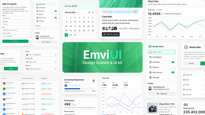
What does a UIKit look like?
Key elements: buttons, typography, grids
Standard UI kit components usually include:
- Buttons, badges, chips, and toggles
- Inputs: text fields, selects, radios, and checkboxes
- Navigation elements: breadcrumbs, navbars, sidebars
- Content blocks: cards, forms, tables, lists
- Utility elements: spacing, shadows, icons
- Typography: font styles and sizes for headings, body, captions
- Layout tools: grid systems, containers, spacing tokens
EmviUI includes all of these and many more, configured to be responsive and visually flexible.
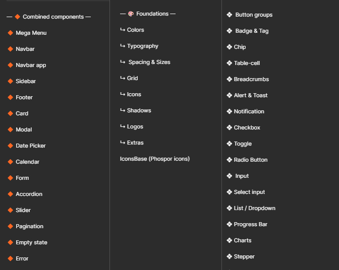
Example from EmviUI's structure
With EmviUI, you get:
- 10,000+ component variants - from UI elements like buttons and tables to surfacing dark mode states.
- 100+ prebuilt screens - such as dashboards, contact pages, pricing layouts, blog boards, and testimonials.
- Fully editable color styles with dark mode toggles, based on TailwindCSS palette.
- Typography systems, aligned with TailwindCSS, for headings, body, captions, labels.
- Spacing tokens that respect scale and alignment across screens.
How to access UI kits in Figma?
Using Figma Community
The Community tab in Figma is your launchpad. Search for "UI kit", explore previews, and duplicate any resource into your own workspace. From there, you can edit, experiment, or fork it as needed.
Installing and duplicating UI kits
To integrate a UI kit:
- Open the Figma Community item,
- Click "Duplicate" or "Open in Figma",
- Move it into your working design system file or team library,
- Use served components, create overrides, or merge into your existing design file.
EmviUI offers both a free version for new users and a premium version for advanced workflows - both easy to duplicate and explore.
Start with EmviUI Free Kit
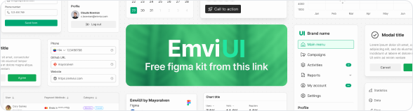
If you're new to UI kits or testing workflows, the free EmviUI version provides a stripped-down yet powerful experience: editable variables, a solid core component library, and prebuilt screens ready to customize.
What is the most popular Figma UI kit?
Community favorites vs professional-grade kits
The Figma Community is brimming with free kits-landing pages, mobile UI packs, wireframe sets. They're great for inspiration and lightweight prototyping, but many lack organization, scalability, and developer orientation.
Why EmviUI stands out in 2025
EmviUI is tailored for professional workflows:
- Built with TailwindCSS architecture - easy to translate into code.
- Fully editable - you can change colors, fonts, and layouts seamlessly.
- Comprehensive structure - design tokens, dark mode, spacing scales, and responsive variants.
- Designed for teams - easy to onboard, easy to extend, and aligns with developer needs.
Is the UIKit still used?
Evolution from UI kits to design systems
Yes-and not just surviving, but thriving. While classic UI kits were static spreadsheets of visual elements, modern design systems (including EmviUI) layer on logic: responsive behaviors, theming, tokens, and documentation.
Role of modern kits like EmviUI
EmviUI isn't just a kit-it's a fully-fledged design system. It provides:
- Interactive components: modals, alerts, carousels, navigation states.
- Dark mode support with one-click toggle and variables.
- High-level organization that keeps even large-scale projects maintainable and consistent.
What is the difference between UI kit and design kit?
Components vs systems
A UI kit is about reusable visual pieces. A design system wraps that with logic, documentation, and consistency rules-like when to use a button variant, how spacing scales across screen sizes, or which colors are accessible.
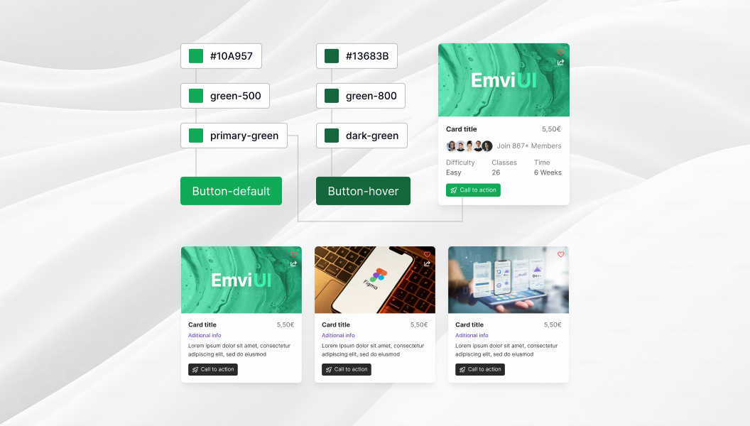
Design tokens, variables, and responsiveness
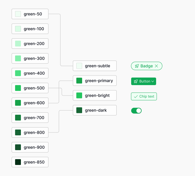
Design tokens are the values that power your UI: color hex codes, font sizes, spacing scale, border radii, shadows, etc. EmviUI has over 150 local variables covering dark mode, responsive states, and utility-first styles-meaning a single change ripples intelligently through your entire design file.
Why EmviUI is the Best Figma UI Kit for 2025
Here's why EmviUI consistently ranks among the most loved kits:
- TailwindCSS-aligned - perfect for developers working with modern frontend frameworks.
- Powerful component library - 10,000+ variants means rarely needing to create from scratch.
- Rich screen inventory - everything from contact pages to dashboards is ready out of the box.
- Built for adaptability - easy theme changes, style updates, and token control.
- Scalable design system - grows with your project, not against it.
Explore Key Components in EmviUI
Let's highlight some standouts:
- Buttons - primary, secondary, icon buttons, with hover and active states.
- Cards - content modules perfect for dashboards, product listings, and blog previews.
- Tables - responsive, styled, and customizable.
- Dashboard Screens - prebuilt admin panels that you can tailor instantly.
- Contact Screens - forms, maps, and layout variations for outreach pages.
How EmviUI Saves 100+ Hours of Design Work
By giving you essential building blocks, you can focus on user experience, not basic implementation. Need a sign-up form with validation states? EmviUI has variants. Want a responsive layout for mobile-first? EmviUI includes components that auto-adjust.
Plus, global editing means no endless hunt for layers-change one token, and every dependent component updates. That's real time saved.

Design Tokens & TailwindCSS Variables in EmviUI
Design tokens are the invisible glue holding your UI together. EmviUI offers:
- 150+ editable variables for color, font, spacing, border-radius, and shadows.
- Dark mode switching done in one click-no manual overrides.
- Responsive token sets that map to Tailwind units, making design-to-code handoff seamless.
This level of integration enables quick theming, branding, and maintenance through controlled variables, not manual adjustments.
Real-World Use Cases for Figma UI Kits
Here are some scenarios where UI kits like EmviUI shine:
- SaaS dashboards - control panels with data cards, stats, charts, sidebars.
- Landing pages & marketing sites - hero sections, testimonials, feature grids built and styled instantly.
- Internal tools - admin lists, forms, tables, and user interfaces that speed onboarding and reduce iterative overhead.
- Agile prototyping - designers working with devs can iterate in-sync because the design library mirrors code structure.
Conclusion: Start Designing Smarter with EmviUI
A Figma UI kit is more than a convenience-it's a workflow revolution. With EmviUI, you're not just adopting a set of components; you're embracing a design system built to scale, collaborate, and evolve with your projects.
Ready to transform your design process? Download the free kit now or upgrade to full access and unlock the full EmviUI experience.
Frequently Asked Questions (FAQs)
What exactly is a UI kit in Figma?
A UI kit in Figma is a prebuilt collection of design elements-like buttons, inputs, cards, and typography-organized into reusable components. It speeds up design by providing a structured library you can customize and scale.
How is a UI kit different from a design system?
A UI kit focuses on the visual building blocks, while a design system includes those blocks plus rules, tokens, documentation, and behaviors for consistent, scalable interface design. EmviUI combines both to offer maximum flexibility.
Why choose EmviUI over other Figma UI kits?
EmviUI is TailwindCSS-aligned, highly editable, and rich with 10,000+ component variants, 100+ screens, and hundreds of tokens. It's designed for both designers and developers working on modern product workflows.
Can I use EmviUI for client or commercial projects?
Yes-EmviUI's licensing supports both personal and commercial use. Visit the pricing page for full terms and options.
Is there a learning curve for EmviUI?
If you're already familiar with Figma, EmviUI will feel intuitive. Its components are clearly named, organized, and styled-making it easy to get started and adapt quickly.
Does EmviUI support dark mode?
Absolutely! EmviUI includes editable dark mode variables-switching themes is just a click away, with no manual restyling needed.
How often is EmviUI updated?
EmviUI is regularly updated with new components, screen templates, and variable enhancements. Check the blog for the latest release notes and design insights.
Do I need TailwindCSS to use EmviUI?
No-you can use EmviUI entirely within Figma. However, its Tailwind alignment makes it incredibly smooth to translate designs into Tailwind-based front-end projects.