How to Change Background Color in Figma
Choose the right Figma surface—canvas, frame, or layer—and change its color without confusing workspace settings with exported UI.

Deselect layers and edit Page properties to change the shared canvas background. Select a frame and edit Fill to change a screen background. A text layer fill changes glyphs; use a containing frame or shape for a surface behind text.
To change the background color of the Figma canvas, deselect every layer, open the Page section in the right properties panel, choose its color fill, and enter a color. To change the background behind a screen or card, select that frame and edit its Fill instead. If you select a text layer, its fill changes the text itself; place the text inside a frame when you need a colored area behind it. This distinction—canvas, frame, and layer fill—solves most “figma how to change background color” confusion.
The canvas is the workspace surrounding designs. A frame is a bounded screen or container. A layer fill belongs to a selected object. They can look like one background in a screenshot, but each has a different job, sharing behavior, and export result. First decide which surface you mean, then change the corresponding property. For a website or app, choose a deliberate frame background and test the foreground contrast; changing the canvas color is usually an editor preference, not part of the exported interface.
Tell the canvas apart from a frame and a layer
Think in three levels. The canvas is the page’s work surface behind all frames, groups, and layers. The frame is an object with bounds that can represent a page, device viewport, panel, or card. A layer—such as a rectangle, icon, or text object—can have one or more fills of its own. The same hue can be used at each level, but changing one level does not automatically change the others.
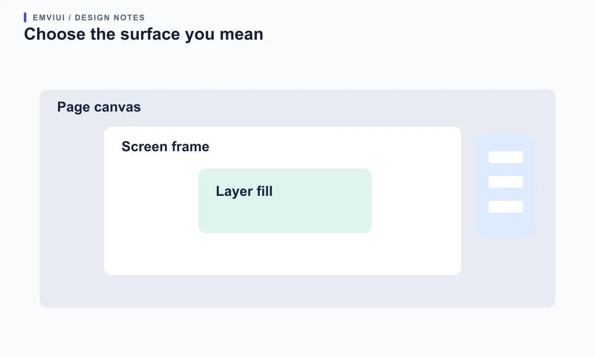
This difference matters when preparing an interface screenshot. A pale canvas may make the composition easier to inspect, yet it does not necessarily mean the website itself has a pale background. A frame fill is part of the design boundary and is included when that frame is exported. A text fill colors glyphs, not the empty space around them. The official Figma guide to fills describes layer fills as properties applied to the inside of a layer, including frames, shapes, and text; the canvas background is configured separately at page level.
Use the Layers panel as a quick diagnostic. If the selected row is a top-level screen frame, edit that frame’s Fill. If it is a card rectangle, edit the card. If nothing is selected, the right panel can show page properties, including canvas background. If the panel shows text properties, you have selected text. Naming frames and keeping a sensible hierarchy makes this distinction easier for collaborators, especially in files with many nested components.
Change the page canvas background
To change the canvas background, first exit object selection: click an empty part of the canvas or press Escape until no layer is selected. In the right properties panel, find the Page section and click the background color swatch. Choose a color in the picker or enter a HEX value when you need a precise one. Figma’s official canvas guide says the initial background follows the light or dark theme and that newly created pages inherit the current page’s canvas background.
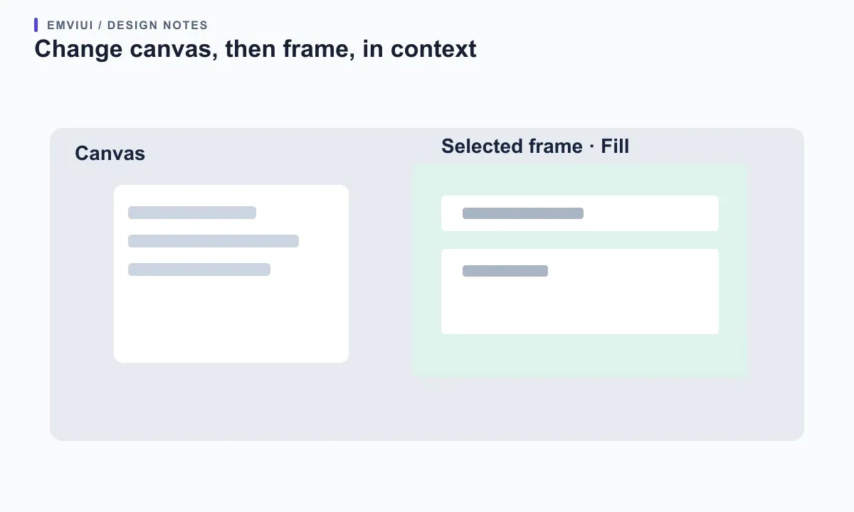
That page-level change affects everyone with access to the file, so treat it as a shared workspace setting rather than a private viewing preference. It is useful when a team needs to inspect light artwork against a darker surface, distinguish pages visually, or present a file in a deliberate editor theme. If you only want a temporary personal appearance adjustment, use Figma’s light/dark interface theme instead of changing the shared page color.
The canvas background can have opacity adjusted or be hidden using the visibility control described in Figma’s help article. It cannot be changed while in Dev Mode, according to that same documentation. If the Page section is missing, check that you are in a design file, have edit access, are not in Dev Mode, and have fully deselected layers. Do not add a large rectangle behind all frames just to imitate a canvas color unless the rectangle is genuinely part of the artwork you plan to export.
Change the background of a frame or screen
Select the frame from the canvas or Layers panel, then use the Fill section in the right panel. Click the swatch to open the color picker, select a solid color, and enter a HEX value when the design needs an exact color. You can also add another fill, adjust its opacity, change its order, or hide it. Figma’s frame documentation describes fill as a frame property, alongside corners, clipping, layout guides, strokes, and effects.
For a web page mockup, the top-level desktop or mobile frame is often the right background target. For a card, select the card’s own frame or shape. Nested frames can each have backgrounds: a white card can sit on a gray page, while an inset input has its own neutral surface. This layered structure resembles CSS containers and backgrounds, but it is only a design representation; it does not automatically create production CSS or guarantee that the implemented surface uses the same values.
If a frame’s fill appears not to change, confirm the selected object is actually a frame rather than a group. A group does not behave exactly like a frame and may need a rectangle or frame added behind its children. Also check whether the fill is hidden, transparent, or covered by a child layer. A frame with Clip content turned on may hide child layers that extend beyond its bounds, but clipping is separate from the fill color itself.
Use a color variable or style for repeated surfaces
For one experiment, a direct color value is fine. For a product interface with repeated surfaces, apply a color variable or style so the same design decision stays consistent. Select the frame or layer, open the Fill swatch, and choose the relevant variable or style from the Libraries picker. Figma’s documentation says color variables can be applied to solid fills, gradient stops, stroke colors, and color styles. Its variables overview describes modes for context-dependent values, including light and dark themes.
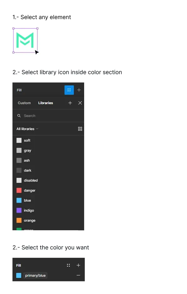
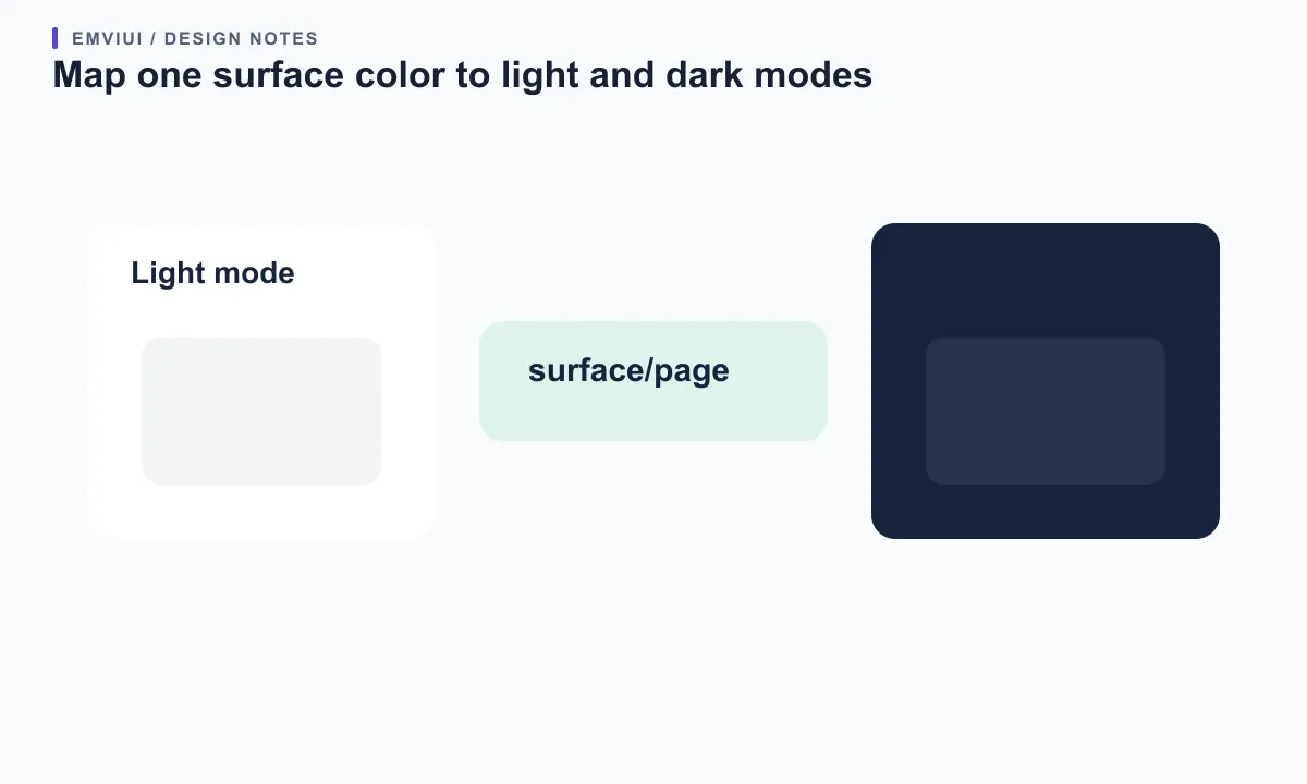
Prefer names that describe purpose, such as surface/page, surface/card, or surface/inverse, instead of names tied only to a color like “pale blue.” A semantic name explains why the value exists. In a light/dark collection, a page surface token can map to near-white in one mode and a deep neutral in another. Apply the variable to the frame, then test both modes and confirm text, borders, icons, and focus indicators remain visible.
Variables and styles solve related but different needs. A variable stores a single reusable value per mode, while a style can group a combination of properties such as several fills or a gradient. Figma’s guide to the difference explains that modes are supported by variables and that styles can retain composite fill properties. If the background uses a complex gradient or image treatment, a style may be the more faithful reusable choice; use a variable when the core decision is a semantic color value that needs mode switching.
Choose the right fill type for the surface
Figma fills are not limited to flat colors. The official fills guide lists solid, gradient, pattern, image, and video fills. A solid fill is usually the clearest choice for page and card surfaces. Gradients can add depth or brand expression, but keep text readable across the entire blend. Images can make a hero or media panel, but they introduce crop, focal point, and contrast decisions. Patterns work best when they remain subtle enough not to compete with content.
Multiple fills can be stacked and reordered. That can support a tint over an image, an overlay, or a layered visual treatment, but it also makes a simple color edit less obvious. Expand the Fill list and check every entry. A fill can be hidden or partially transparent, so the visible result may come from a lower fill or the canvas behind a transparent area. Change one property at a time and inspect the stack rather than adding a second fill to compensate for a misunderstood first one.
When a layer has no fill, adding one from the Fill section creates the default solid fill. On text, however, adding a fill changes the color of the text characters. To put a colored panel behind text, use a frame with padding or place the text over a separate shape. In a design system, keep decorative imagery, surface color, and text color as separate decisions. That makes responsive layouts, content changes, and accessibility reviews easier.
Check contrast and preserve readable content
A background color is never only decorative when text or controls sit on top of it. Check the foreground/background pair after every change, including hover, disabled, selected, and dark-mode states. Figma’s color picker includes a contrast check, as described in its official help documentation; use it as a quick review aid, then evaluate the actual text size, weight, and surrounding states. A single contrast score does not assess hierarchy, meaning, focus visibility, or whether information is communicated by color alone.
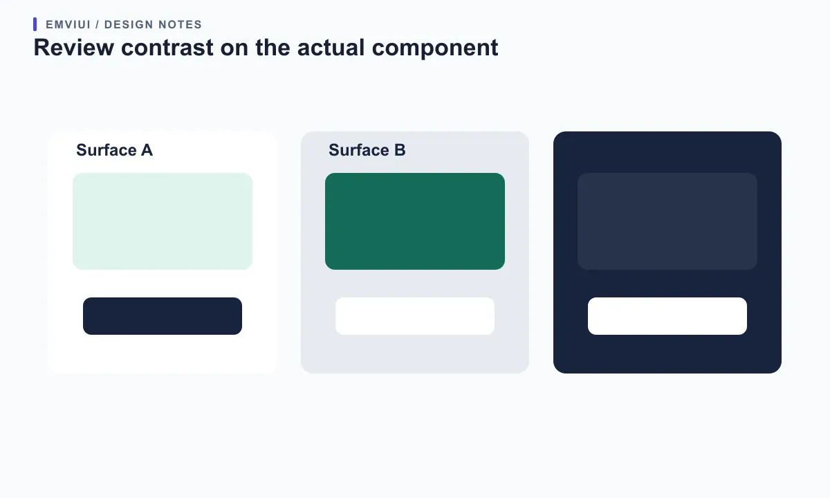
For body text, make sure the combination remains readable at normal zoom and when enlarged. For buttons, verify both the label and the boundary or focus indicator when the component requires one. A saturated brand color may work well for a small accent but fail as a large background for small white text. Adjust the surface, foreground, or both rather than assuming a brand color is automatically accessible because it appears in a palette.
Test realistic content, not only placeholder headings. Long text blocks reveal whether a subtle background becomes tiring; translated labels may change line wrapping; and translucent fills can look different over varied images. If using a variable, test its alternate modes. If using an image or gradient, inspect the lightest and darkest regions behind text. Document which combinations are approved in the design system so contributors do not have to rediscover them for every screen.
Fix common background color problems
If the entire workspace changed but your design did not, you probably changed the canvas rather than a frame. Select the frame and update its Fill. If only the text changed, you edited a text fill; create or select a containing frame for the surface. If the color looks correct on canvas but disappears in a PNG, verify that you are exporting the frame you intended and that the color is part of the frame or a visible child layer, not merely the page canvas.
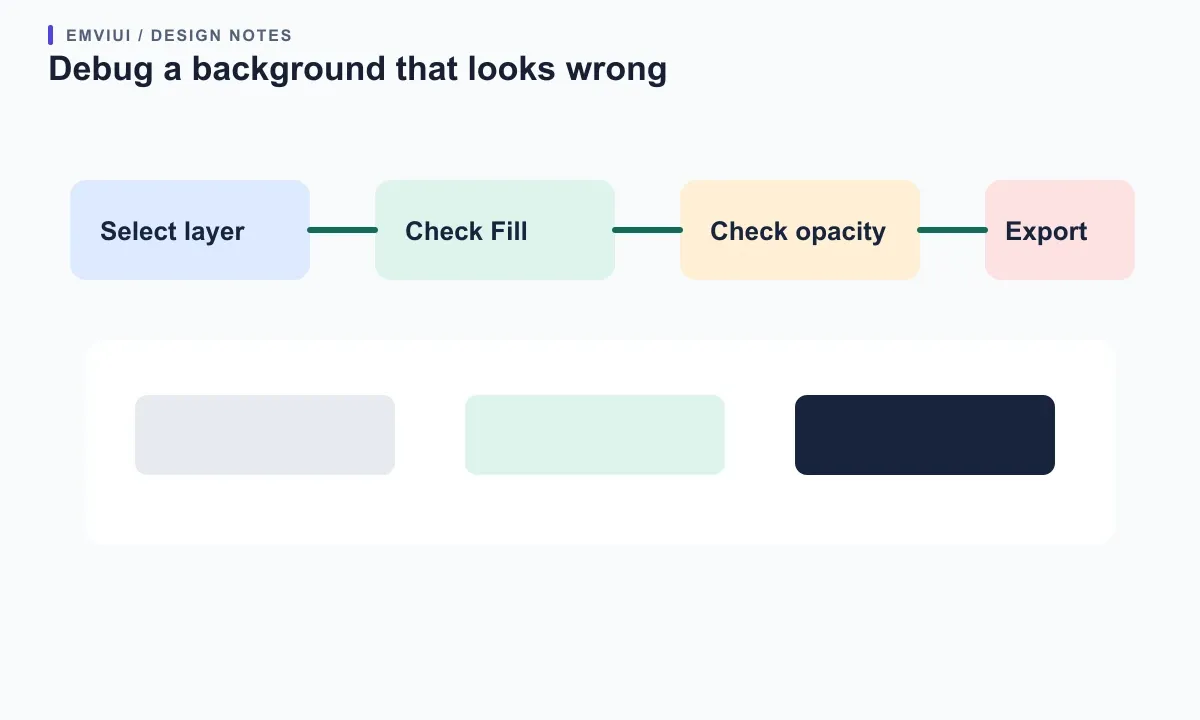
If the picker shows a value but the layer looks different, inspect fill opacity, visibility, blend mode, and stacking order. A semi-transparent fill blends with the layers below it. A blend mode can alter the apparent result against different backgrounds. A variable may resolve differently in another mode or may be linked to a library value. Check whether the swatch is a direct color, variable, or style, then inspect its source before overriding it.
If you cannot edit the color, verify your permission level and mode. Figma’s canvas guide requires edit access and notes that the canvas background cannot be changed in Dev Mode; the fills guide likewise says applying fills requires edit access. If the color controls are missing, deselect, leave Dev Mode if appropriate, and select the intended layer. Keep a clear distinction between a file permission problem and a selection problem, because the fixes differ.
Make a background decision your team can reuse
For a single screen, select the exact surface you want to change and use the corresponding property: Page for canvas, Fill for frame or shape, and text Fill for glyph color. For a shared product interface, make repeated surface colors semantic variables or styles and test each mode. Before handoff, name the relevant layers, record whether a value is a token or one-off, check contrast, and confirm the exported frame shows the intended surface.
EmviUI’s color and interface examples can help teams discuss the difference between a palette, a reusable semantic surface, and a finished component. They are reference material for design decisions; they do not change your Figma file or generate implementation code. Pair a visual kit with documented variables and component states so a developer can see not only “which blue” but where it belongs and how the interface should behave across themes.
For the next step, read what design tokens mean in web design and the Figma workflow for responsive web design. For Spanish readers, see what design tokens mean in web design and the Figma workflow for responsive web design. Figma’s primary references are its guides to canvas background color, fills, frames, applying variables, and the color picker and contrast check.

Pablo Mayoral
Senior UX/UI & Web Designer with 10+ years of experience. Creator of EmviUI (10k+ components Figma design system), UImand, and Vitamin Bootstrap. Currently designing digital products at CQMRewards.