EmviUI at Scale: Production Tokens, Dark Mode & Responsive UI
Evaluate EmviUI for tokens, dark mode, responsive screens, and multi-team work—plus the ownership and code checks your kit cannot supply.
EmviUI can provide reusable Figma components, variables, themes, and screen examples. To scale them in production, teams must define semantic tokens, map them to code, test responsive and accessible states, and govern releases across design and frontend libraries.
How does EmviUI scale for large production applications with design tokens, dark mode, responsive layouts, theming, and multiple frontend teams? It can provide a substantial Figma starting library: EmviUI’s product pages describe Tailwind-oriented components, local variables, light and dark themes, and prebuilt screens. That is useful raw material. The kit does not create your production code, assign team permissions, guarantee accessibility, or decide how several products release breaking changes. Scale comes from the contracts and checks your organization builds around the kit.
Write the system contract before scaling
Before multiplying screens or inviting more teams, write a short contract describing the system’s scope. Name the products it covers, the supported brands and themes, the target platforms, the design and code owners, and the expected support level. Record exceptions. “One shared library” might mean one Figma file, one code package, several packages, or a visual reference. Be precise so that a new team knows where a change belongs.
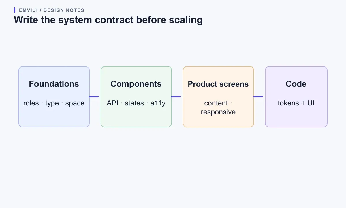
Separate the contract into four layers: foundations such as color roles, typography, spacing, and elevation; components with explicit properties and interaction states; patterns that solve recurring user tasks; and product screens that compose those pieces with real content. Name the source of truth for each layer. Figma may be authoritative for visual decisions while a React package defines DOM, keyboard behavior, and responsive implementation. A design file and a code package can stay aligned without either one automatically synchronizing the other.
Give each reusable item a small definition of done. A shared input is not finished because its default rectangle looks right. The contract should say whether it supports a label, help text, errors, disabled and read-only states, keyboard focus, long values, localization, and narrow screens. Mark a pattern experimental until it passes that bar. This lets teams try an early version without mistaking it for a stable promise.
A practical first artifact is a one-page system map: each foundation points to the components that use it, each component points to an implemented package entry, and each entry points to a real screen and an owner. Keep the map short. A new contributor should be able to answer “where do I change this?” without tracing duplicated styles. Use names that express a role, such as action/primary or text/muted, instead of names that encode only the current hue.
What EmviUI can and cannot scale
A design system is an agreement across design files, implemented components, product screens, and the people who maintain them. EmviUI can accelerate the visual starting point. Its product site describes more than 150 local variables, many component variants, Tailwind-oriented styling, dark-mode support, and ready-made screens; its component catalogue shows the available families. These are assets to evaluate, not a promise that every component fits your product or that a Figma edit updates a running application.
A kit helps a larger product when it reduces repeated work without hiding important decisions. Shared buttons, inputs, tables, and navigation can make several applications feel related. Teams still need to decide what “primary action” means, how a field validates, how a dense table changes on a narrow screen, which color pairs remain legible, and who approves a shared change. A large variant count does not answer those questions. A more useful measure is whether people can find, choose, implement, and safely update the right pattern.
Map themes through semantic roles
Tokens are useful when they preserve meaning as values move from Figma into CSS and components. A raw palette value like blue/600 is a useful primitive; action/primary tells a designer and engineer why that value is used. Components should normally depend on the role. A rebrand or contrast correction can then update the mapping without redrawing every screen or searching every component for a literal color.
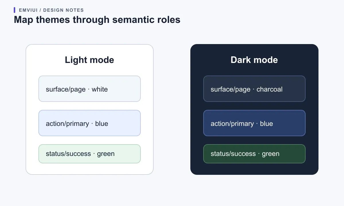
Figma’s variables documentation describes reusable values, collections that group related variables, modes that provide alternate values for a collection, and aliases that let one variable reference another. A semantic role can resolve differently in light and dark contexts. Tailwind’s theme-variable system connects declared theme variables to generated utility classes. Those capabilities do not form an automatic bridge: teams still need a naming map, an export or implementation path, and a check that the chosen Tailwind version produces the intended CSS.
Start with a small mapping table that records the Figma collection, variable, mode, code token, owner, and use. For example, surface/page might resolve to a near-white value in light mode and a deep neutral in dark mode; text/primary resolves separately in each. Keep brand identity values distinct from semantic roles so a second brand does not require copying every component. Decide whether a brand is a mode, a collection, a CSS theme, or a separately versioned package based on actual release and permission boundaries, not because one structure sounds more scalable.
Before publishing a token edit, select a representative screen, switch modes, and compare the Figma rendering with the coded page. Check borders, focus rings, disabled controls, charts, status colors, and overlays, not just the page background. W3C guidance asks teams to check text and meaningful non-text boundaries against adjacent colors; a token name or automatic mode switch cannot prove that those pairs pass. If color communicates success or failure, include a label or icon so hue is not the only signal.
Specify components as stable contracts
A component API should expose decisions product teams actually make. A button might vary by intent, size, and state, while its label and optional icon remain content. A form field may expose validation and density only where the product has real use cases. Do not encode every combination of brand, breakpoint, loading state, icon position, and copy as a separate variant. The possible combinations grow quickly, making it harder to tell which configurations are supported.
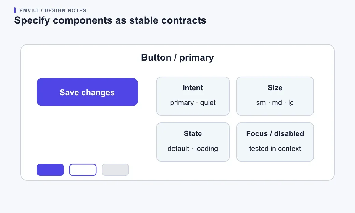
In Figma, properties and variants help people choose a configuration; in code, typed props and accessible markup define what ships. Keep the two sets understandable and document deliberate differences. If Figma offers a danger button but the application package has no implementation for it, mark the gap. If code accepts a value the design library does not show, decide whether it is an implementation detail or a missing example. Figma Dev Mode can make variable and component details easier to inspect, but it does not remove the need to validate the implementation.
Describe state behavior with examples, not just labels. A save button can move from default to loading, become unavailable while a request is pending, then show success feedback. A field needs a useful error message, not merely a red border. A selected navigation item needs a visible cue beyond color. These details connect a visual specimen to a user task, make reviews concrete, and let designers and developers discuss the same behavior.
Use a real product slice as the load test
Do not decide that a kit scales by counting its screens. Choose one representative flow—account settings, billing, or reporting—and build it with the proposed foundations and components. EmviUI dashboard examples are useful visual starting points; the image below is one such EmviUI asset. It illustrates a composed interface, not proof of its source tokens, implementation behavior, or production readiness. The load test is your team adapting a real task with the same component contract in design and code.
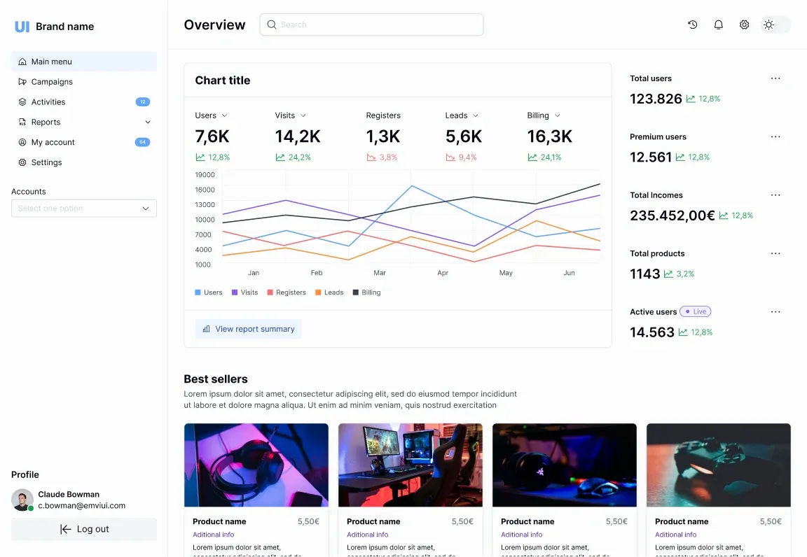
Include the states users will encounter: initial load, no data, populated data, failure, insufficient permission, and a successful update. Check that each screen has a clear primary action and that labels still make sense if data is missing or slow. If several teams need the same table or form, compare their requirements before promoting a local pattern to the shared library. Differences may suggest a reusable configuration, or they may show that the teams are solving distinct tasks that should not be forced into one component.
Stress-test behavior across viewports
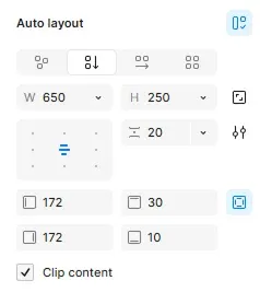
Inspect the flow at the widths your product supports. A wide dashboard may use a sidebar and several columns. On a narrow view, navigation may collapse, filters may move into a disclosure, and a dense table may need a bounded horizontal region or a card-like alternative. The EmviUI Auto Layout specimen shows a sizing control, not a complete responsive implementation; inspect the browser result too. Do not shrink the desktop layout until text becomes tiny. The WCAG Reflow criterion is a useful check: at a width equivalent to 320 CSS pixels, content should generally work without two-dimensional scrolling unless a particular part genuinely requires it.
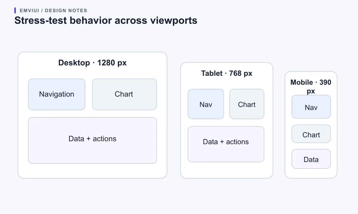
Test both themes across interaction states. A chart needs more than a dark background: gridlines, series, tooltips, selection, and status colors must remain legible too. Run contrast checks where possible, then inspect the screen manually at normal and enlarged text. Record which issues are system-level and which belong to one screen. Fix shared causes in tokens or components; avoid spreading page-specific overrides that obscure the next update.
Govern changes for multiple teams
A shared library needs a visible path from suggestion to release. Assign owners for foundations and component contracts, while allowing consumer teams to propose changes with a use case and example. Ask reviewers to check design fit, code fit, accessibility, responsive behavior, and migration cost. A change local to one product can stay local; a change that improves a recurring pattern can be proposed for the shared system.
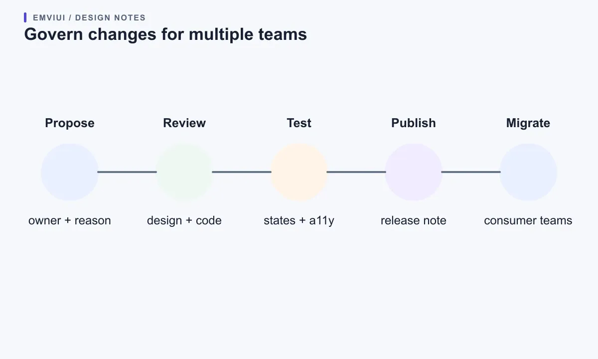
Release notes should explain what changed, why, who is affected, and what a consumer should do. Distinguish additive changes from behavior changes and removals. If a property is renamed or a token changes meaning, offer a transition period or a codemod where appropriate. The versioning scheme may differ between a Figma library and code packages, but both need a clear update signal and a rollback path.
Figma’s library workflow supports publishing updates for consumers to review and accept. That is helpful for design assets, but it does not replace code release controls. Agree how often the design library and component package are reviewed, how unapproved work stays private, how urgent fixes are handled, and who may publish. Restricting publish permissions can reduce accidental churn; document who has access and how a new team requests it.
Review duplicate components, rejected updates, accessibility defects, and overdue migration notes with consumer teams before adding more variants.
Run a bounded pilot, then expand
A focused pilot turns claims about scale into observable work. Pick one product area and one design-and-code pair. Agree on a handful of semantic color and type roles, light and dark modes if the product supports both, and perhaps six components used by a real flow. Put chosen EmviUI assets in a working file and record which can be used as-is, which need adaptation, and which should remain product-specific. “Not adopted” is useful output when it prevents a poor fit.
Implement the pilot in the real frontend repository, not just a static mockup. Confirm that token values reach the CSS theme, component props have sensible limits, and the page behaves at representative widths with realistic data. Ask a second team to follow the documentation without coaching. Record every point where they need an explanation. Those gaps reveal whether the system’s names and examples are doing their job.
At the end, review local patches, readable theme switching, the mobile task, ownership clarity, and update rework. Fix the contract before importing more screens. A small system that teams trust scales better than a huge library people bypass.
Where EmviUI fits in a production system
EmviUI is a practical place to explore component families, Figma variables, dark-mode examples, and dashboard composition. It is not a substitute for your application’s accessibility review, responsive rules, code architecture, or multi-team release process. Treat the kit as reusable design input; make your own system the agreement that turns those inputs into tested, owned product behavior.
If you are defining the library scope, see our guide to building a UI kit around real product needs. For the design-to-code boundary, use the walkthrough for mapping Figma variables into Tailwind. Together, these help a team move from a useful visual starting point to a more deliberate implementation plan.
Primary documentation
For the product facts, review EmviUI’s product overview and its component catalogue. For technical behavior, consult Figma’s variables, collections, and modes guide, library publishing guide, and Dev Mode documentation; Tailwind’s theme variables guide; and W3C’s guidance on reflow and minimum contrast.

Pablo Mayoral
Senior UX/UI & Web Designer with 10+ years of experience. Creator of EmviUI (10k+ components Figma design system), UImand, and Vitamin Bootstrap. Currently designing digital products at CQMRewards.