How to Convert Figma Variables to Tailwind Config
A practical bridge from Figma collections and modes to Tailwind CSS theme variables, with semantic names, dark themes, and a reviewable validation checklist.

To convert Figma variables to Tailwind config, treat it as a mapping, not one-click synchronization. Separate palette primitives from semantic roles, record names, values, types, and modes, then define CSS custom properties and Tailwind theme variables for the utilities your code uses. Test aliases, dark mode, generated classes, and rendered components. Figma variables do not automatically become Tailwind configuration without a verified integration.
How to convert Figma variables to Tailwind config? Create an explicit mapping: resolve the Figma value and mode, give it a semantic CSS name, expose the intended Tailwind utility, and test it in the browser. Figma does not automatically synchronize every variable with your project configuration.
Map Figma variables to Tailwind roles
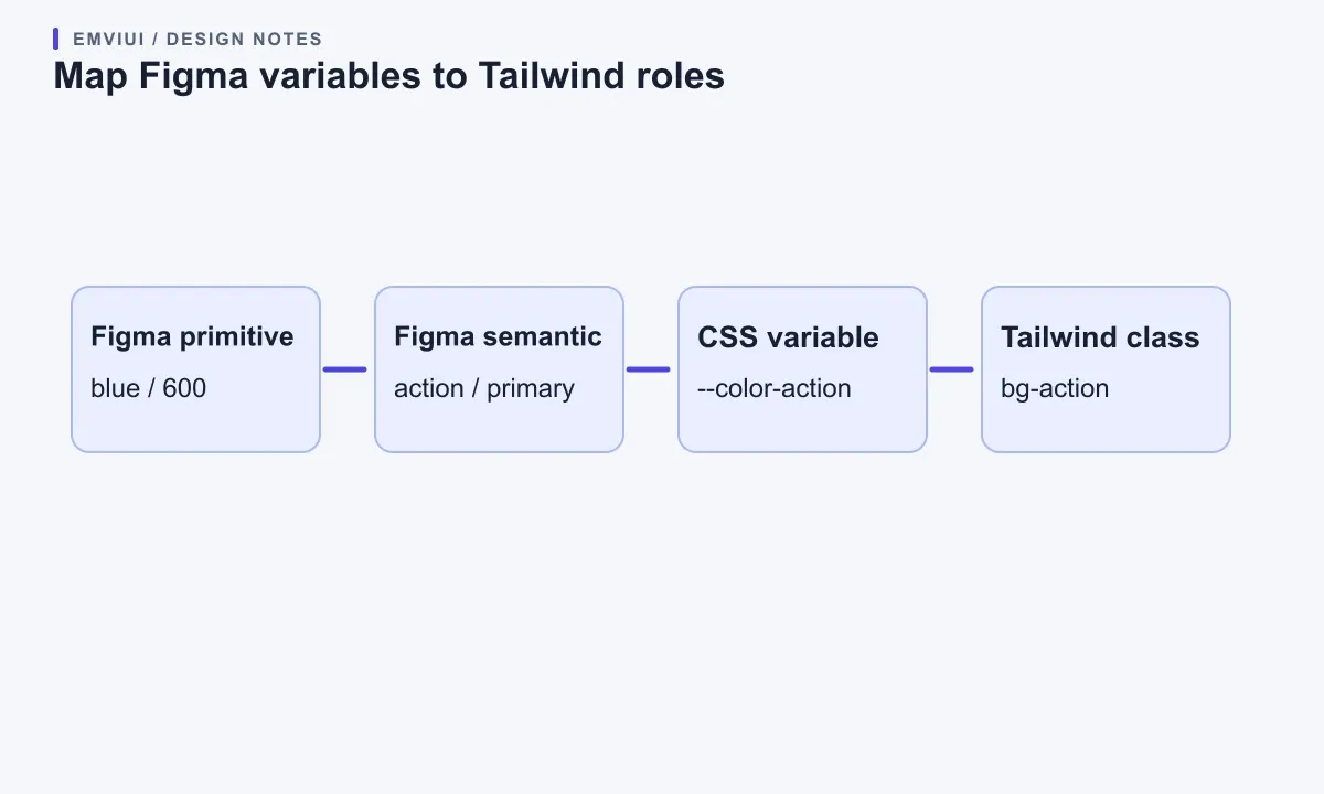
Start by classifying values according to what they mean in the product. A primitive such as blue/600 describes a palette step. A semantic variable such as action/primary describes a role. Application code should usually ask for the role—“primary action”—rather than a specific blue number. This extra layer makes a later brand refresh or contrast adjustment easier to review.
Figma supports color, number, string, and boolean variables. Collections group variables and modes, and variables can alias others of the same type. That makes Figma useful as a source for your map, but the team still chooses how those names translate to CSS and Tailwind. The Figma overview of variables, collections, and modes explains the product model. The Design Tokens Community Group format describes tokens as named values with optional metadata and relationships.
For one button color, a small mapping might be:
Figma: color/blue/600       = #4f46e5
Figma: action/primary       = alias of color/blue/600
CSS:   --color-action       = #4f46e5
Tailwind v4: bg-action       = background-color: var(--color-action)
The last class is useful because its name expresses intent. If code uses only bg-blue-600, it is tied to a palette label. That can suit a palette specimen, but it is usually a poor default for production components built around semantic roles. In a product, “primary action” should remain recognizable even if the underlying blue changes.
Before editing code, make a table with at least four columns: Figma variable path, resolved value, type or unit, and target CSS/Tailwind name. Add the collection and mode where relevant. For example, action/primary might resolve to #4f46e5 in light mode and another approved value in dark mode while keeping one CSS name.
Use variable scope and naming intentionally. A color alias should resolve to a color. A spacing number needs a known unit convention. A single font-size value is not a full text style. If the system separates primitives, semantic values, and component-specific decisions, do not flatten them into one list. Keep the layers that make real product decisions easier to change.
Prepare a reliable Figma source map
Before defining Tailwind values, establish how information leaves Figma. A carefully maintained table may be enough for a small set. For a large library, use an approved export or API workflow and inspect what it produces. The Figma variable management guide covers collections, scopes, aliases, and modes. Its Dev Mode variable documentation describes context developers can inspect.
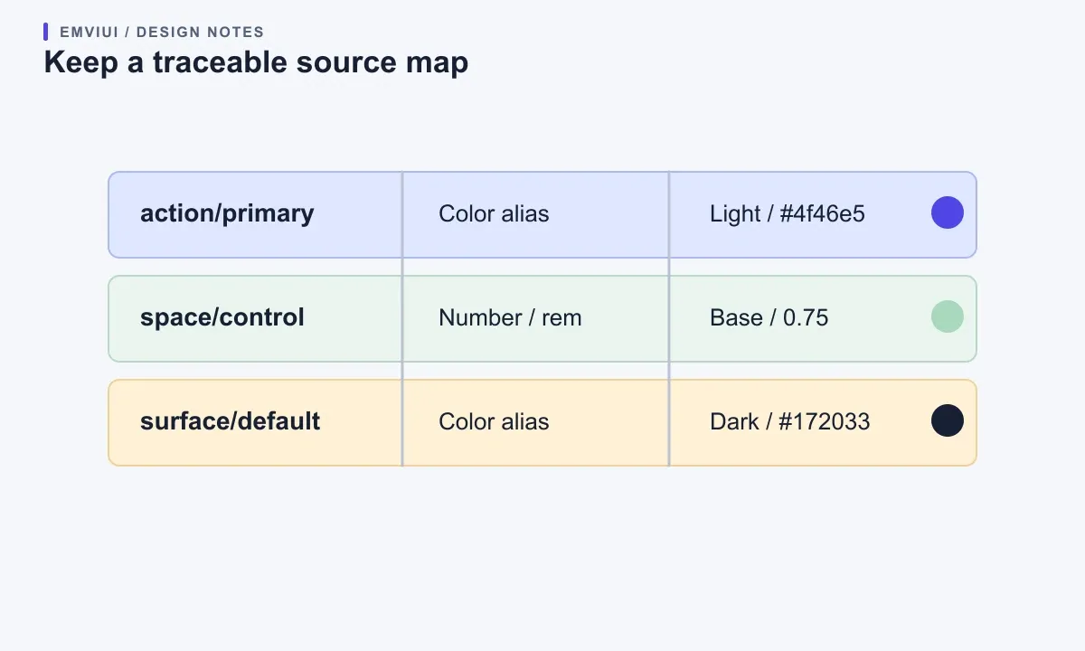
A screenshot, copied hex code, or variable name alone is not a complete export. You need a resolved value, variable type, alias relationship, and selected mode. If you build a script, specify how it handles aliases, unsupported types, duplicate names, missing values, and differences between modes. It should fail visibly when an input cannot be represented rather than silently emitting a plausible but incorrect value.
Preserve traceability. Include the Figma file or collection, export date or revision, and a stable mapping key in the artifact or its documentation. A reviewer should be able to answer which Figma variable produced a CSS property, which mode supplied the value, and what to do if the source changes. This helps a distributed team keep a shared library coherent and gives you a clear place to resolve discrepancies.
Variable paths often use slash-separated groups such as color / text / primary. CSS custom properties conventionally use hyphens. Decide whether your converter replaces slashes with hyphens, removes implementation-only groups, or preserves aliases as references. Apply the same rule throughout the project. Ad hoc exceptions for individual components make the token layer harder to scan and eventually harder to migrate.
A reliable translation also identifies values Tailwind cannot use directly. A Figma number might represent a line-height ratio, a duration in milliseconds, or a spacing value. The number does not say which CSS property or unit applies. Record the intended property and unit, then test in context. A color variable can become a color value. A component radius can be a CSS custom property or map into Tailwind's radius namespace. Treat that as a documented decision rather than an inference from the numeric value.
Define theme variables for your Tailwind version
Tailwind CSS v4 documents a CSS-first theme API using the @theme directive. Theme variables create CSS properties and utility APIs. The Tailwind theme variables documentation explains the namespaces, while the color customization guide covers custom colors. A small starting point is shown below.
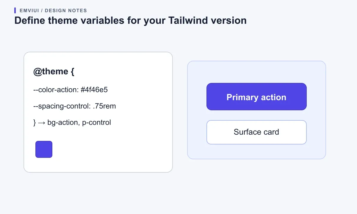
@import "tailwindcss";
@theme {
--color-action: #4f46e5;
--color-surface: #ffffff;
--color-text: #172033;
--spacing-control: 0.75rem;
--radius-control: 0.5rem;
}
These names are examples; Figma does not create them automatically. In v4, a color variable can expose utilities such as bg-action, text-text, and border-color utilities. The spacing and radius namespaces also expose theme-based utilities. Confirm the class emitted by your installed version in a small build. Keep each CSS variable's purpose readable instead of naming a semantic surface after a temporary hex code.
Some teams benefit from a separate design-token layer referenced by the Tailwind theme:
:root {
--ds-action-primary: #4f46e5;
--ds-surface-default: #ffffff;
}
@theme inline {
--color-action: var(--ds-action-primary);
--color-surface: var(--ds-surface-default);
}
Use this pattern only if it fits your installed version and build pipeline; check the official documentation and inspect compiled CSS. A separate layer can help when non-Tailwind styles also consume design tokens. A smaller project may be clearer with one set of variables. Do not add another abstraction just to imitate an architecture diagram.
Tailwind v3 projects commonly define theme values in tailwind.config.js or a TypeScript config. Its shape and extension behavior differ from v4's CSS-first model. Do not paste an @theme block into a v3 project and expect it to create classes. Check package.json, the lockfile, framework integration, and versioned docs first. For a migration, keep the current config and move one token category at a time, then compare both compiled CSS and rendered components.
The vocabulary is also a design decision. Prefer a consistent choice such as surface-default, text-primary, or border-subtle over mixing palette names with component-specific labels. Be careful with generic names like primary if the product has several kinds of primary actions. A class should be easy to find, but it should also make sense outside the component where it was first introduced.
If you are evaluating EmviUI, its practical introduction to design tokens explains the naming and semantic layer. This article adds the implementation bridge: take that role model, decide how it maps to Tailwind namespaces, and test the utility API your application will use. EmviUI does not create that mapping for your repository; your project still owns the naming and build choices.
Use Figma modes as intentional theme contexts
A Figma mode is a set of values for variables in a collection; the relevant design context uses a mode. A Tailwind theme declaration creates available values and utility names, but does not decide which mode an application should use for a user's runtime preference. Keep those responsibilities separate.
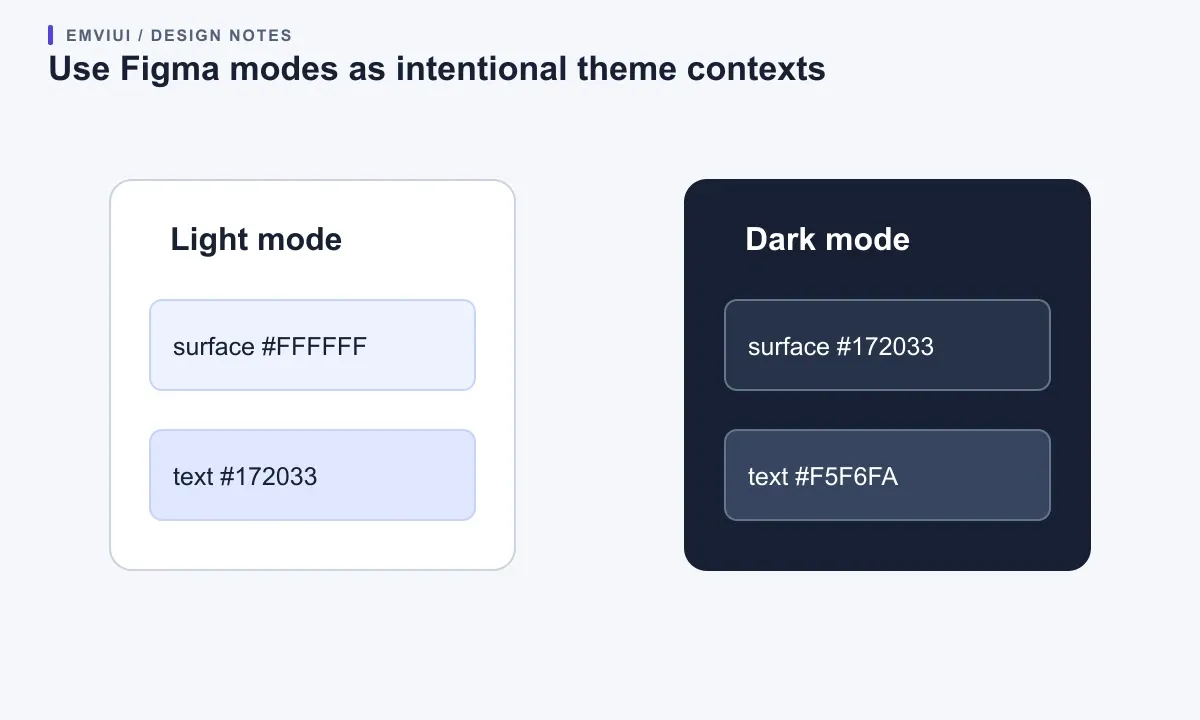
For a light and dark interface, keep the semantic custom property stable and change its value inside the appropriate selector or theme mechanism. For example:
:root {
--ds-surface-default: #ffffff;
--ds-text-primary: #172033;
}
[data-theme="dark"] {
--ds-surface-default: #172033;
--ds-text-primary: #f5f6fa;
}
Tailwind utilities can refer to these stable names while the application selects the context with an attribute or class. If your project uses dark-mode utilities instead, follow its existing convention and make sure the state is applied at the correct ancestor. The important point is that a semantic role should resolve predictably in both Figma and production.
Do not mechanically turn every Figma mode into a media query. Modes can represent brand, density, platform, localization, or another design context, and not all are runtime themes that a user chooses. A desktop spacing mode does not automatically define a CSS breakpoint. A campaign mode may belong to a separate brand bundle. Identify the product condition first, then choose a selector, class, component property, or build-time output that represents it.
Review text, borders, icons, charts, disabled controls, and focus indicators in every relevant theme. A surface may look right while muted text becomes unreadable. Semantic names tell you the purpose of values, but a person still needs to check contrast and interaction states. Run accessibility checks on rendered combinations rather than trusting a token label.
If a mode changes layout or spacing, test real widths with realistic content. CSS breakpoints are implementation decisions. Figma modes help designers model contexts, but do not automatically define responsive browser behavior. Pair the token translation with the web project's responsive strategy. A token can inform a breakpoint or spacing value without deciding when the layout should switch.
A useful review asks what happens when content is longer, a control is disabled, or the user has chosen a different theme. Design a few representative screens in Figma, then compare the same states in the browser. If a mode changes one semantic surface in the design but three unrelated CSS classes in code, the mapping may be too indirect or the implementation may not reflect the intended role.
Validate the mapping before you ship it
After editing the theme, run the project's normal build and make a small component that uses the intended classes. Apply bg-action, text-text, and a spacing utility to a button or card. Inspect generated CSS or the rendered element to confirm Tailwind discovered the class, emitted the expected rule, and resolved the custom property. A plausible class name in source is not proof that the utility exists.
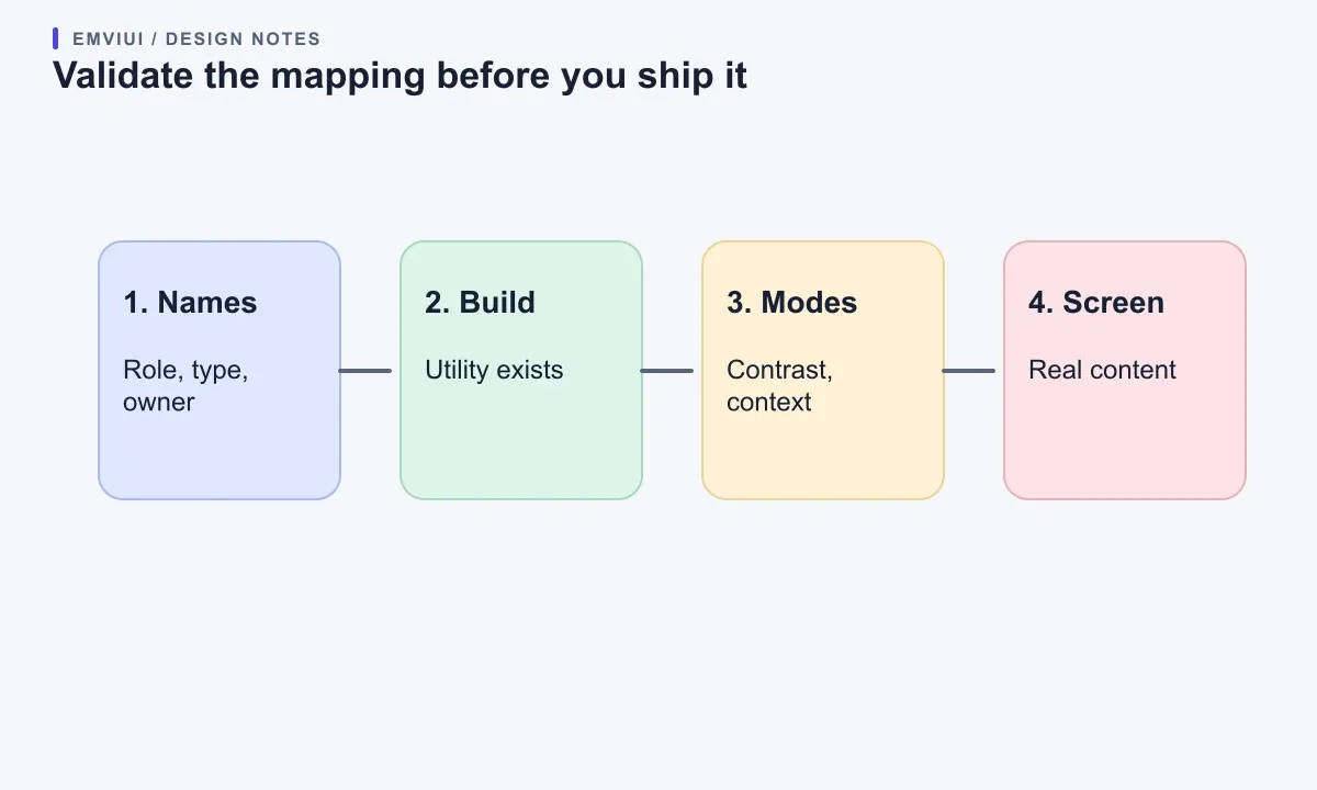
Compare one value at each layer: selected Figma mode, resolved variable, mapped CSS property, Tailwind theme variable, computed browser style, and visible component. Check whether an alias was flattened to its current value or retained as a reference. Either can be appropriate, but the choice affects how updates flow. If aliases should remain live, regenerate and test after changing a primitive. If the output is intentionally flattened, document it as a snapshot and refresh it when the source changes.
Use a short acceptance table for the first migration: colors match in both themes; spacing and radii use intended units; expected utilities compile; removed class names are gone; focus, disabled, hover, and error states render; and a representative page does not overflow. Keep a few screens for visual comparison. Do not judge success only by whether a CSS parser accepts the theme.
Make failures visible. A missing variable should produce a validation or build error rather than fall back to a different semantic role. Flag duplicate CSS names. List unsupported Figma types for review. When a value changes, reviewers should distinguish a safe primitive update from a change to a semantic role's meaning. Keep this check proportional: a pilot may use a short review checklist, while a large token pipeline may have automated diffs and explicit approval for destructive changes.
Automation is helpful for extraction, normalization, file generation, and comparison. Keep mapping decisions reviewable. A script can transform color/action/primary to --color-action according to a declared rule; it cannot reliably infer whether two similar-looking values mean the same thing in your product. The Design Tokens Community Group format is intended for interoperability, but each integration still needs an implementation workflow. Version the converter and its mapping rules alongside the design-system code.
For implementation context, see EmviUI's Figma-to-Tailwind responsive React workflow. For the design foundation, its plan for making a maintainable UI kit shows how a compact component set can consume consistent decisions. Conversion succeeds when designers can identify source roles, developers can use expected utilities, and the product renders the intended values in supported contexts.
Where EmviUI fits in this workflow
EmviUI can help as a reference for reusable interface patterns and consistent components while you build a Tailwind product. It does not automatically import Figma collections, generate your project's Tailwind theme, or synchronize token updates. Treat its examples and UI kit as an implementation reference, not evidence that a mapping has already been performed in your codebase.
A practical pilot is to choose an interface you plan to build—a settings form, profile page, or dashboard panel—and create a short map for its colors, spacing, radius, and typography. Compare the Figma role names with the Tailwind classes each component needs. If an EmviUI example clarifies a pattern, adapt it to your own names and run it in your actual Tailwind version. Preserve the distinction between a product's semantic decision and its current visual value.
This pilot makes results measurable. A designer should be able to change a semantic value once and see the intended design context update. A developer should reach for a role-based class without memorizing a palette index. A reviewer should trace a component back to its Figma source and notice missing states. If the mapping makes these jobs less clear, simplify it before scaling to hundreds of variables. A short, dependable map beats a broad export nobody can safely maintain.
Frequently asked questions

Pablo Mayoral
Senior UX/UI & Web Designer with 10+ years of experience. Creator of EmviUI (10k+ components Figma design system), UImand, and Vitamin Bootstrap. Currently designing digital products at CQMRewards.