Figma Plugins for Images: Choose Tools and Review Crops
Use an image plugin for a specific operation, then review the selected layer, crop and meaning inside a real interface component.
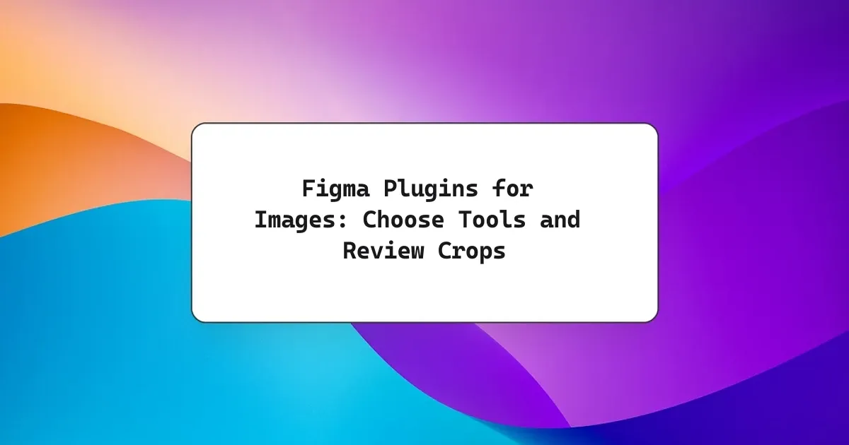
Choose Unsplash for sourcing photographs or Remove BG for background removal, and use native Figma fills for placement and cropping. Test one image layer first, then review card layouts, contextual meaning and delivery requirements.
Choose Figma plugins for images by the operation you need: Unsplash for finding photographs inside a design workflow, or Remove BG for a background-removal task. Use Figma’s native image fills for placement, replacement and cropping. Test one selected layer before applying a plugin broadly, then review the image’s meaning, crop and delivery requirements. Installing more plugins does not settle those design decisions.
Choose the image operation first
Write the missing operation as a verb: find, place, replace, crop or isolate. This prevents a common detour in which a designer installs an image plugin to solve a problem already handled by the selected layer’s fill settings. Choose the tool after defining the result.
This guide proposes a small exercise for Northstar, a fictional workshop directory. Designer Jo needs three course cards: an introductory pottery session, a wheel-throwing session and a glazing session. Each card needs a relevant image and a readable title. The exercise and acceptance criteria are editorial recommendations, not a report of measured plugin performance.
Start with Figma’s image import controls: uploaded raster images become layer fills. This is useful when an approved photograph already exists. Keep the original asset available and replace the fill in a duplicate card before adjusting other properties.
| Task | Starting point | Check before accepting |
|---|---|---|
| Find a stock photograph | Unsplash integration | Subject matches the course |
| Place an approved asset | Native image import | Correct layer and source |
| Show another crop | Native fill properties | Important detail stays visible |
| Isolate a photographed object | Remove BG workflow | Edges and transparency |
Unsplash’s current apps directory lists its Figma integration. Its official integration article describes searching for photographs and inserting them into selected shapes. Use this as a sourcing option, not a promise that every result communicates your product accurately. Search for a concrete activity, then assess the individual image.
For Northstar, “hands shaping clay” is a more testable brief than “inspiring creativity.” Write down what the picture must communicate before browsing. If the class is wheel throwing, a photograph of painted mugs might be attractive while leaving the activity unclear. Keep two candidates only when they support a real decision; a large mood board is unnecessary for this exercise.
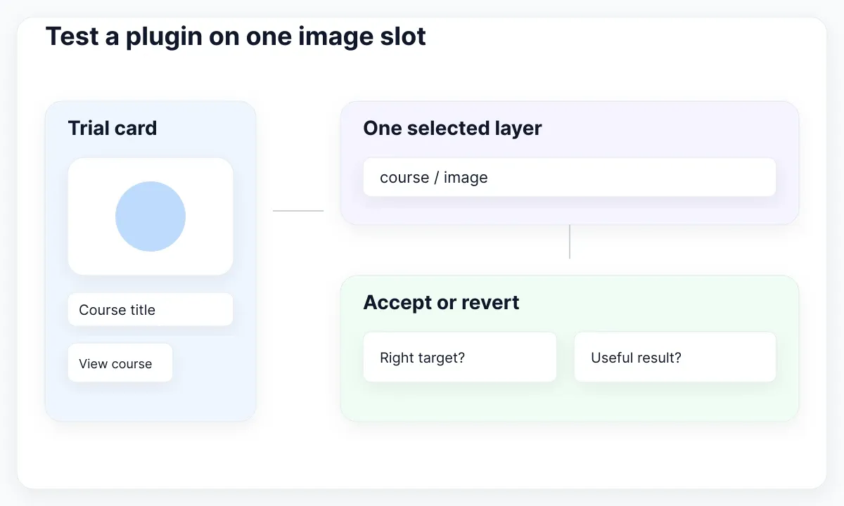
Test a plugin on one image slot
Create a disposable card instance and select only its image layer. Apply one operation, inspect the resulting fill, and compare it with the starting state. A narrow first test makes it easier to notice an incorrect target, unsuitable subject or unexpected change.
The remove.bg integration guide documents a Figma workflow that uses an account API key and a selected image to remove its background. Consider it when the brief needs an isolated tool or object. This article does not run that service, benchmark its quality or assert current pricing. Check the provider’s current requirements before choosing it for a real project.
For the proposed glazing card, an isolated brush might communicate a tool but omit the workshop context. Review that tradeoff before processing a whole set. Keep the unprocessed source beside the result. Look closely at fine edges and semi-transparent areas against both light and dark review surfaces. These are proposed inspection steps, not claims that a specific output contains defects.
Also inspect the plugin’s Community entry. Figma’s plugin guidance explains that plugins execute third-party code, can access file information and display a network-access scope. Check publisher identity and the data the operation needs. Use an approved sample image for the trial rather than a confidential customer photograph. Follow your team’s existing approval process where one applies.
- Duplicate a representative card into a trial area.
- Select the named image layer and record the starting asset.
- Run the chosen operation once.
- Inspect the target, resulting fill and visual quality.
- Accept or revert before applying the operation elsewhere.
A successful trial means the operation changed the intended asset and the result meets the brief. It does not prove that every other photograph will work. If the plugin cannot run, use the separate plugin troubleshooting guide for access, selection and network diagnosis; keep the image decision recorded here.
Compare Fill, Fit and Crop
Judge the crop inside the destination shape. Figma’s Fill, Fit and Crop controls solve different presentation problems. A correct image in the wrong mode can hide the pottery wheel, introduce unwanted blank space or give the subject too little emphasis.
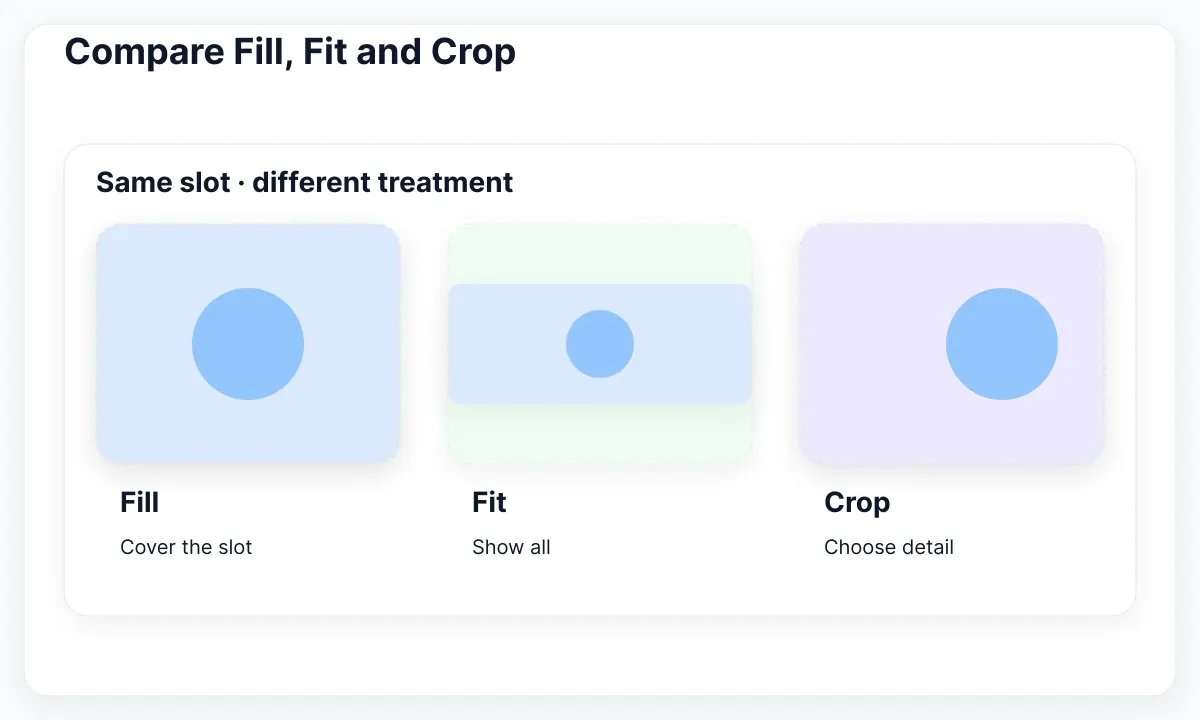
Figma’s image property documentation distinguishes Fill, which covers the layer and can clip the image, from Fit, which keeps the complete image visible and may leave space. Crop lets you reposition the visible portion non-destructively. Choose by the picture’s purpose, then inspect the actual result.
In the Northstar exercise, duplicate one rectangular image slot three times. Keep its width and height identical across copies. Apply Fill to the first, Fit to the second and a deliberate Crop to the third. The comparison isolates the fill decision instead of mixing it with three different card sizes. Label the copies so a reviewer can identify the intended mode.
Define the focal detail in ordinary language: “hands and wheel must remain visible.” A decorative texture can tolerate a different crop from a course photograph that explains the activity. Ask someone to identify the class from the image and title together. If their explanation depends on a detail the narrow crop removes, revise the image treatment.
Replacing a fill can preserve existing crop and positioning settings, according to Figma’s import documentation. That makes a replacement convenient, but still demands review: a crop chosen for a centered bowl may cut off a person at the edge of the next photograph. Check the new subject rather than accepting the old crop because the layer dimensions stayed constant.
Leave a short note beside the accepted version: source image, mode, required detail and the width reviewed. This is more useful than “make it look like the screenshot.” It identifies what must survive later resizing and gives the implementer a concrete visual check.
Review a card at two widths
Review the image together with the card’s text and action at a wide and a narrow layout. An attractive thumbnail alone does not show whether the full card still explains its subject. Keep the task, heading and action visible while evaluating the image.

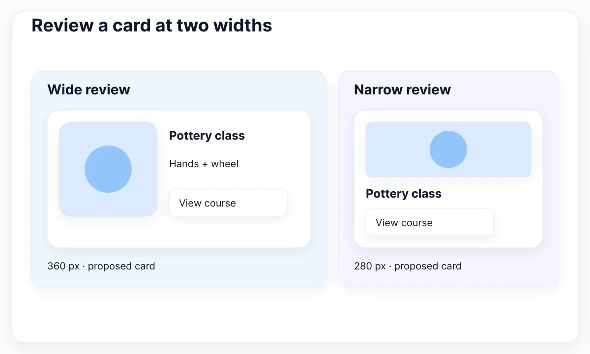
EmviUI provides editable Figma interface building blocks that can serve as the starting specimen. The real EmviUI blog-card examples below combine thumbnails, titles and supporting metadata. They are EmviUI designs, not screenshots of Unsplash or Remove BG. Their sample article topics are not evidence about the workshop exercise.
In an authorized working copy, replace the sample content with the Northstar course title and selected image. The specimen helps you inspect image-to-title hierarchy and repeated card structure. EmviUI does not establish the image’s suitability, rights or plugin output quality, and this static capture does not demonstrate a working responsive implementation.
Use an illustrative desktop card width of 360 pixels and a compact version of 280 pixels for this exercise. These are proposed test sizes, not universal breakpoints. Review the focal detail, title wrapping and action placement at both widths. If the real product uses other dimensions, substitute those measured sizes.
Keep the image source constant during the first comparison. Then, if the narrow version cannot communicate the activity, propose a second crop and document why. Do not shrink the entire card until all its contents fit. The aim is a readable component whose image still supports the same task.
For the surrounding page, continue with the responsive landing-page workflow. Here, the acceptance decision remains local: the course is identifiable, the heading remains readable and the action follows the description in each proposed layout. Record a failed width as unresolved rather than silently approving only the wide view.
Write the image meaning into handoff
Describe what the image contributes, then decide how that meaning will be represented in the delivered interface. The same photograph can be informative in one context and decorative in another. The decision depends on the surrounding text and the user’s task.
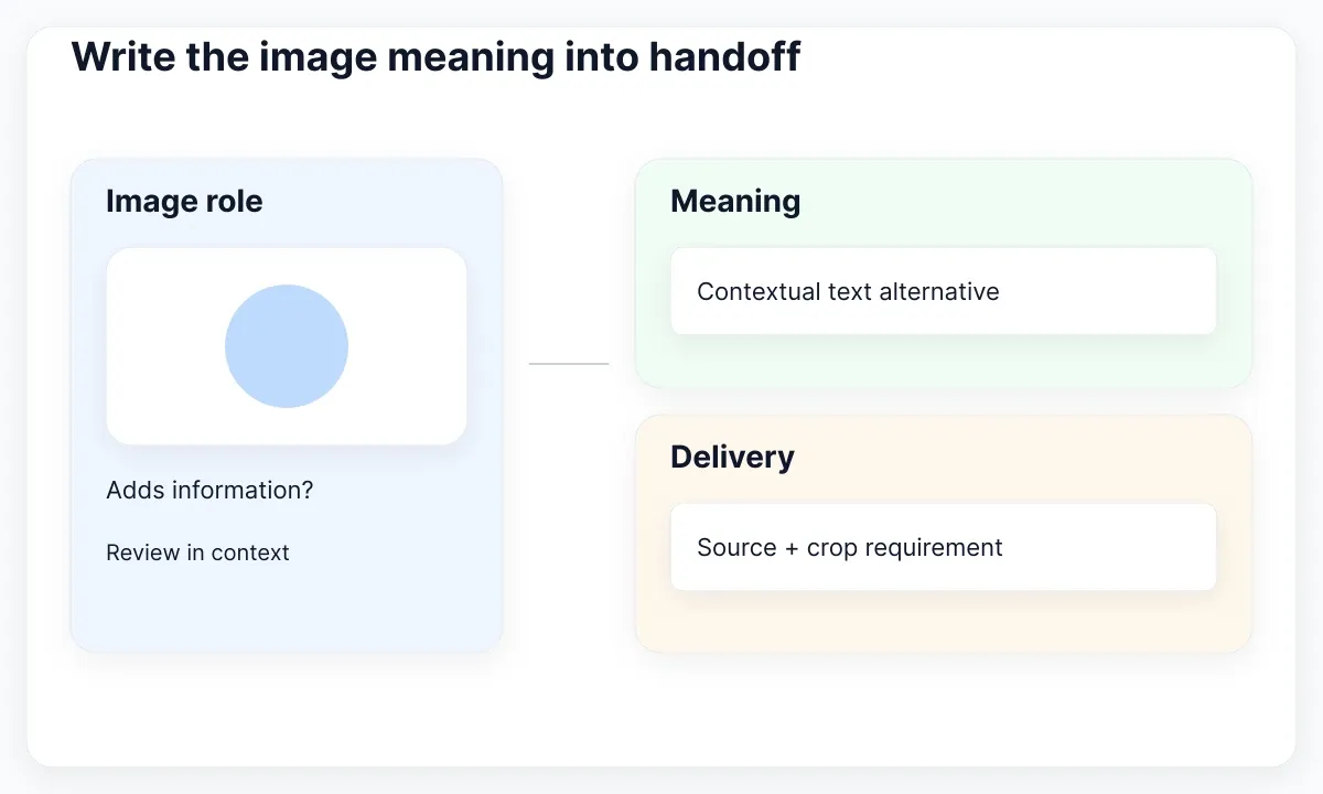
The W3C image decision tree helps distinguish informative, functional and decorative uses. Its informative-image guidance focuses on conveying essential information through an appropriate text alternative. For Northstar, record whether the photograph adds course information beyond the adjacent title. Avoid turning a design filename into the proposed alternative text.
Consider two proposed uses. A generic clay texture behind a heading adds atmosphere and can be decorative. A photograph demonstrating the hand position required in a workshop may convey information the title omits. Write the relevant meaning, then review it in the actual page context. If the picture functions as a link, the destination or action also matters.
Keep important course details in real interface text. A thumbnail with a tiny embedded date is difficult to adapt and can lose that date when cropped. Put the schedule beside the title and let the photograph support recognition. This is a design recommendation for the example, not an assertion that an image-processing plugin adds accessible markup.
Responsive delivery is another handoff decision. MDN’s responsive-image guide explains different source sizes and art direction. Ask the developer to specify how the chosen assets will be served, and note whether a narrow crop requires a different source. A Figma fill setting alone does not define browser image selection.
- Meaning: what the image adds to this card.
- Crop: which detail must remain visible.
- Text alternative: a contextual proposal for implementation.
- Delivery: source asset and any alternate crop to review.
Test the implemented result with the intended assistive-technology and viewport checks. A well-labeled Figma layer helps communication, but acceptance depends on what the interface actually exposes and renders.
Keep an asset decision record
Finish with a small asset record that survives the design review. List the approved source, operation, selected layer, accepted crop, meaning, owner and unresolved delivery questions. Keep pending questions explicit so a developer does not mistake a polished mockup for a complete asset package.
For example: “Pottery introduction; approved source photo A; native Crop; course/image; retain hands and wheel; contextual alternative text pending content review; Jo owns the crop decision.” For an isolated object, also retain the original and processed files. Label alternatives by purpose rather than opaque names such as final-final-two.
Before delivery, check each card against the same criteria: accurate subject, deliberate crop, readable adjacent content and a recorded accessibility decision. Reject a candidate when it needs a missing source or unresolved processing step. Choosing a different approved image can be more useful than adding another plugin to rescue the wrong subject.
Use the asset export and delivery guide when the accepted design needs concrete output formats and dimensions. The finished result here is a justified image choice and reviewable treatment. The plugin performs a bounded operation; the designer remains responsible for whether the image helps someone understand the interface.
When repeating the workflow later, record the plugin name and review date alongside the chosen asset. Keep one approved card as a visual reference. If a later operation changes the subject or crop, reopen the same acceptance checks rather than assuming that the earlier approval still applies.

Pablo Mayoral
Senior UX/UI & Web Designer with 10+ years of experience. Creator of EmviUI (10k+ components Figma design system), UImand, and Vitamin Bootstrap. Currently designing digital products at CQMRewards.