What Font Does Figma Use? Inter vs Figma Sans
Inter is Figma Design’s new-text default; Figma Sans is a separate brand family. Here is how to verify fonts and hand off a dependable UI type system.
Figma Design uses Inter for new text layers by default during a session. Figma’s brand uses the separate Figma Sans family. Check the selected layer, font source, team access, and real interface behavior before handing off a design.
What font does Figma use? In Figma Design, Inter is the default font for new text layers in a session. That describes the design canvas, not every Figma product or its brand identity: Figma’s own brand uses a custom family called Figma Sans, alongside Figma Condensed, Figma Mono, and Figma Hand. If a file looks different on another computer, check the font actually applied to the layer, shared and installed font sources, and missing-font warnings before changing the design.
Which font does Figma use by default?
Figma’s text-properties guide says that new text layers use Inter as the default font in a session. “Default” is a starting value for a new layer, not a rule that every existing layer, template, or shared library must use Inter. Select a text layer and inspect its font family in the right sidebar; the visible layer setting is the reliable answer for that object. A file can mix families deliberately, and a selected range within a text layer can use a different font from the rest.
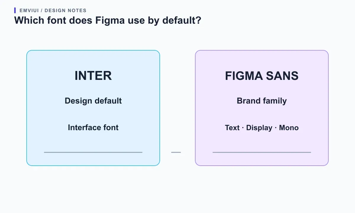
This distinction helps when troubleshooting a mismatch. If a heading looks unlike Inter, verify the selected text rather than assuming the canvas default was retained. A copied component may preserve its original family. A library may apply a text style. A file may use an organization-shared font or a locally installed font. Figma’s current text-properties documentation explains how to inspect the family, style, and size. The default answers what a newly created layer starts with; it does not identify the typeface used in Figma’s logo, marketing pages, or every interface surface.
For a quick check, create a temporary text layer in a fresh area, select it, and read the family shown in the Text section. Then compare it with the component or style you meant to use. If the new layer says Inter but a branded heading uses another family, both may be correct: one is a session default and the other is an explicit design choice. Remove the temporary layer after checking so it does not become accidental production content.
Separate Figma’s interface font from its brand typeface
Three different questions often get compressed into “Figma’s font”: which family a new design text layer starts with, which fonts draw Figma’s application controls, and which typefaces appear in Figma’s brand work. Figma’s help center identifies Inter as its interface font and default font in Figma Design. Its brand team separately describes commissioning Figma Sans with Grilli Type; the family system includes text, display, condensed, and mono designs, with variable weight and width axes. These are related facts, not competing answers.
Name the surface before choosing. For a product mock-up, inspect the file’s text layers and styles. For interface chrome such as menus and panels, the official font-conflict guide calls Inter Figma’s interface font. For Figma’s identity, use its published brand story, which describes Figma Sans and companion families. Do not copy Figma Sans into a client product merely because it appears in a brand article; use it only when the applicable license and project brief allow it.
This distinction prevents a handoff error. A designer may say “use Figma’s font” while a developer hears “use the Figma brand font.” Put the family name, role, and fallback in the handoff: for example, “UI body: Inter, regular; headings: Inter, semibold; campaign title: approved display family.” If your design calls for Figma Sans, identify it explicitly and ensure recipients can access it. For a broader page workflow, see our Figma web-design walkthrough.
Check font availability before sharing a file
A font name in a file does not prove every collaborator can render it. Figma documents several font sources: fonts provided by Figma, fonts installed on a device, and fonts uploaded or shared by an organization. Its conflict guide describes source precedence and a special case for Inter: a locally installed or organization-shared copy can take precedence over Figma’s provided version in the documented circumstances. Teams should standardize the actual family source, not only its label.
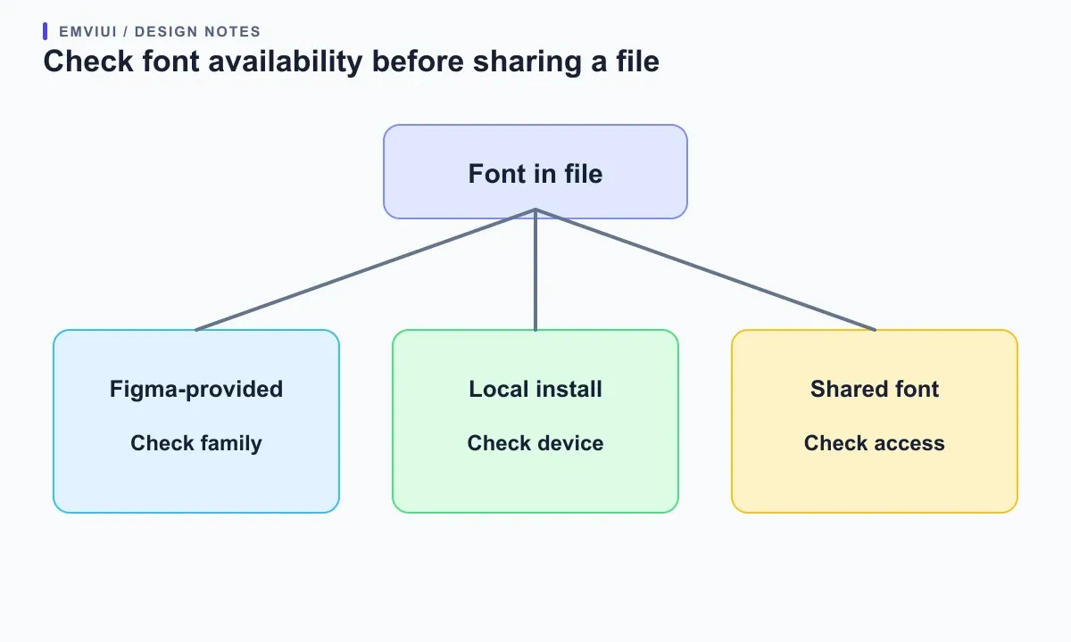
When Figma shows a missing-font warning, do not replace the family immediately. Identify the text style and affected layers, then ask whether the font is part of the team’s shared library or a local install. Figma’s font-installation guide says desktop users can access installed fonts through the desktop app, while browser users need Figma’s font installer for additional local fonts. Figma also documents platform limitations; check its current guide for each collaborator’s operating system and browser.
A useful team handoff records the family name, source, required weights, and fallback. If a licensed brand font is local to one designer, others may see a substitution or warning. If an organization owns a shared font, confirm intended editors have access. Use a substitute only after the design owner approves it: a different font can alter line breaks, card height, button width, and page rhythm. Inspect the file from a second account or device before calling the handoff complete.
Figma’s font-picker guide describes searching available fonts, previewing them on selected text, and filtering by source. Treat the picker as a diagnostic tool: it shows what is available in the current environment, but the receiving team still needs a reproducible font source and the right permissions.
Turn Inter into a useful UI type system
Knowing that Inter is the default does not mean every interface should leave every text layer at its initial settings. A design system needs roles: display heading, page title, section heading, body, label, helper text, and data value. Assign a purposeful size, weight, line height, and color to each role, then save recurring combinations as text styles or variables where your Figma workflow supports them. The aim is a predictable hierarchy that is easy to adjust, not a long list of nearly identical styles.
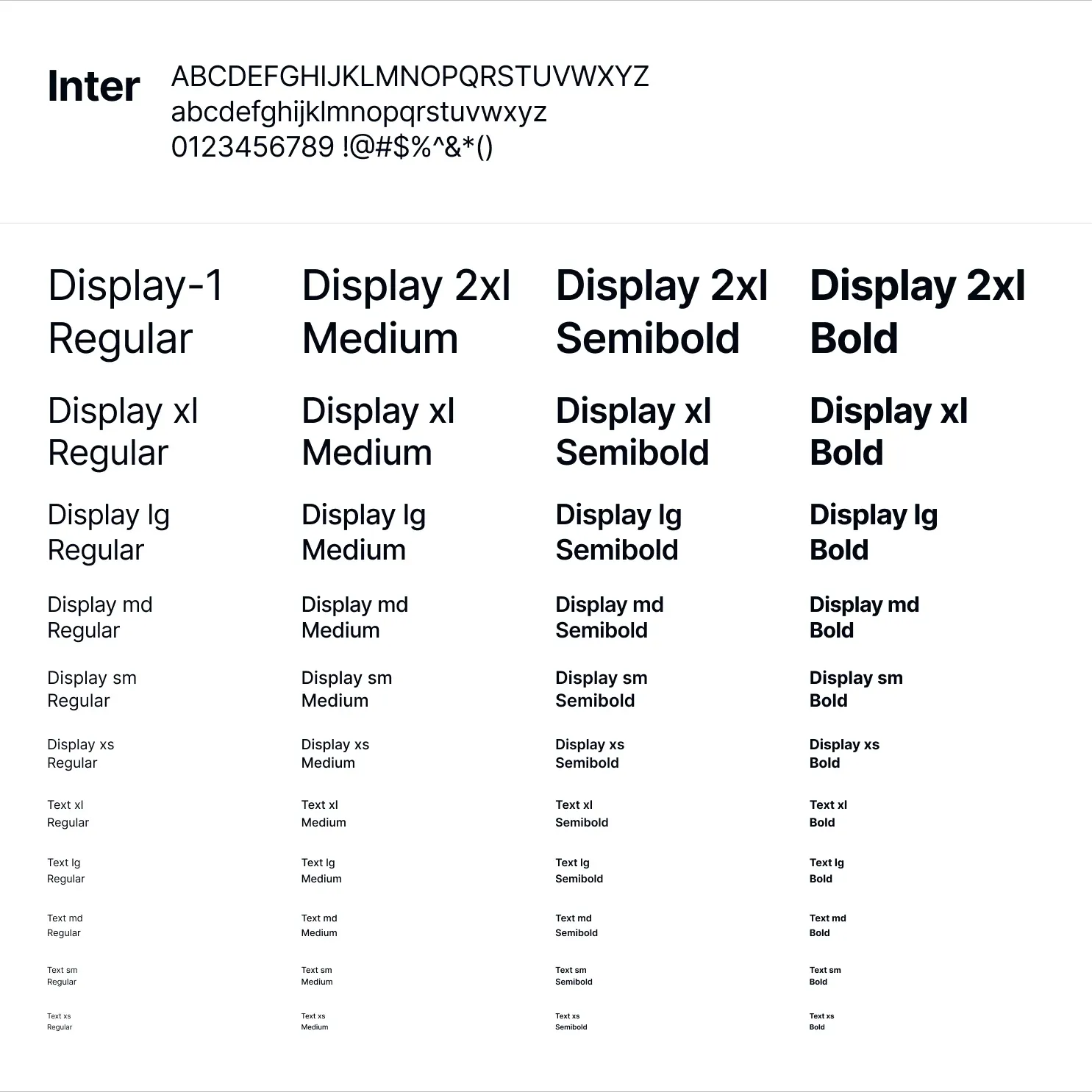
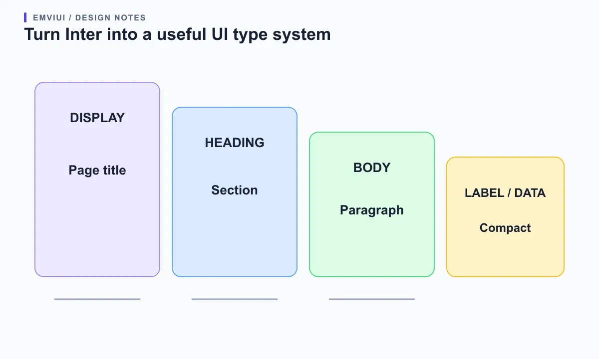
Start with the content users must scan. A dashboard might use a display style for its page heading, a compact heading for card titles, readable body text for descriptions, and a tabular or monospaced treatment only when fixed-width alignment helps. Avoid using weight as the only hierarchy cue: spacing, size, contrast, and placement should also make relationships clear. Check the smallest text at realistic zoom and distinguish labels from helper text.
Test with real strings rather than a short placeholder. Try a long translated label, a two-line button, a validation message, a large currency amount, and a name with accented characters. Font metrics change line wrapping and therefore the geometry of cards, forms, and responsive navigation. Confirm that components grow or wrap appropriately and that focus indicators and text contrast remain visible. The current EmviUI product page describes editable typography styles alongside reusable components and Tailwind-aligned foundations. The kit can provide a concrete starting specimen, but your product’s brand and accessibility requirements determine the final type roles.
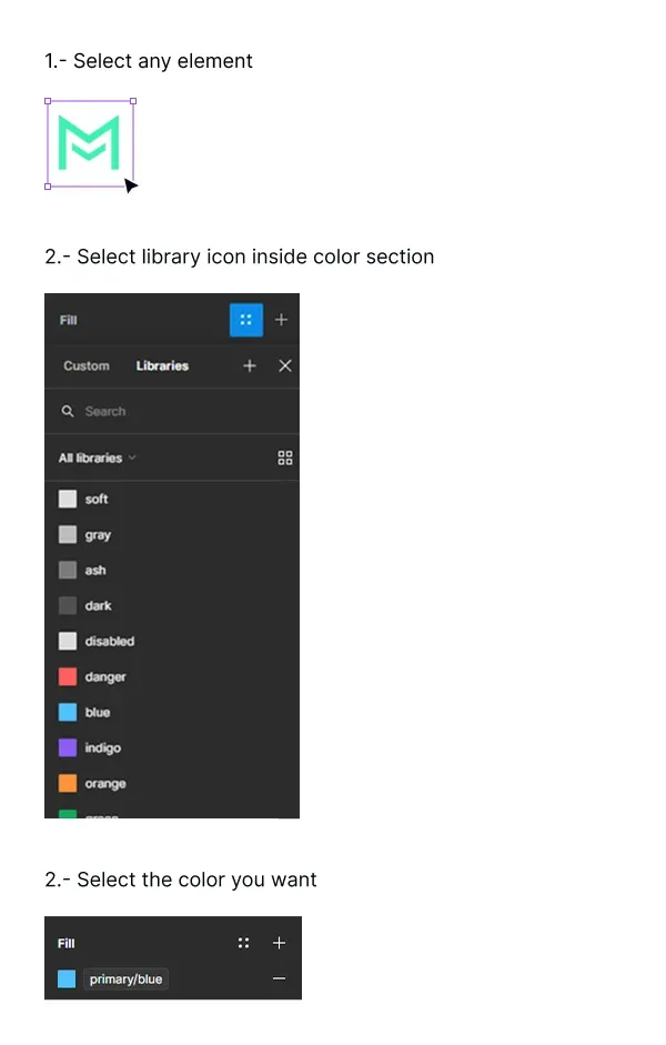
The local specimen below is an EmviUI typography sample showing an Inter character set and display and text roles across weights. A separate Figma color-library capture helps keep color tokens distinct from text styles; it shows color roles only. It is an example of a type scale, not a screenshot of Figma’s font picker and not a claim that every EmviUI file uses this exact scale. Use it to compare hierarchy, then inspect the editable source for actual family and style values. Our guide to design tokens in Figma explains how named decisions can travel into a code system.
Choose a font that survives the real interface
Inter works as a flexible default for many product interfaces, but “default” is not “best for every project.” Choose by testing the product’s languages, content density, brand character, and supported devices. A family that reads cleanly in English may have different coverage or metrics in another script. A brand display family may look distinctive in a campaign headline yet be tiring in dense settings screens. Define a small role-based set and verify each language with representative text.
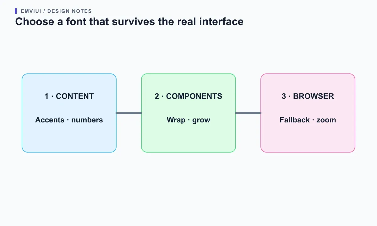
Use a comparison sheet with the same content in each candidate: a page title, paragraph, form label, numeric value, and button. Compare letter shapes at the sizes users will see, not just at a large presentation size. Check punctuation, numerals, accented glyphs, and the weights the family actually supplies. If you rely on a variable font, confirm the needed axes and styles appear in collaborators’ environments and in the browser implementation.
For an interface, legibility includes behavior. Long words and translated labels may wrap differently. A family change can push a primary action below the fold or make two table columns compete. Test narrow screens, zoomed text, and browser rendering; Figma is a specification workspace, not a substitute for testing the shipped page. Document font choices alongside spacing and color roles. EmviUI’s typography styles can help teams explore hierarchy inside an existing kit, while its Tailwind mapping can guide a handoff; developers should still confirm font files, CSS declarations, licensing, and fallbacks in the repository. Our Figma-to-Tailwind workflow covers that implementation check.
A practical Figma font handoff checklist
Before sharing the file, make the typography decision easy to reproduce. State whether the design uses Inter as a convenient default, an approved brand family, or a project-specific choice. Name each text style by role, such as `Body / Default` or `Heading / Page`, rather than by appearance alone. Keep the style list small enough that another designer can predict which option to select.
Check source and access next. Identify whether the family is available from Figma, installed locally, or shared by an organization. Confirm the required weights, styles, variable axes, and scripts. If a font is unavailable to a collaborator, fix access or get approval for a substitute before changing text across the file. Do not outline text as a general workaround for an editable product design; that removes text semantics and makes revisions harder.
Finally, inspect real component instances: a button with the longest label, a field with helper and error text, a card with a long title, and a page at a narrow viewport. Confirm line height, truncation, wrapping, alignment, and component growth. Include the intended browser font stack and fallbacks in the developer handoff. If implementation uses a different family from the mock-up, document the decision and validate the resulting measurements in the browser. Knowing the default is useful context; a reproducible system is what keeps the product consistent.
Write down the role-to-style mapping in a small table or note: role, family, style, size, line height, and source. A developer should be able to translate “body default” into a specific token or CSS rule without guessing which of several similarly named styles the designer meant. Record exceptions beside the component that needs them, not as a second global rule. This handoff detail reduces accidental font substitutions when a page moves from design to code.
Include at least one stress string for every important role. Test a heading with the longest expected product name, a button with a translation longer than English, a data label with a large negative value, and body copy with punctuation and accented characters. These examples expose clipping and awkward wraps early. If the design supports several scripts, use actual text in each script rather than assuming Latin characters predict its spacing. Save the examples in the file so future edits can repeat the same review.
Frequently asked questions

Pablo Mayoral
Senior UX/UI & Web Designer with 10+ years of experience. Creator of EmviUI (10k+ components Figma design system), UImand, and Vitamin Bootstrap. Currently designing digital products at CQMRewards.