Best Figma to Code Plugin: How to Choose
Choose a Figma-to-code tool by testing the result your team actually needs.

There is no universal best Figma to code plugin. Define whether you need a prototype, an editable code export, or design-system handoff, then test candidates on the same screen. Inspect component reuse, responsive behavior, code readability, permissions, and the maintenance path before using generated output.
There is no single best Figma to code plugin for every team. The right choice depends on what you need to leave Figma with: a quick visual prototype, exportable markup to revise, or code that fits an existing component system. Start with the deliverable, not a gallery ranking. Then run two candidates on the same representative screen and judge the output against your actual framework, responsive behavior, accessibility needs, and maintenance standards.
For a production design system, a plugin that generates a convincing screenshot is not necessarily the best handoff tool. Figma’s Dev Mode already provides inspection and generated snippets; Code Connect can show code from your own component library. A third-party plugin can still be useful for a bounded conversion or prototype. This guide gives you a repeatable selection test. For the design side of the workflow, see the Figma-to-Tailwind handoff guide and how Figma components and instances work.
Choose the Figma-to-code output
The phrase covers different jobs. A screenshot-to-interface generator guesses a layout from pixels or a prompt. A Figma plugin reads selected nodes and creates or exports code. A Dev Mode integration helps a developer inspect dimensions, variables, assets, and component references while implementing a design. These outputs are not interchangeable. A clickable demo can be the right answer for a usability test and the wrong answer for a codebase that must be maintained for years.
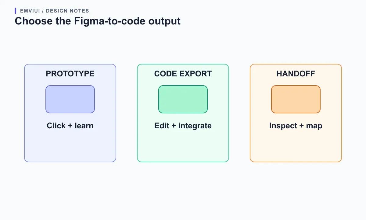
Write one sentence before evaluating tools: “We need editable React components that use our existing Button, spacing tokens, and CSS conventions,” or “We need a throwaway prototype to test a checkout flow.” Add the expected output format, destination framework, and whether it is a learning artifact, prototype, or production starting point. This statement prevents a flashy animation or number of generated screens from standing in for the job you actually need done.
Figma’s Plugin API reads and can modify document nodes, but access depends on what is in the current file and on the APIs available to the plugin. That makes the source file itself part of the input quality. A plugin cannot infer every product rule from a static artboard. Decide whether your task needs node-aware conversion, visual inspiration, component lookup, or developer inspection; then compare candidates in the same category.
Choose the right handoff path before installing a plugin
For inspection, first try Dev Mode. Figma describes it as a place to inspect properties and assets, compare design changes, and manage handoff. If the team already has production components, investigate Code Connect: it maps design components to code components and can provide examples based on your system. Code Connect is part of the Dev Mode workflow, not a general-purpose “convert this page into an app” button, and Figma lists plan and seat requirements in its current documentation.
Use a third-party plugin when it solves a specific gap: perhaps exporting selected vectors, producing a quick starter layout, or moving a small design sample into a format you can refine. A plugin can read or change Figma file content through the Plugin API, while an external service may add its own processing step. Confirm which editor mode it runs in, what it reads, what it writes, and where the output goes. Avoid granting broad file or network access without a clear need.
Do not install a plugin solely because its listing says “production-ready.” Treat that phrase as a claim to test. Figma reviews Community submissions for quality, usability, trust and safety, and business/legal fit; review does not certify that generated code follows your architecture or accessibility rules. Check the listing’s update history, support route, documentation, and behavior on a small duplicate file before using it on sensitive work.
Score candidates with a small, evidence-based rubric
Use a 0–2 score for each criterion: 0 means it fails or is unknown, 1 means partly acceptable, and 2 means it meets the need. Score source fidelity, component reuse, responsive behavior, code readability, editability, and data handling. Record the evidence beside each score: a generated file, a setting, a permission prompt, or a documented limitation. Unknowns should stay unknown; do not award points based on promotional screenshots.
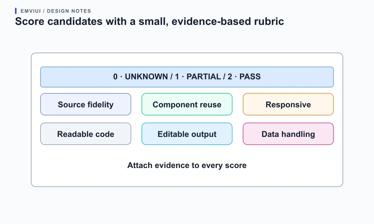
Source fidelity means the result preserves the important hierarchy, text, assets, and states from the selected design. Component reuse means it uses your existing components or gives you a practical way to replace generated markup with them. Responsive behavior means the code works between the two frames you supplied, not just at one desktop width. Readability asks whether a teammate can understand and change it. Editability asks whether the output remains useful in your repo rather than trapped in a plugin’s private format.
Set minimums before testing. For example, a production candidate might need a passing privacy review, no severe accessibility defects, and output that can be maintained by your team even if the plugin disappears. A prototype tool may pass with editable output and acceptable keyboard behavior, while failing the component-architecture criterion by design. The rubric is a decision aid, not a universal industry benchmark; change the weights to match your project and keep the raw observations.
Run the same screen through a fair comparison
Choose one screen with representative complexity: a navigation area, a content card, a form control, and at least one meaningful state. Duplicate the Figma page and remove unrelated layers. Use real text and existing components where possible. Give every candidate the same selection, the same instructions, and the same target framework. If a plugin requires different preparation, record that time and effort as part of the result instead of hiding it.
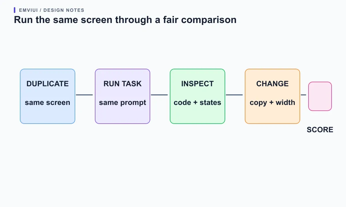
Ask each candidate for the same bounded outcome. For example: export the selected settings card into a React component using the supplied design tokens, preserve the empty and error states, and make it work at a wide and narrow content width. Keep the task small enough to inspect line by line. Capture the plugin version and date, relevant options, output files, manual corrections, and any steps that required a paid seat or external account.
Score the result after editing one label and changing one design state. Can the component take new text without clipping? Can a developer find the source of its colors and spacing? Can you replace its button with the real product button? If the generated code is a one-off screenshot reconstruction, that may still be useful—but call it a prototype and do not confuse it with a reusable component. Keep the Figma source, generated output, and corrections together so a second reviewer can reproduce the test.
Inspect code quality instead of judging the preview
A polished preview answers whether pixels look plausible at one size. Open the output and inspect its structure. Look for repeated inline styles, unexplained absolute positioning, duplicated markup, placeholder links, missing labels, and hard-coded text or colors. Check that components have meaningful names and that a visible variant maps to a real prop or state. Inspect the package dependencies and build steps before adding generated code to a product repository.
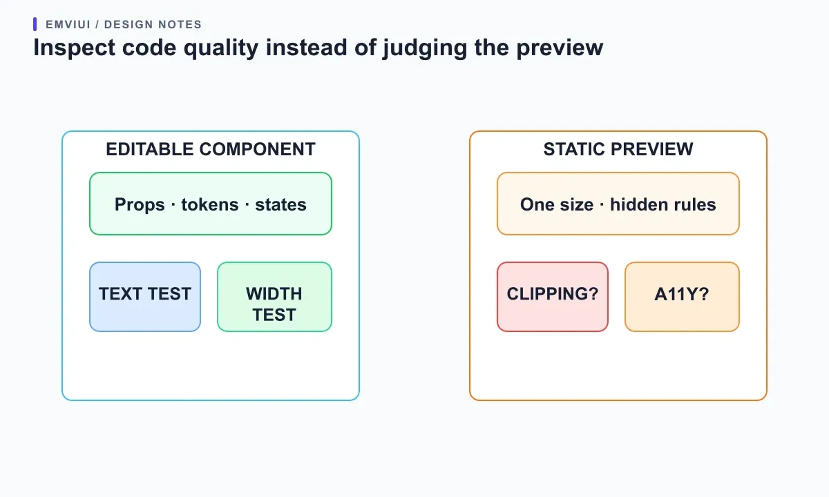
Then change something the design did not make easy: lengthen the title, remove an optional icon, load a long translated button label, or display an error message. A useful component should handle the data it claims to support. If only one screenshot is available, test intermediate widths rather than comparing just desktop and mobile endpoints. Look for clipped content, horizontal scrolling, unstable alignment, and controls that are hard to reach.
Use WCAG’s Reflow guidance as one outcome check for ordinary content at a narrow viewport: users should not have to scroll in two directions to read a typical page. This does not make a Figma plugin conformant; the implementation must be checked. Also inspect semantic elements, keyboard order, visible focus, labels, contrast, and text zoom. Your test should include empty, loading, error, and disabled states when the product uses them.
Check permissions, privacy and the maintenance path
Read the permission prompt in context. Does the plugin need to inspect only a selection, modify the current file, access network domains, or connect to a repository? Figma’s plugin documentation describes a sandboxed execution model and declared network access. Those platform controls do not tell you what a separate vendor stores on its own servers. Read the vendor’s privacy terms, identify whether design content leaves your workspace, and check what happens to tokens, customer names, or unreleased screens.
Ask how the team can stop using the plugin. Can you keep the exported source? Are assets standard files? Does the output depend on a runtime, subscription, or private format? Who owns fixes when Figma changes its API or the generated framework version moves on? Figma notes that plugin API versions are declared in the manifest and are not automatically upgraded, so plugin maintenance matters. A tool with clear documentation and a visible support path is easier to evaluate than one that produces output but gives no route to diagnose failures.
For a short trial, use a duplicate file with no confidential data and a small component. Keep a record of the plugin’s permissions, export, package dependencies, and manual work. If it connects to GitHub or another service, review the requested access with whoever owns that repository. The goal is not to avoid every integration; it is to understand the boundary before placing design or code in it.
Use a repeatable workflow from design to code
First, clean the source: name the main frames, use real text, publish or identify the intended components, and remove accidental hidden layers. Define a token and component map for the small test. Figma files are node trees, and a plugin operates on the nodes and properties available to it; clear structure gives both a plugin and a human a better input. Keep the source small enough to inspect and include the interaction states that matter.
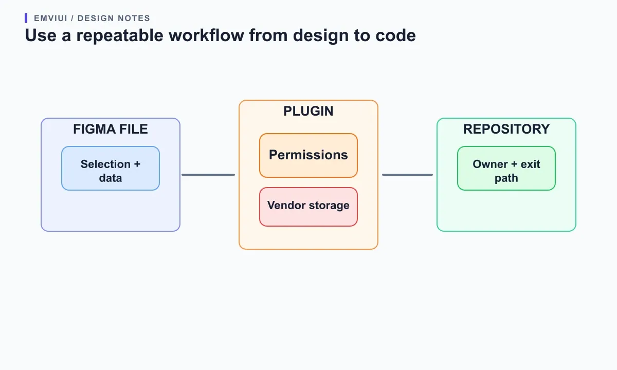
Second, choose a path. Use Dev Mode when the developer needs precise inspection and asset access. Use Code Connect when the task is to expose existing system components in Dev Mode. Use a conversion plugin for a bounded export, and record its assumptions. Keep automated output in a branch or isolated folder until a developer checks it. Compare it to the repo’s actual lint, build, and component conventions rather than accepting it because the preview rendered.
Third, test the result with content and widths that differ from the source. Replace copy, change a state, resize the container, and inspect keyboard behavior in the running implementation. Fix structure before polishing small visual differences. Finally, write down what the plugin handled well, what required manual work, and where it must not be used. This turns one-off experimentation into a workflow another designer or engineer can repeat.
Where EmviUI fits into the decision
EmviUI’s Figma UI kit can provide concrete interface components and patterns for a handoff experiment. Use one EmviUI button or card as the shared source sample, then check whether the candidate preserves its hierarchy and whether your developers can map it to the real component API. The kit is a design starting point; it is not a code-generation plugin and does not claim to export production React code. That distinction keeps the tool choice honest.
If your next step is implementing a responsive page, pair the experiment with the Figma web-design workflow and the Figma-to-Tailwind handoff guide linked above. A coherent UI kit helps teams start from reusable patterns; the best plugin for a given task is the one whose output passes your team’s test and has a maintenance path. If no candidate does, use Dev Mode and a human-reviewed implementation rather than forcing a weak conversion into production.
Make the final choice with a clear stop rule
Choose the candidate with the strongest evidence against your required criteria, not the largest feature list. A reasonable stop rule is: the output fits the actual framework, a teammate can edit it, one content change and one state change work, narrow content reflows acceptably, access is understood, and the maintenance owner is named. If a tool fails a non-negotiable privacy or code-ownership condition, reject it even if its preview is attractive.
Keep a short decision note with the tested file, plugin version, settings, rubric scores, corrections, and the task it is approved for. Re-test after a major plugin or Figma API change, or when the team changes frameworks. The note should also say what the tool does not do: for example, it may create a prototype but not semantic production components. With those limits clear, you can use a Figma plugin where it saves real work and keep human judgment responsible for architecture and user experience.
Primary sources
Primary documentation: Figma Plugin API, Dev Mode in Figma, Code Connect, Figma plugin review guidelines, how Figma plugins run, and W3C WCAG Reflow.

Pablo Mayoral
Senior UX/UI & Web Designer with 10+ years of experience. Creator of EmviUI (10k+ components Figma design system), UImand, and Vitamin Bootstrap. Currently designing digital products at CQMRewards.