Best Component Library: Page-Level Patterns for Multiple Product Teams
Separate shared visual decisions, reusable controls, task patterns and product pages. Use one settings screen to define contracts and verify dependencies.
Separate shared visual decisions, reusable controls, task patterns and product pages. Use one settings screen to define contracts and verify dependencies.
Map the four library layers
The best practice for structuring component library architecture is to separate four responsibilities: foundations hold shared visual decisions; primitives provide small reusable controls; patterns combine controls around a user task; pages assemble those patterns with product data and business rules. Keep dependencies pointing toward the smaller building blocks. A button should not need to know about the page that happens to use it. This is a recommended architecture, not a mandatory industry taxonomy. Use it to make changes predictable across teams rather than to create more folders.
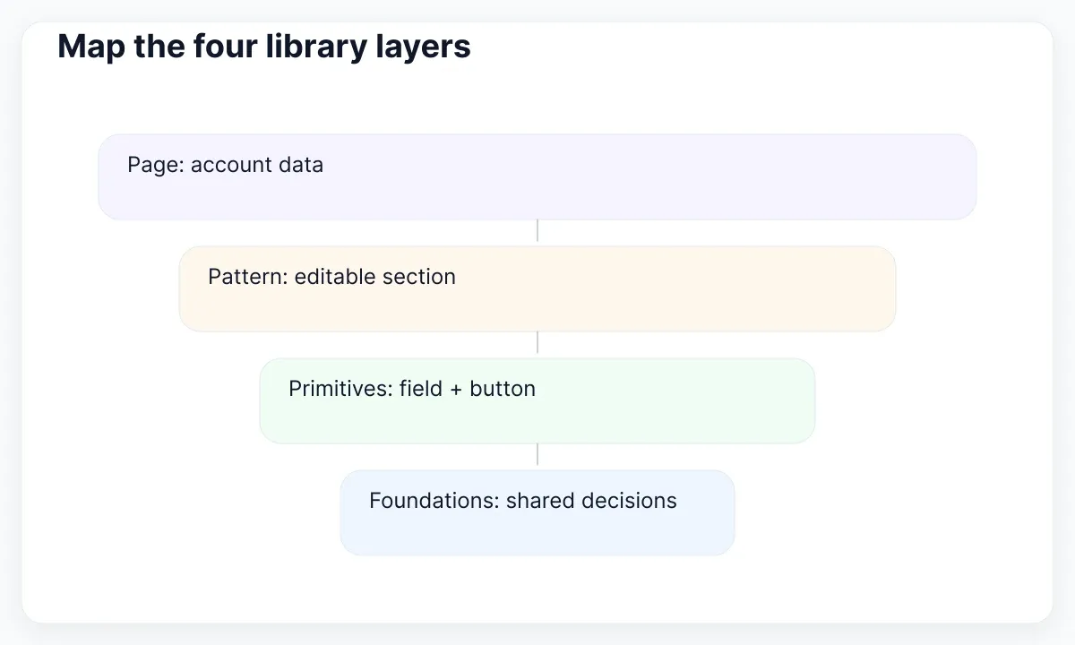
Consider a fictional account-settings screen with an email field, a save action and a success message. Its typography and spacing come from foundations. The input and button are primitives. The editable settings section is a pattern. The account page decides which customer is signed in, whether they can edit the address, and how to persist the change. One screen gives you a concrete way to classify the library before moving hundreds of existing assets.
The boundaries matter more than the names. Some teams call a primitive a component and a pattern a composite component. Write your definitions beside examples, including one example that does not belong. A shared Card can arrange content; an AccountRenewalCard that calculates an account's renewal eligibility belongs closer to the product. Our UI kit and design system scope guide explains the wider operating model; this article focuses on dependency and responsibility boundaries inside the library.
Keep foundations independent of screens
Foundations should describe decisions that more than one interface can consume without importing product behavior. Start with your actual type styles, surfaces, spacing, borders and interaction indicators. USWDS describes tokens as a limited vocabulary of visual values. A named decision can make a change traceable; it does not prove that the chosen value works in every context. Separate the decision from the control that applies it.
For example, define a role called border.interactive and let an input use that role for its boundary. The account page should not carry a special copy called account.email.border merely because the input appears there. Add a more specific role only when it represents a genuine decision that existing roles cannot express. Record the reason and its consumers. Otherwise, every screen becomes its own theme and the foundation layer loses its practical purpose.
Audit one change before declaring this layer complete. Alter a spacing decision in a branch or duplicate design file, then inspect the input, the editable section and the account page. If one updates and another retains a local value, document the exception or reconnect it. This is a dependency exercise, not permission to change all production spacing at once. Keep platform-specific output and any transformation code visible to the people who maintain it.
Give primitives a narrow contract
A primitive should have a useful job that can be described without naming a business area. Button triggers an action; TextField collects text; Badge displays a short status. The contract includes supported states, content limits, events and accessibility responsibilities. It should make valid use easy and unsupported combinations understandable. Avoid treating every screenshot variation as a new public property. A small API with documented composition is often easier to maintain than a control with dozens of unrelated switches.
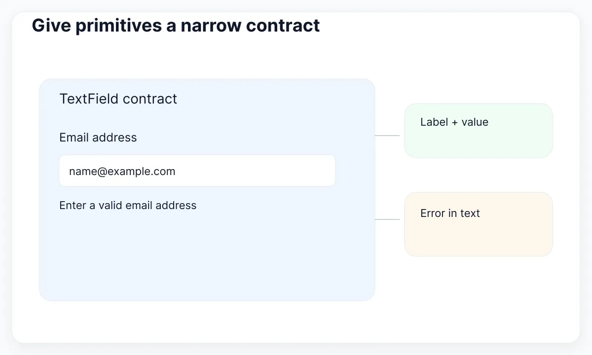
For TextField, document its label, value, hint and error inputs, and how the implementation associates them. State whether the consumer supplies validation and when an error is shown. The field can render an error consistently while the account flow decides whether an email address is acceptable. W3C requires automatically detected input errors to be identified and described in text. A red border alone is therefore an incomplete specification for an error state.
Treat accessibility as a responsibility across layers. A button primitive can preserve its accessible name and keyboard behavior; the page still has to choose a meaningful label and a sensible position in the flow. Likewise, a card can support flexible content while its consumer introduces a fixed-width image that breaks the layout. Review the composed result. For design examples of states and property choices, use our guide to variants and clear UI states.
Build patterns around a user task
Promote a composition to a pattern when the repeated relationship solves the same task, not just when two screens look alike. An editable settings section combines a heading, explanatory text, fields, save behavior and feedback. Its documentation should explain when users save, what happens on failure, and which information remains available while the request runs. CMS Design System distinguishes patterns from individual UI chunks: patterns bring components, content and accessibility together around recurring problems.
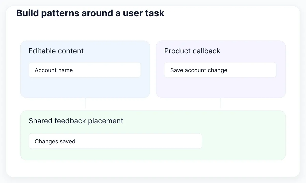
Write a small pattern contract before building a generic SettingsPanel. The contract might accept a title, explanatory content, a field area and a save callback. It can define where feedback appears and which actions remain available. The product supplies the actual fields, permission checks and persistence. If two teams need different save timing, name the behavioral difference explicitly. Do not bury automatic saving and explicit submission behind an obscure boolean whose consequences only one team understands.
Test the relationship with concrete scenarios: unchanged values, a pending save, a validation error, a server failure and a successful save. Show realistic copy rather than empty rectangles. Ask whether users can recover without losing their input and whether the result is understandable without color. Keep the examples as part of the pattern's contract. A repeated layout without agreed behavior is a template candidate; it has not yet established the shared interaction that makes this pattern useful.
Keep product logic at the page boundary
Pages assemble the shared pieces into a product-specific experience. They know the current account, route, permissions and data-loading result. A page can select which pattern to show and translate a service error into useful feedback. Shared controls should not import that page's service client or its route names. Otherwise, a team changing account logic unexpectedly changes the dependencies of every application that consumes the library.
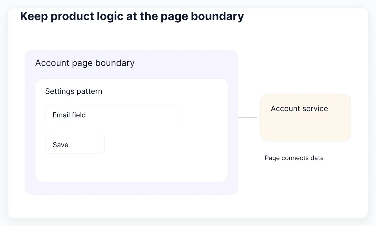
For the settings example, keep a connected AccountPage wrapper around a presentational AccountView. The wrapper retrieves data and supplies callbacks; the view composes the settings pattern. Storybook documents presentational pages and mocking for connected components. This separation is one useful option, with tradeoffs: centralized fetching can introduce prop passing and may not fit incremental loading. Choose the boundary that keeps real dependencies explicit, rather than forcing every application into the same data architecture.
Describe the dependency rule as an example: AccountPage uses SettingsSection; SettingsSection uses TextField and Button; those controls consume foundations. A foundation must never require AccountPage to render. You can keep these layers in one package initially. Split packages when consumers, release timing or platform needs justify the separation. Folder names alone cannot enforce the rule; review imports, public exports and actual installation behavior before promising that a boundary is protected.
Use an EmviUI card as a boundary test
A ready-made specimen is useful for testing the architecture before rebuilding a library. EmviUI’s component catalogue provides interface examples to inspect and adapt. The horizontal card below contains a media area, badges, a heading, supporting copy and an action. Treat it as an EmviUI design specimen. Its placeholder content illustrates composition; it is not evidence of another product, a working application or any current price.

Classify each responsibility. Typography and gaps belong to foundations; the action and badges are reusable controls; the arrangement can become a Card composition. Choosing which account or resource appears belongs to the page. If several products repeat the same resource-selection task, extract a pattern with documented behavior. If they only share the visual arrangement, keep a flexible composition and let the product specify the interaction. This avoids turning one example screen into a compulsory business model.
Use the specimen for a design review: replace the heading with a long localized title, remove the optional badge, and replace the image with an unavailable-media state. Then specify what code should do when the action cannot proceed. EmviUI supplies a design starting point; your team still defines implementation, data behavior and acceptance checks. For the broader multi-team ownership and release concerns, continue with EmviUI at production scale.
Verify contracts at every layer
Build the smallest useful verification set around failure paths rather than collecting screenshots of the default state. Check a primitive's error presentation, a pattern's recovery path and a page's realistic data state. Reuse fixtures where that keeps examples coherent, but preserve the ability to expose a failure at the right boundary. A successful button story cannot establish that the complete account update works.
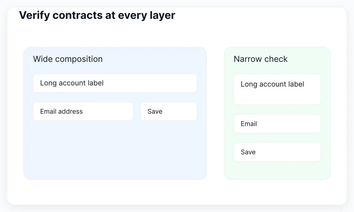
Include a narrow-width case with long content. W3C Reflow guidance describes a 320 CSS pixel width condition for vertically scrolling content, with exceptions for content that needs two-dimensional layout. Use that as an accessibility check where applicable, not as a universal product breakpoint. Inspect whether the label wraps, feedback remains associated with its field and actions stay reachable. Repeat the task at the actual supported viewports as well.
Make review ownership concrete. The library maintainer checks the control contract; a product representative checks the composed task; engineering checks the runtime behavior. One person may fill multiple roles in a small team. Record which checks were actually performed and any remaining exceptions. Distinguish a proposed design state from a verified implementation so downstream teams can judge what they can safely rely on.
Add a dependency acceptance check to the review: can a consumer render TextField without configuring the account service? Can a pattern story display a server failure using supplied data? Can the page replace its persistence callback without modifying the primitive? These questions expose accidental coupling. Write the answers beside the examples so a new team can reproduce the same boundary checks instead of trusting the folder structure.
Refactor one screen before expanding
Begin with a screen that uses several repeated controls and has a known maintenance problem. List its imports, local styling and business rules. Move only the responsibilities whose boundary you can explain. Keep an adapter for the existing page while you introduce the new primitive or pattern contract. Review the before-and-after task with realistic content. This gives the architecture a visible benefit before it becomes a repository-wide migration.
Use a short change note: what contract changed, who consumes it, what needs migration, and which scenarios were checked. Keep old and new examples available during transition. When a second team adopts the pattern, record where the contract fits and where it needs an extension. Promote the smallest shared behavior supported by those cases. The aim is a library whose next change is understandable, with a clear place for product-specific exceptions.
For a concrete migration ticket, replace two account screens' local save buttons with the shared Button contract, then remove their duplicated spacing overrides. Leave each screen's submission callback in its page. Next, compare the two feedback arrangements and extract only the relationship that is actually shared. Record an explicit exception if one account type needs an approval step. That exception is useful evidence about scope; it should not silently become a new requirement for every button in the system.
| Change | Start the review at | Check the consequence |
|---|---|---|
| Shared spacing | Foundations | Every consuming control |
| Input error text | Primitive contract | Association and readability |
| Save recovery | Task pattern | Preserved input and feedback |
| Account permissions | Product page | Allowed actions and data |

Pablo Mayoral
Senior UX/UI & Web Designer with 10+ years of experience. Creator of EmviUI (10k+ components Figma design system), UImand, and Vitamin Bootstrap. Currently designing digital products at CQMRewards.