CRM UI Kit for SaaS Dashboards: Contacts, Forms and States
Build one contact-management task with consistent kit components, explicit editing rules, recoverable save states and narrow-layout acceptance cases.
Build one contact-management task with consistent kit components, explicit editing rules, recoverable save states and narrow-layout acceptance cases.
A CRM UI kit for SaaS dashboards should help you build a complete customer-management task: find a record, understand its context, edit it safely, and see the result. Start with those tasks, then adapt the kit's navigation, tables, fields and feedback. A polished analytics overview is useful visual material, but it does not establish that a salesperson can recover from an unsuccessful save.
This guide applies a kit to a fictional small-business CRM called North Studio. Its first release supports contacts, account ownership and a next follow-up date. The examples are proposed design decisions, not descriptions of an existing CRM product. Use them to create a bounded prototype and discover which parts of your chosen kit actually support your workflow.
Map the CRM task before choosing screens
Write one realistic scenario before browsing dashboard layouts: “Find a contact assigned to me, update their company, and schedule the next follow-up.” This gives every proposed component a job. The initial map below links a list, a record and an edit form; it deliberately leaves reporting outside the first acceptance task.
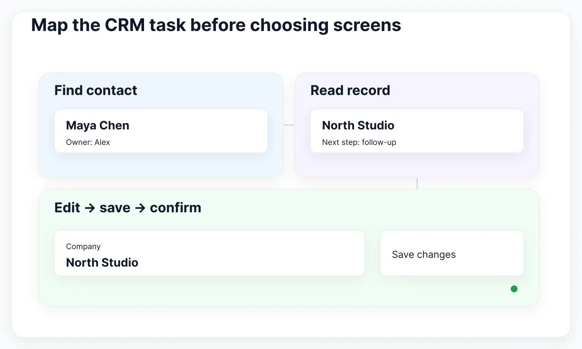
For North Studio, the list answers who needs attention. The record answers who this person is and what happened most recently. The form changes agreed fields. Completion confirms what was saved and returns the person to useful context. Sketch these destinations using ordinary content before applying typography and color. If a screen cannot be connected to an action in the scenario, defer it until you have a reason to build it.
Define a small data vocabulary: Contact, Company, Owner, Last contact and Next follow-up. Decide which values are required, which may be unknown, and which users can edit them. “No follow-up scheduled” should mean something different from “the follow-up date could not be loaded.” This distinction becomes important when you assemble the kit's empty states and status messages.
A simple coverage sheet can have four columns: task, required surface, available kit component, and remaining behavior. For example, Find contact needs search plus results; Edit company needs a labelled field; Schedule follow-up needs a date interaction; Save needs pending, success and failure behavior. A reusable visual component may cover only part of a row. Mark the gap explicitly instead of treating a matching screenshot as finished work.
For a broader starting point, read the dashboard UI kit guide. Here the selection question is narrower: can this kit support the contact task with a coherent set of reusable controls? Use that task as your first prototype review rather than comparing the number of screens in competing libraries.
Adapt the dashboard shell without copying its metrics
The real EmviUI dashboard specimen below shows a sidebar, search, summary cards and chart regions. It is a useful shell reference. Its example figures are demonstration content; they do not establish CRM reporting definitions, production data, or business outcomes.
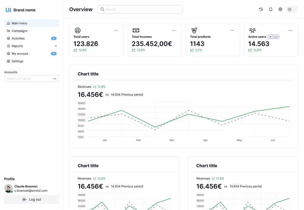
Use the shell to discuss hierarchy with your team. Put Contacts, Companies and Follow-ups in the proposed navigation, then decide where search belongs. A search field scoped to the contacts list should say so; a global search needs a defined set of searchable objects and a way to distinguish results. Keep this distinction in the prototype even if both controls share the same visual input component.
The current EmviUI component catalogue offers visual references for interface assembly. EmviUI can help you start from consistent controls and dashboard structure in Figma. Customer records, authorization, data synchronization and actual save behavior still need product and engineering decisions. Do not describe a Figma kit as a functioning CRM backend.
For the first review, replace demonstration content with synthetic but credible records. Include a long company name, an unassigned owner and a follow-up that has passed. Define any proposed metric in plain language: for example, “Contacts with a follow-up due today” needs a timezone and a rule for completed tasks. If the definition is unsettled, leave the metric out of this prototype. You can review the workflow without inventing analytics precision.
Keep brand adaptation bounded. Change approved colors, type roles and spacing through the kit's supported structure, then inspect the affected controls. For the difference between a reusable asset set and its wider governance, use UI kit versus design system scope. Your CRM prototype needs consistency, while shared ownership and release policy need an explicit team agreement.
Build a contact list around decisions
Choose columns for the decision the list supports. Our example starts with Contact, Company, Owner and Next follow-up. A row opens the contact record, while a clearly labelled control changes ownership. Keep a separate specification for each interaction rather than making the entire row perform several competing actions.
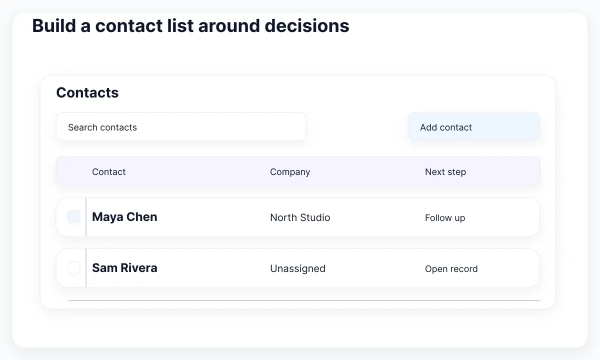
Carbon data-table guidance describes sorting, selection and row actions as distinct table capabilities. Borrow that separation when reviewing kit coverage. A selected record and an opened record are different states, even if both look highlighted. Use the diagram as a contact-list specimen, not as a claim that every CRM should use these exact columns.
Give the list a meaningful default order. In North Studio, upcoming follow-up is a reasonable hypothesis because the pilot task concerns attention today. Show the active sort and test whether that order helps actual users. Search and filtering should preserve their visible values when someone returns from a record. This is a proposed continuity requirement; document it for implementation instead of assuming the kit already provides it.
Specify selection scope before adding batch actions. Does “Select all” affect the current page, the filtered result set, or every contact? Display the intended scope and count before a reassignment is committed. For a first release, current-page selection may be easier to explain and validate. That is an example trade-off, not a universal recommendation for all CRM datasets.
Use realistic content to discover layout pressure. A contact may have no company, several people may share a name, and an account name may be much longer than the neat sample text. Provide an identifying detail when ambiguity matters. Choose a missing-value label deliberately. Avoid filling every gap with a dash if readers cannot tell whether it means unknown, unavailable or not applicable.
Finally, separate a zero-result filter from a first-use empty list and a failed request. Each needs a different next action: clear filters, add a contact, or retry loading. Review these states beside the successful list. If the kit includes an empty-state illustration, adapt its copy to the reason instead of using the same “Nothing here” message for all three conditions.
Design record editing as a recoverable task
A useful record page preserves identity while letting people change a bounded set of fields. For North Studio, editing company and follow-up should retain the contact's name and show Save and Cancel clearly. Keep activity history outside the editable field group unless the current task requires changing it.
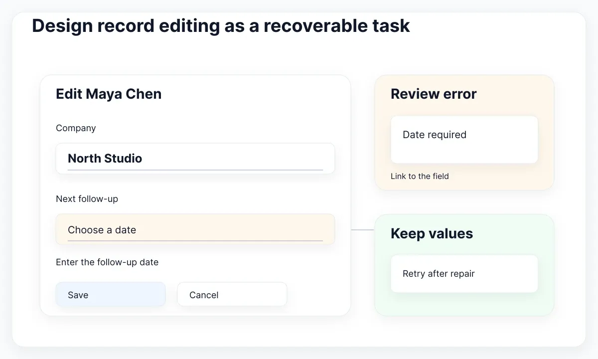
GOV.UK text-input guidance requires labels and explains why placeholders cannot replace them. Use visible field names in the kit specimen, with supporting instructions where needed. “Company” remains visible after typing; a placeholder alone disappears when the user needs to review their entry. Treat notes as a separate multiline control rather than forcing them into a single-line field.
Define validation from the product's actual rules. In our fictional example, a scheduled follow-up requires a date; a blank company is allowed. Explain the correction next to the relevant field. GOV.UK error-summary guidance pairs a linked summary with field messages and describes focus handling. It is a concrete pattern to evaluate, not a reason to copy government-service content into every CRM form.
Keep entered values when a save fails. The designer should provide an error specimen containing the user's attempted change, a useful explanation and an available retry. Also distinguish validation failure from a connection problem and an authorization change. The proposed remedies differ: correct a value, retry after recovery, or understand that editing is no longer available.
Agree on Cancel before connecting the prototype. With no changes, it can return to the record. With unsaved changes, decide whether the product asks before discarding them. Record the chosen behavior and include a review case. Do not use a confirmation dialog automatically for every action; its purpose here is protecting a meaningful unsaved edit.
Review a concurrent-edit example with engineering. Another teammate may change the record while this form is open. Whether the product detects a conflict depends on implementation, but the kit needs a place to explain the outcome and offer an appropriate next step. A design file cannot enforce concurrency control. It can make the intended recovery understandable before the backend contract is finalized.
Cover feedback and narrow layouts
Review pending, saved and failed versions of the same task. Keep the contact identity visible so feedback remains attached to the right record. The proposed state sheet below uses text and small indicators rather than treating a green accent as sufficient confirmation.
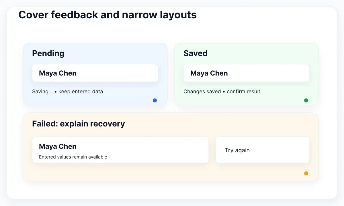
WCAG Use of Color guidance says color cannot be the only visual means of conveying information. Pair a CRM stage or outcome with a meaningful label. “Needs follow-up” should still be understandable without interpreting an amber dot. WCAG Status Messages guidance covers making status updates available to assistive technology without necessarily moving focus. Specify that implementation requirement alongside the visual state.
Set a pending interaction rule for this prototype: retain the entered values and prevent an accidental duplicate submission while the same save is in progress. Then test success and failure with realistic delays. The correct behavior for another product may differ, especially with offline work or optimistic updates. Document the rule instead of assuming a disabled-button drawing proves it exists.
At a narrow width, prioritize the contact name, company and next action. A list of compact record summaries may fit this task better than every desktop column. Preserve a route to the full record and expose controls that desktop users see on hover. If cross-column comparison remains necessary, keep an appropriate table treatment and review it as a separate task.
WCAG Reflow guidance describes the 320 CSS-pixel width condition and exceptions for content requiring two-dimensional layout. Test the surrounding page and edit form as well as the data area. A table exception does not justify horizontal scrolling through navigation or clipping a Save button. Use the responsive-table design guide when comparison is the user's actual job.
Test English and Spanish interface samples independently. “Next follow-up” and “Próximo seguimiento” should fit their intended containers, including error and confirmation messages. Use credible text at the smallest supported width, and test keyboard navigation in the implementation. A tidy desktop frame cannot establish either mobile usability or accessible focus order.
Review the kit with an acceptance specimen
Finish with one traceable specimen that connects the list, record, edit and outcome. Figma variants let designers organize related component configurations. Use named states to make the review reproducible, while keeping prototype behavior and production behavior as separate evidence.
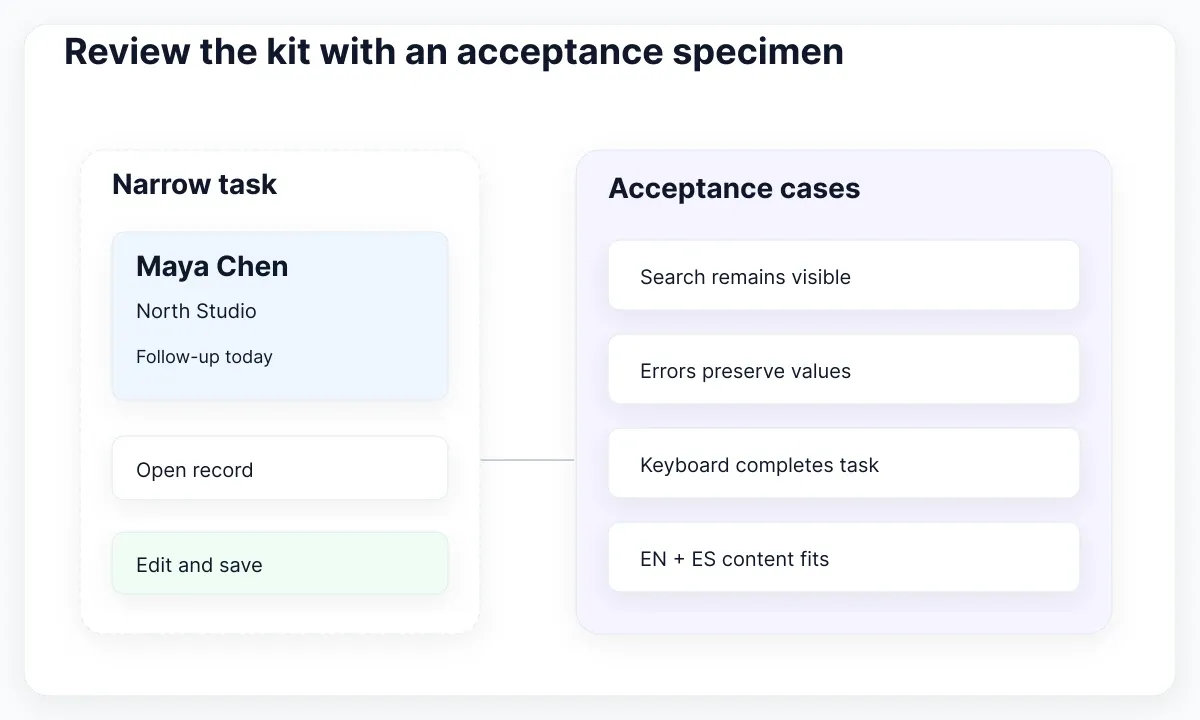
Ask a reviewer to find an assigned contact, open it, change the company, schedule a follow-up and recover from a simulated failed save. Observe where they lose context or cannot predict an action. Capture the issue against the relevant state, with the intended result and the proposed correction. This is a practical evaluation plan, not a measured claim that the kit improves task completion.
Handoff should include the synthetic data set, field rules, state names, layout decisions and unresolved questions. Reference the kit components actually used and identify custom additions. Give engineering an acceptance case for search continuity, selection scope, invalid input, failed save and narrow-layout completion. A screenshot can support each case, but the behavioral requirement must be written too.
- Find Maya Chen with the proposed owner filter; confirm the scope is visible.
- Open the record and change the company without losing contact identity.
- Submit without the required date; check the correction and retained values.
- Simulate a failed save, then retry and confirm the intended change.
- Repeat at a narrow width with keyboard interaction and both locale samples.
Accept the kit for this task when the team can explain the complete path and its recovery states using consistent components. If a crucial gap remains, build a deliberate extension or reduce the first-release scope. This outcome is more actionable than a blanket verdict that a kit is “CRM ready”: it names the workflow you evaluated and the work still needed to ship it.

Pablo Mayoral
Senior UX/UI & Web Designer with 10+ years of experience. Creator of EmviUI (10k+ components Figma design system), UImand, and Vitamin Bootstrap. Currently designing digital products at CQMRewards.