Possible Responsive Table: Variable Columns, Pinned Headers, Mobile
A responsive table can keep dense data usable on a phone without multiplying component variants. Match the narrow layout to the job: compare, scan records, or inspect one item.
Yes. Build one table component with clear data and interaction contracts, then use a few intentional behaviors: contained horizontal scrolling for comparison, labeled stacked records for descriptive rows, or a detail view for secondary fields. Preserve semantic headers, reflow the page, and test keyboard and assistive technology at narrow widths.
Yes. A responsive table can support variable columns, contained horizontal scrolling, a sticky header on long lists, and a mobile view without creating a separate component for every screen size. Keep one data and interaction contract, then choose a few behaviors that match the task. Keep a real table when people compare values across rows or columns; stack labeled records when each row reads like a short profile; move secondary fields to a detail view when they crowd out the decision. These are presentation choices around one model, not unrelated table variants.
Before drawing breakpoints, ask what people compare, what must remain visible while scrolling, and which details can wait until they open a record. Those answers help the component work on desktop, mobile, zoomed screens, and narrow split windows.
Choose the responsive behavior from the user task
A table is useful when row and column relationships make information easier to scan or compare. Begin with the task, not the device label. If a support lead compares ticket owner, priority, and last update across records, a table preserves those relationships. If a field worker reads one customer record at a time, stacked rows may make labels and values easier to follow. If audit fields rarely affect the current decision, a record page or panel may be clearer.
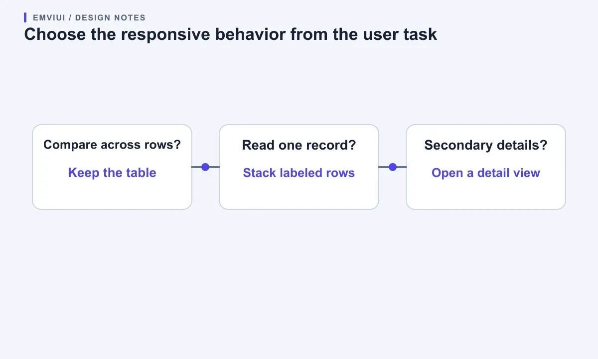
Make a short content inventory: name the entity represented by each row, the decision the screen supports, the fields needed for that decision, and the optional fields. Mark which columns people compare across records. A customer table may need status, renewal date, and amount together for a finance review; a mobile directory may need only name, role, and a contact action. A desktop column does not have to survive just because the data model contains it.
| Pattern | Useful when | Tradeoff |
|---|---|---|
| Contained scroll | People compare values across rows | More side-to-side movement |
| Stacked records | People read one text-heavy record | Slower row comparison |
| Detail view | Secondary fields are lengthy | One extra interaction |
W3C’s reflow guidance recognizes that data tables can require two-dimensional presentation while surrounding page content should still reflow. Its example of placing the table in its own scrollable container keeps that exception at the component boundary instead of causing page-wide horizontal scrolling. The criterion evaluates vertically scrolling content at 320 CSS pixels, with an exception for content whose two-dimensional relationship is necessary; it does not say every table must become cards.
Use the diagram as a first decision, then check the real task with representative data. Ask someone to find a record, compare two values, and take the primary action. If those tasks conflict, offer a clear mode or detail view instead of squeezing every feature into one viewport.
Let the table scroll inside its own frame
Contained horizontal scrolling is often the most honest behavior for dense data. Put the table in a wrapper that can scroll sideways, keep the page itself within the viewport, and let the columns determine the table’s intrinsic width. This preserves alignment and supports cross-row comparison. The U.S. Web Design System recommends a scrollable variant for dense tables with many columns and distinguishes it from text-heavy tables that can stack.
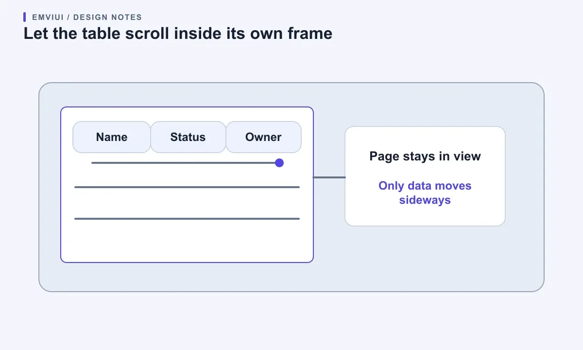
Make the scroll region discoverable. A clipped edge, subtle fade, or short “Scroll table horizontally” hint can show that more columns exist. Keep the first column meaningful where possible: a name, date, or record ID helps people identify the row after moving sideways. Avoid making the first view a sea of unlabelled metrics. If the table sits inside another scrollable region, check that vertical page movement and horizontal table movement remain predictable.
Do not fix the whole page width to preserve a desktop grid. A bounded table wrapper can overflow in one direction while headings, actions, filters, and explanatory text reflow normally. This matters at browser zoom and in a narrow window as well as on a phone. W3C notes that row and column relationships can make a table two-dimensional; that exception does not extend to unrelated text around it.
Pagination and bulk actions need their own mobile treatment. Keep controls near the dataset they affect, label the current range, and make the next action reachable without a long diagonal scan. If the table has many pages, search or a few high-value filters may help people find a record more directly. Do not make the whole toolbar scroll sideways just because the table does.
Use a real table to expose content pressure
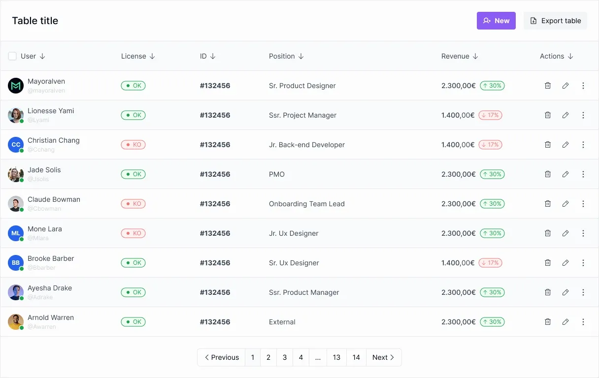
Before designing responsive variants, use realistic values, status lengths, and actions. Placeholder text such as “Item” hides the pressure that makes headers wrap, columns stretch, or controls collide. A useful specimen includes a short and long name, a multiword status, an optional icon, one row action, and enough columns to test a narrow layout.
Stack descriptive records with explicit labels
Stacking works when a row is a compact record and people mainly read one record at a time. At narrow widths, each row can become a card or grouped block: labels remain visible, values follow, and actions sit in a consistent place. USWDS is specific: each cell in its stacked table variant needs a data-label matching the column heading. That label is part of the content contract, not decoration to remove when CSS changes.
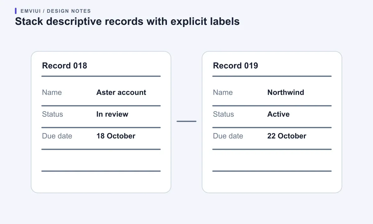
Do not choose cards just because they look modern. A card per row can slow comparisons because one record’s value no longer lines up with the same value in the next. It also increases vertical scrolling. For names and descriptions, that tradeoff may be fine; for a plan comparison, inventory count, or schedule, keeping columns together may matter more. Evaluate both versions with the same task.
Test the stacked view with long labels, missing values, badges, links, and actions. Labels must stay attached to values; nobody should have to infer that a green chip means “Status” because the heading disappeared. If fields are reordered on mobile, preserve a predictable reading order and keep an action near the item it affects.
Some tables have grouped columns or complex headers. A visual card transformation can make those relationships hard to express. Keep the semantic table and offer a labeled record view when the alternative would flatten important structure. The W3C table tutorial explains how header and data cells establish relationships, and when complex tables need explicit associations such as scope, ids, and headers. The display can change while the information architecture remains understandable.
Keep essential columns and move the rest with intent
Classify fields before hiding anything. “Essential” means needed to identify a row or make the screen’s primary decision. “Optional” means useful in some contexts but safe to omit from the default narrow view if users can still reach it. “Detail” means it belongs on an item page, expanded row, or side panel. Hiding a column is not a responsive strategy if the information disappears.
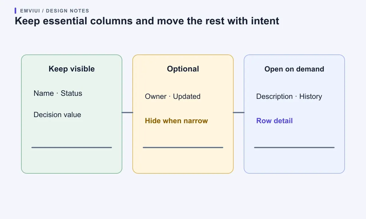
For each width, specify visible columns, minimum widths, and their order. Give long text room to wrap instead of compressing every field equally. Numeric values often benefit from right alignment and stable digit spacing; labels and descriptions need room to wrap. Use a consistent empty-value treatment so a blank cell is not mistaken for a rendering failure.
Column visibility controls can help teams with different tasks, but they add state and decisions. Start with a useful default and a small set of named optional fields. Persist the selection only when the product explains that behavior. Do not create a component variant for every combination of hidden columns; treat visibility as data or a user preference where appropriate and keep the visual system consistent.
If a field is hidden at a breakpoint, document the rule and verify that users can still access it. A details action should say “View record details,” not rely on an unlabeled icon. Make it keyboard reachable and expose the same content in the detail view. Carbon recommends giving dense tables enough space to avoid truncation and treats expansion as a way to show supplementary information. If you truncate, provide a usable accessible path to the complete value.
Design sticky headers and pinned columns carefully
A sticky header can help people keep column labels in view while reading a long table. Use it when there are many rows and people repeatedly need the labels. Keep it inside the table’s scroll context, account for sticky site navigation, and check that it does not cover the row being read or focused.
Pinned columns cost more. A pinned first column can preserve row identity during horizontal movement, but adds layers, shadows, and overlap risks. Before implementing it, test whether the first column alone provides enough context and leaves room to read the next column on a narrow viewport. If the pinned column obscures content or makes the table feel wider, remove it or offer a detail action.
These behaviors can conflict. USWDS explicitly says its sticky-header variant is not compatible with its scrollable or stacked variants. That is a useful warning: combinations that look simple in Figma may require separate code paths or may not be supported by the chosen component system. Decide which combination is needed, test it in the real browser and framework, and document limitations. Do not promise “pinned everywhere” before checking nested scrolling, touch, focus, and zoom.
For a modest list, a normal header may be calmer. Prefer stable reading over motion or a pinned region by default. If people need to search or filter before finding the right row, improve those controls first.
Keep sorting and row actions understandable
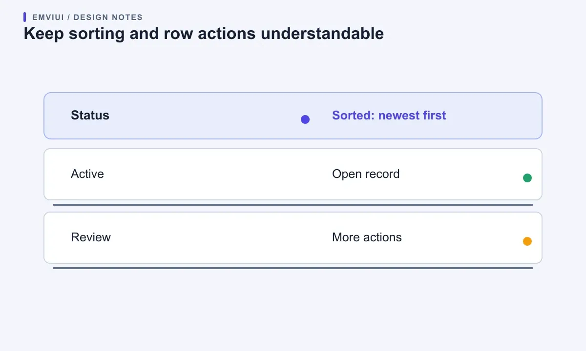
Sorting should communicate both the action and current result. Use a real keyboard-operable control in a sortable header, give it a concise accessible name, and expose the active direction. WAI’s table guidance recommends semantic header cells and clear relationships between headers and data. A sort icon is not enough when direction or active state depends only on color.
Selection, editing, and many in-cell controls can turn a static table into an interactive grid. The WAI-ARIA Authoring Practices grid pattern is a significant keyboard contract: a grid is a composite widget, manages focus movement, and uses arrow-key navigation. It can suit spreadsheet-like editing or highly interactive cells, but adding role=grid does not automatically improve accessibility. If users only open links or buttons in a list, a semantic table with ordinary tab order may be simpler.
Keep row actions identifiable on touch and keyboard. Do not rely on hover-only menus; provide a visible trigger or clear focus treatment. An opened menu needs an accessible name, logical focus entry, and a way to close or return focus. On mobile, a visible “More options” button can be clearer than a tiny kebab icon when links and selection controls share a row.
After sorting, filtering, or loading records, announce meaningful asynchronous changes. Preserve focus when a row is edited or removed, and explain an empty result with a useful next step. Responsive behavior includes these states: loading, empty, filtered, selected, and error.
Build one component contract and test the real breakpoints
Write the contract in plain language before building variants. Define the data model, required and optional fields, header semantics, default sort, selection, row actions, loading and empty states, and which responsive behavior applies to which content type. Describe breakpoints as changes in available space or task needs, not “iPhone” and “tablet.” GOV.UK likewise advises designing for different screen sizes rather than assuming a device and starting general page content with a small-screen single column.
Use representative data: a long value, an empty value, a status, a multiline description, a numeric column, and enough rows to test scrolling. Review desktop, a medium split window, a 320 CSS pixel viewport or equivalent zoom case, and a touch device. Check horizontal table and vertical page movement, focus visibility, screen-reader header announcements, zoom, wrapping, and access to the primary action.
Record which browser and assistive-technology combinations you tested. A screenshot cannot demonstrate keyboard behavior or semantic relationships. Automated checks catch some markup problems, but cannot decide whether stacking harms comparison or a pinned header covers focus. Ask someone to find, compare, and update data while you observe where they lose context.
EmviUI can provide a visual starting point. Its component library includes table cells and responsive variants, and the UI kit versus design system guide explains why a kit is only one layer of a maintained product system. Use the specimen to align hierarchy, row density, and actions. Your team still owns the HTML semantics, data behavior, responsive code, and accessibility checks. A Figma component describes an interface; it does not prove that the shipped table works.
For handoff, connect the table contract to implementation: say which columns remain visible, what scrolls, and which fields move into details. The guides to responsive Figma-to-Tailwind handoff and using Figma for web design help teams communicate decisions across design and code. Keep one component with a few deliberate behaviors, and revisit the contract when tasks or data change.
In short: preserve a true table for comparison, contain horizontal scrolling, stack only descriptive records with repeated labels, and move secondary information to a clear detail path. Test realistic content, keyboard input, zoom, and assistive technology before calling the responsive design complete.
Primary references: W3C reflow guidance; W3C tables tutorial; USWDS table component; GOV.UK table component; WAI-ARIA grid pattern; Carbon data table guidance.

Pablo Mayoral
Senior UX/UI & Web Designer with 10+ years of experience. Creator of EmviUI (10k+ components Figma design system), UImand, and Vitamin Bootstrap. Currently designing digital products at CQMRewards.