Shadcn UI Kit Dashboard: A Practical Component Plan
Turn shadcn/ui blocks into a task-centered SaaS dashboard by defining the shell, component layers, responsive behavior, and states before adding more widgets.

Use shadcn/ui dashboard blocks as editable starting points, not a finished app. Organize the page around a real user task, keep component boundaries clear, define loading/empty/error/access states, adapt the shell to narrow screens, and verify the page with real content before expanding the kit.
Shadcn UI kit dashboard works best as a small set of product-specific modules built from accessible, themeable components—not as one giant page imported unchanged. Start with the user's recurring task, assemble navigation, a page header, a few relevant summaries, one primary work area, and explicit empty/loading/error states. Then adapt the copied source to your product and test the whole layout on narrow screens.
Plan the Dashboard Around Work, Not Widgets
Before selecting blocks, write down the three decisions a user must make in this dashboard. A support lead may need to spot an overdue queue, assign the next case, and see whether the backlog is improving. A billing operator may need a different main table, filters, and summary. The page should make the frequent decision easy; a row of decorative charts does not become useful merely because it looks like a dashboard.
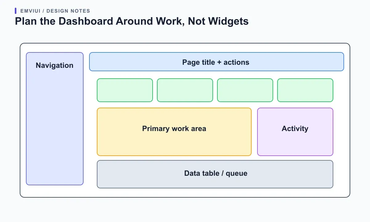
Sketch the screen in task order: global navigation, page identity and scope, a small summary of the most important signals, the primary work surface, then secondary activity or help. Decide which elements must remain available while someone scans or edits data. If a metric does not change a decision, remove it from the first view or place it behind a detail action. This keeps the page from becoming a dashboard-shaped catalog of widgets.
shadcn/ui's official dashboard block is a practical starting specimen: its sample assembles a sidebar, a page header, summary cards, an interactive chart, and a data table from separate files. Treat that composition as an example, not a required recipe. Swap the modules to match a real workflow, and preserve room for the one task people repeat most often.
Build a Clear Component Stack
Keep the dashboard's reusable parts at three understandable levels. Foundations define color, type, spacing, radius, and focus treatment. Components provide a button, field, menu, badge, dialog, or table cell. Product patterns combine those pieces into a filter bar, saved-view control, metric card, or activity row. A page then arranges patterns around one workflow. This model lets a designer adjust a token without confusing it with a product-specific decision.
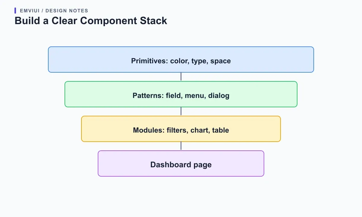
Avoid both extremes: one-off markup for every screen and a universal “Dashboard” component with dozens of unrelated props. If a card repeats the same label, value, trend, and action across several routes, give it a small API. If two cards only look alike but mean different things, keep their names and behavior separate. Consistent anatomy is useful; pretending every product concept is interchangeable creates hidden conditions.
For a team handoff, define the component's purpose, supported states, content limits, and responsive behavior beside the code. Give slots clear names and show realistic examples. A designer can then choose a pattern without knowing every implementation detail, while an engineer can see where the product-specific logic belongs. If Figma and code use the same terms for “filter bar” or “empty queue,” reviews become faster and mismatches easier to catch.
Give the Dashboard a Responsive Shell
Make the page frame work before tuning each chart. A desktop sidebar may stay expanded, collapse to a smaller rail, or become a sheet opened from a header control. Choose based on how often users switch sections and whether the main content needs the recovered width. Keep the page title, current workspace, and primary action visible when navigation changes. A compact menu should still reveal where a link leads and which destination is active.
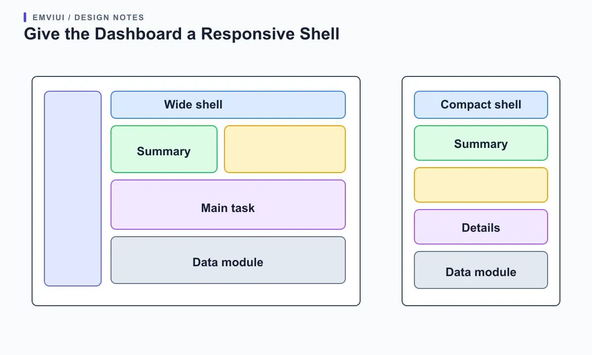
The shadcn/ui Sidebar documentation exposes composition pieces such as a provider, header, scrollable content, groups, footer, trigger, and inset. Those named boundaries are helpful because they make the shell's behavior explicit. Do not copy a desktop width and call the result responsive: test the navigation control, focus return, scrolling, and page width on touch devices as well as with a keyboard.
Let dashboard modules reflow according to the relationships they contain. Summary cards can stack or become a two-column grid; a chart may need a minimum readable plot width; the primary table may keep its own horizontal scroll. W3C's Reflow guidance permits two-dimensional layout for content that needs it, including data tables, while ordinary page content should still fit the viewport. Keep any necessary overflow local.
Specify Empty, Loading, Error, and Permission States
A dashboard kit is incomplete if it shows only successful sample data. For each module, define what people see while data loads, when a search has no matches, when the request fails, and when the current role cannot access a field. Keep the module's footprint stable where that avoids disorienting movement. Use skeletons as a temporary loading cue, not as an imitation of live content that might be mistaken for a real metric.
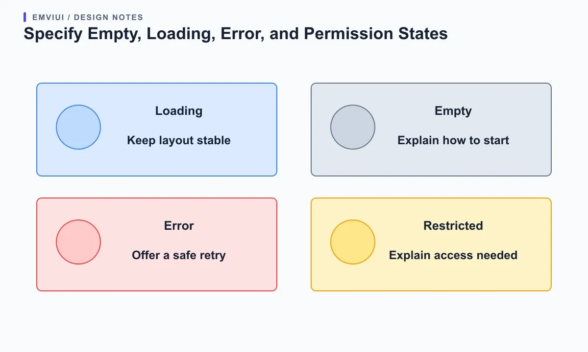
An empty state should explain why it is empty and what action can change that, if the user has permission. “No records match these filters” suggests a reset; “No projects yet” may offer a create action. An error should say whether retrying is safe and avoid discarding unsaved filter or form state. A restricted state should explain the access requirement without leaking private field values. These are different conditions, so do not encode all of them as a blank white card.
Make controls stateful in the implementation and consistent in Figma. Disabled should have a reason when the next step is not obvious; loading should prevent duplicate submissions when relevant; success should confirm the action without relying only on color. Include focus, hover, selected, expanded, and validation-error states in the component notes. Test a full path, such as filtering a queue, opening a record, saving a change, and returning to the updated view.
Keep Charts and Tables Useful and Accessible
Use a chart only when its visual shape helps answer a question faster than a value or small table. Label the measure, period, units, and any comparison baseline. Provide a text summary or accessible data view for the key information. Avoid using color as the only way to distinguish series, and make a chart's tooltip reachable if it contains essential details. A dashboard chart should support a decision, not merely fill the wide column beside a sidebar.
For tables, identify the job first: compare records, scan a status, or act on one row. The shadcn/ui data table guide separates column definitions, table behavior, and the rendering component, which is a useful structure for product code. Add sorting, filters, pagination, and column visibility only when users need them. Define how these controls behave together so changing a filter does not silently reset unrelated state.
Give every interaction a clear name and focus path. Header sorting must communicate which column and direction are active; row actions should identify the record they affect. Use semantic table markup for tabular relationships, and test the most common workflow with a keyboard and screen reader. At narrow widths, keep text and actions reachable. A scrollable data surface can be appropriate, but it should not force the entire dashboard to move sideways.
Theme the Product Through Tokens
Before styling every dashboard module separately, define the small set of roles that should stay coherent: page background, raised surface, primary text, muted text, border, accent, destructive action, focus ring, and chart series. shadcn/ui's theming guide documents CSS variables for semantic roles used across components, including input, ring, chart, and sidebar colors. Reuse role names so light and dark themes can change together.
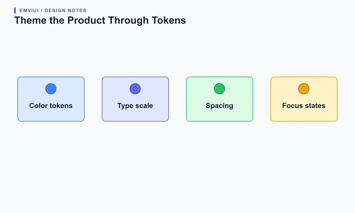
Connect token choices to actual meaning rather than just a palette index. A “success” signal, selected navigation item, or danger action should remain distinct when the theme changes. Check contrast for muted labels, chart series, focus indicators, and disabled controls in each supported theme. If a token changes, review every surface that uses it: badges and chart lines can communicate different things even when they share a hue.
Use EmviUI where its strength fits: it offers a Figma design system and UI components for exploring dashboard layouts, component families, and visual consistency. It is not a drop-in shadcn/ui React registry, so do not treat its Figma library as code that the shadcn CLI installs. The EmviUI component catalogue can help a designer specify the screen, while the team's local shadcn source remains the implementation to adapt and verify.
Verify Fit in a Real Screen Before Expanding
Build one real dashboard route with the most demanding content before adding many blocks. Include the longest workspace name, translated navigation labels, a long table value, an empty result, and a chart with several series. Then inspect the layout at a narrow viewport, browser zoom, and a large desktop. A screenshot with placeholder copy can hide wrapping, truncation, and density problems that users encounter immediately.
Review both structure and behavior: can people tell which section is active, find the primary action, filter the data, recover from an error, and understand what a metric means? Check tab order, visible focus, labels, contrast, and target spacing. Confirm that the sidebar does not cover the main task, dialogs return focus to the control that opened them, and sticky headers do not obscure content. These checks should be part of the component acceptance notes.
Only expand the kit after one page proves the boundaries. Record what is a shared primitive, what is a dashboard pattern, and what remains specific to a route. Keep a short decision log for unusual behavior such as a persistent filter or alternate mobile table view. That gives future contributors a reason to preserve the design and a safe way to extend it without cloning the whole page.
Use EmviUI as a Figma Starting Point
EmviUI can help a team explore dashboard composition in Figma, reuse visual building blocks, and communicate component states before implementation. Its public UI kit material includes dashboards, data tables, charts, navigation, and other interface families. For a concrete starting point, see the EmviUI Figma UI kit; confirm current files and license terms for your use. The implementation remains a separate job: adapt the local shadcn source to your design, data, framework, and accessibility needs.
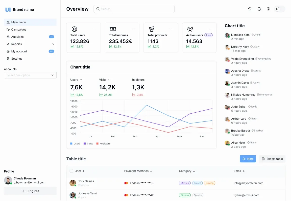
The image below is an EmviUI dashboard specimen, not a shadcn/ui screenshot. Names, metrics, and chart values shown in that sample are illustrative design content, not real EmviUI analytics or pricing. Use the screen to discuss hierarchy—navigation, summary cards, chart, table, and activity—and replace the sample with the SaaS workflow your users need. Our Figma dashboard UI kit guide helps plan that design-side starting point.
For a broader selection checklist, continue with how to choose a Tailwind UI kit or a practical plan for making your own UI kit. Keep the boundary clear: visual references support design decisions, copied shadcn source supplies a code starting point, and a production dashboard needs your own data, permissions, interactions, and quality checks.
The shadcn/ui project setup guide explains how its CLI adds component source files to an application for direct customization.

Pablo Mayoral
Senior UX/UI & Web Designer with 10+ years of experience. Creator of EmviUI (10k+ components Figma design system), UImand, and Vitamin Bootstrap. Currently designing digital products at CQMRewards.