Tailwind CSS vs CSS: How to Structure Interface Styles
Tailwind generates CSS from utility classes; direct CSS lets you organize your own selectors and declarations. Choose the approach that makes component ownership, responsive rules, states, and the next maintenance change clear. A bounded screen test can justify a hybrid approach.
Tailwind generates CSS from utility classes; direct CSS lets you organize your own selectors and declarations. Choose the approach that makes component ownership, responsive rules, states, and the next maintenance change clear. A bounded screen test can justify a hybrid approach.
Tailwind CSS vs CSS is a choice about how you author interface styles: Tailwind generates CSS from utility classes, while writing CSS directly lets you define your own selectors and rules. Both ultimately use the browser’s CSS layout, cascade, and rendering engine. Choose utilities when a shared vocabulary makes repeated interface work easier; choose direct CSS when a clear stylesheet is the better home for a particular relationship or behavior. A project can use both.
Start with one representative screen rather than a rewrite. Build the same card, form controls, narrow layout, and keyboard focus states using the approach your team can maintain. The useful question is which version makes the next product change understandable. This guide uses small examples and an acceptance checklist; it does not assume that either approach guarantees speed, accessibility, or smaller production assets.
Two authoring paths, one browser
In the official utility guide, Tailwind’s model is to compose presentational classes in markup. With direct CSS, you can attach a component class and put its declarations in a stylesheet. The visible control can be identical; the location and organization of the decisions differ.
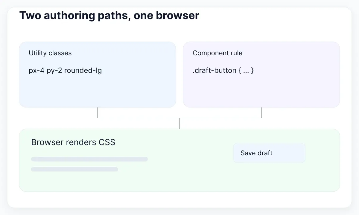
Consider a compact “Save draft” button. A utility version might use rounded-lg px-4 py-2 font-medium. A direct CSS version might use .draft-button with border-radius: .5rem; padding: .5rem 1rem; font-weight: 500. Neither name tells you whether saving works. Keep a real button element, a meaningful label, and the application event logic separate from the presentation choice.
Utilities expose decisions where the element is assembled. A component class provides a named boundary and lets related selectors live together. Long class lists can become difficult to review; an oversized stylesheet can hide dependencies. These are maintenance problems to address in the design of the codebase, rather than evidence that one syntax is inherently unsuitable.
For a team exercise, ask a second developer to change the button’s padding and focus treatment without a verbal walkthrough. Record which file they opened, whether another control changed unexpectedly, and whether the patch was easy to inspect. This is a useful local comparison, not a universal benchmark. Keep the same HTML and acceptance criteria in both versions so the exercise measures organization rather than different product requirements.
Choose the home for each style decision
Use a small decision table to assign ownership before writing the screen. Repeated values belong to a shared vocabulary; a component’s states belong to its contract; unusual content relationships need an explicit styling boundary. Tailwind also documents adding custom CSS, so adopting utilities does not require avoiding stylesheets.
| Decision | Utility approach | Direct CSS approach |
|---|---|---|
| Card spacing | Compose approved spacing classes | Use shared spacing variables in a card rule |
| Button appearance | Keep complete class sets inside the button component | Keep base and state selectors beside each other |
| Editorial content | Apply a bounded prose treatment | Scope headings and lists beneath a content class |
| One unusual layout | Use a readable arbitrary value if appropriate | Write a focused layout rule |
Do not choose a framework solely because a mockup has many cards. Instead, consider whether your application already has components, which build tools it uses, how colleagues inspect styles, and who will update the interface next year. If a small static page has a readable stylesheet and no recurring styling problem, a migration needs a more specific benefit than fashionable syntax.
For a product with many repeated settings panels, utilities can make local composition convenient. Still centralize the shared button rather than copying its full class list into every screen. With direct CSS, avoid expanding a generic class until unrelated features depend on it. In both approaches, document a small public API such as appearance, size, and disabled state. This is a recommendation for maintainable ownership, not a prescribed component architecture.
Build the narrow layout first
Tailwind’s responsive documentation explains that unprefixed classes apply across sizes and breakpoint-prefixed classes apply at that breakpoint and above. Direct CSS can express the corresponding condition with a media query. The important design decision is where the content needs to change, not whether the condition lives in markup or a stylesheet.
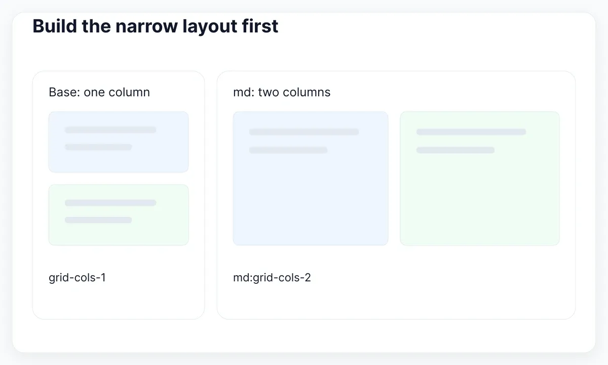
For example, grid grid-cols-1 md:grid-cols-2 starts with one column and switches to two at the configured medium breakpoint. A direct CSS version could set grid-template-columns: 1fr, then change it inside @media (min-width: 48rem). That value corresponds to Tailwind’s default medium breakpoint; inspect your project’s theme before assuming it is unchanged. These snippets demonstrate the layout rule, not a complete production card.
Use realistic content in the test: a long account name, a translated button label, a missing avatar, and a message that wraps over several lines. A pair of cards that looks balanced with short English placeholders may fail when the actual data arrives. At the narrow size, keep the action near the content it affects and check that a fixed width does not force an unintended horizontal scrollbar.
Resize between your chosen test widths, not just at the endpoints. Watch for the moment labels wrap or actions collide. Decide whether the card should grow vertically, whether controls should stack, and whether a container-based rule would better suit a reusable module. For table-specific behavior, continue with the responsive table design guide. A breakpoint is an implementation condition, not proof that every intermediate width works.
Specify states before polishing colors
A button needs more than its resting appearance. Tailwind provides state variants such as hover, focus-visible, and disabled; direct CSS uses the corresponding selectors. W3C’s Focus Visible explanation requires a visible keyboard focus indicator for the relevant keyboard-operable interface. A color utility alone does not establish that behavior.
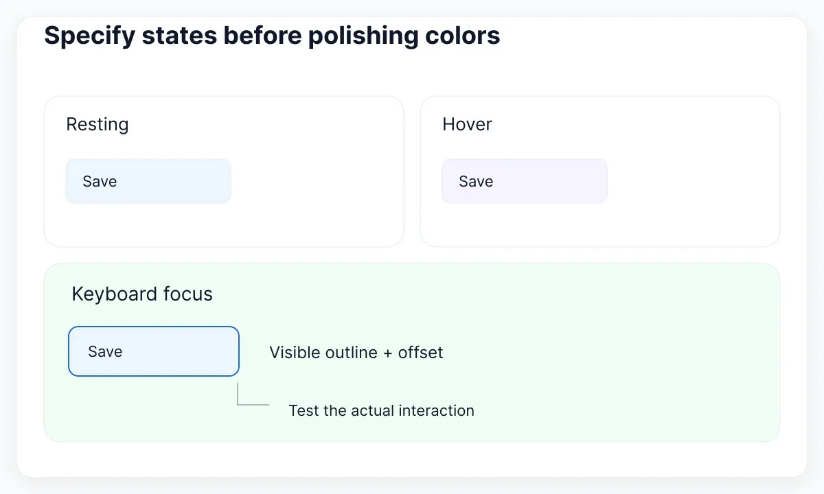
Write the expected interaction beside each visual state. Resting: the action is available. Hover: the pointer is over an available control. Focus: the keyboard user can locate the control. Disabled: the action is currently unavailable. Loading: the application is processing the action and must explain what happens to further activation. Do not treat loading and disabled as interchangeable without deciding how the user receives progress information.
For a utility specimen, focus-visible:outline-2 focus-visible:outline-offset-2 expresses part of a focus treatment. In CSS, a :focus-visible rule can express the same outline and offset. Add a deliberate color, then inspect the actual rendered result against the surrounding surface. The classes are a starting point; they are not an accessibility certification. Check keyboard navigation and the product’s complete interaction behavior.
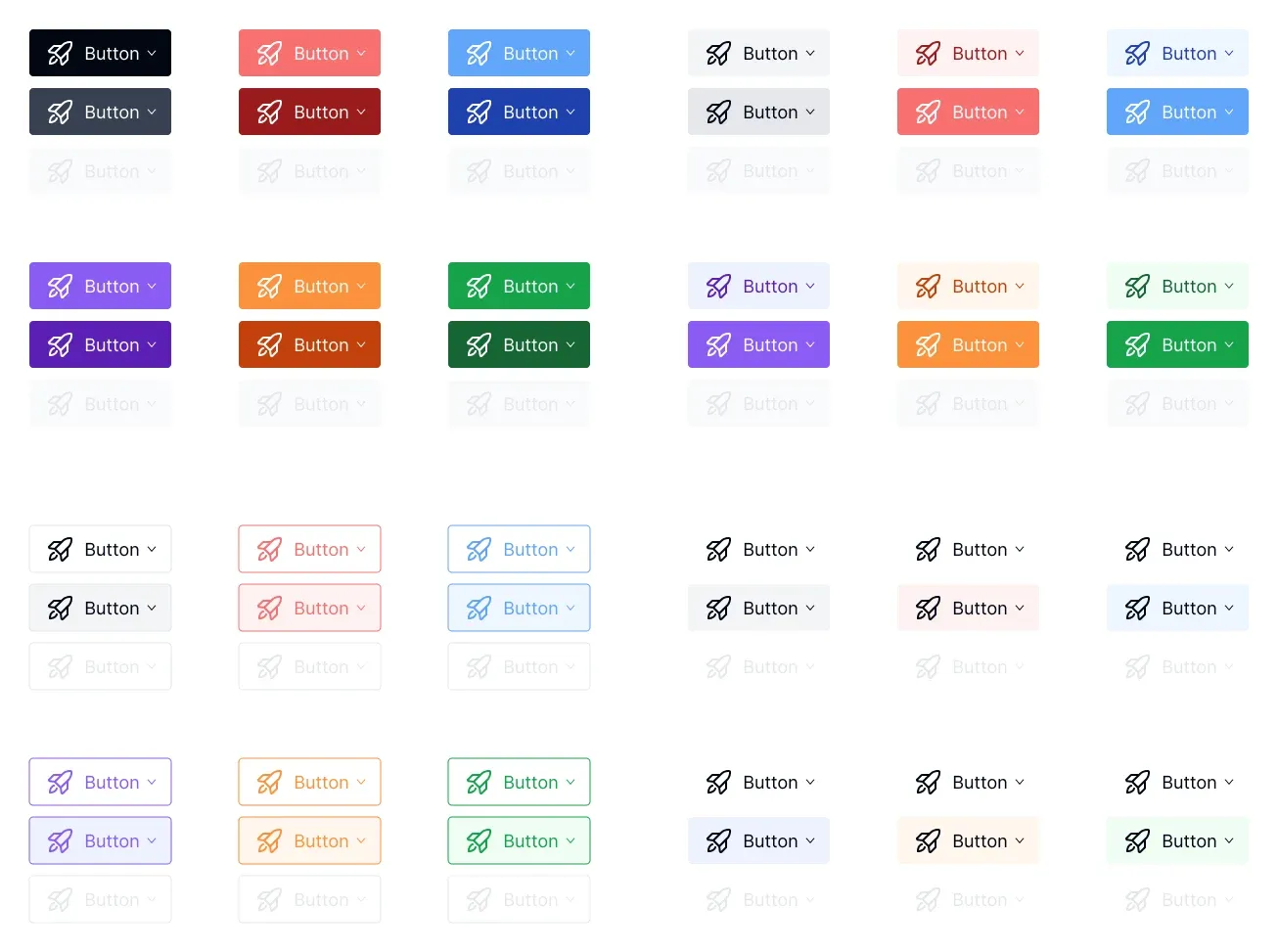
The inspected EmviUI button specimen below gives a concrete set of appearance variations to discuss. Its pale and saturated rows should not be used to infer undocumented behaviors. Use the EmviUI component catalogue to choose a visual reference, then document your implementation’s actual states, labels, and events. EmviUI helps establish design intent; it does not turn this image into working Tailwind code or supply the application’s loading logic.
Choose one appearance for the exercise instead of reproducing every color. Test it on both the primary page surface and a contained panel. If the design depends on a hover cue, decide how the same action remains understandable on touch. Keep the textual label stable unless the task requires a change, and explain changes such as “Saving” to the people implementing and reviewing the flow.
Keep dynamic variants detectable
Tailwind’s source detection guide says the scanner reads source text rather than evaluating your program. It needs complete class names. Building a name such as bg- plus a runtime color plus -600 can leave the expected class absent from the generated stylesheet.
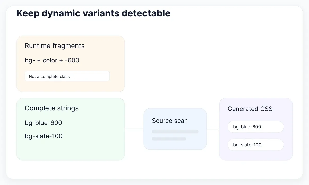
Map allowed component appearances to complete strings instead: primary: "bg-blue-600 text-white" and quiet: "bg-slate-100 text-slate-900". Keep those strings in scanned source files. The application can select a string dynamically; the scanner can still see both complete choices. If you use a shared package, verify that its sources are included by the project’s detection configuration instead of assuming a local demo proves the production build.
Direct CSS has a different boundary: selectors and declarations must be delivered to the page, and state must select the intended rule. A component can choose between button--primary and button--quiet, with both rules present in its stylesheet. For arbitrary data-driven values, consider a controlled custom property rather than manufacturing unlimited style variants. Establish the allowed data format and validation in the application.
Add a production-build smoke check for every supported appearance. Open the built page, activate each state, and inspect its computed styles. This catches a class that works during one development experiment but disappears in the real pipeline. Do not add dozens of speculative states to avoid making a decision: publish the supported set and extend it when a concrete product need appears.
Debug the cascade, then decide what to extract
Tailwind still produces CSS, so conflicting declarations follow the browser’s cascade. MDN’s cascade introduction explains that importance, origins, layers, specificity, and other ordering rules determine which declaration wins. Simply moving two class names around in the HTML is not a dependable conflict-resolution policy.
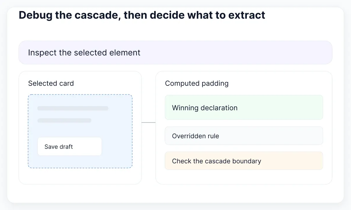
When a card’s padding is wrong, select the element in browser developer tools and inspect the winning padding declaration. Note which rule lost and why. Check whether the problem comes from a component default, a global selector, a utility, or an inline value. Fix the boundary that owns the decision. Adding another override may make the screenshot look correct while leaving the ownership unclear for the next change.
Keep shared values explicit. Tailwind’s theme variables documentation shows how theme variables drive utilities; direct CSS can reference custom properties from your own rules. Agree which values represent approved spacing, typography, and color roles before copying arbitrary numbers throughout the interface. The design-token introduction explains that vocabulary, while the UI kit creation guide helps define the design-side inventory.
Extract a component when the same meaning and behavior recur, not merely when two strings happen to match. Two “Save” actions may share one button contract; a toolbar control and a destructive confirmation may need different expectations. Keep exceptions visible and explain them in the component documentation. Avoid exposing every low-level spacing choice as a public prop just to make one screen fit.
Run a bounded adoption test
Choose one real interface slice and make the decision reviewable. A useful candidate is an account-settings panel with a heading, two fields, a status message, and one save action. Keep the existing screen as a baseline, use the same content, and record which approach you are testing. Do not combine a styling migration with an unrelated redesign.
- Define acceptance cases: narrow width, long text, keyboard focus, disabled action, and a failed save.
- Implement the visual rules with one clear owner per component and a small set of shared values.
- Run the production build and verify every supported variant in the delivered page.
- Ask another maintainer to make one realistic change and review the resulting diff.
- Record remaining exceptions and choose whether to extend, keep, or stop the trial.
Compare outcomes that matter to this project: whether the change was understandable, whether regressions appeared elsewhere, and whether the implementation preserved the agreed behavior. Measure asset size if it affects your delivery budget, using the actual build; do not turn an assumed framework benefit into a factual claim. Keep screenshots of the acceptance cases so the review can compare the same conditions.
A hybrid result is valid. You may keep utilities for ordinary component composition and direct CSS for scoped editorial content or a specialized layout. The useful outcome is a documented boundary that colleagues can follow. Revisit it when the product’s requirements change, using the same small test instead of restarting an ideological debate about class names.

Pablo Mayoral
Senior UX/UI & Web Designer with 10+ years of experience. Creator of EmviUI (10k+ components Figma design system), UImand, and Vitamin Bootstrap. Currently designing digital products at CQMRewards.