Components
Badge
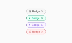
A badge (or tag) is a small UI item that indicates status, notifications, or events, typically appearing next to the related object.
Components
A badge (or tag) is a small UI item that indicates status, notifications, or events, typically appearing next to the related object.
Badges are perfect for indicating status updates. Whether it's showing an online/offline status, availability, or any other state, badges provide immediate, at-a-glance information. This helps users quickly understand the status of different elements without needing to click or navigate further, improving the overall user experience.
Badges are commonly used to highlight notifications or alerts. They often appear with numbers to show unread messages, pending tasks, or new updates. This visual cue ensures users don't miss important information and can promptly address notifications, making their interaction with your site more efficient and responsive.
Badges are also great for marking events or special conditions. They can denote new features, limited-time offers, or any event that requires attention. Placing a badge next to an item can draw users’ focus to it, ensuring they notice and engage with important content. Our UI kit includes versatile badge components that can be customized to fit various needs, enhancing both functionality and aesthetics of your design.
 Free
Free
8 Variants
 Free
Free
16 Variants
96 Variants
 Free
Free
1128 Variants
 Free
Free
36 Variants
 Free
Free
340 Variants
336 Variants
 Free
Free
960 Variants
86 Variants
70 Variants
 Free
Free
128 Variants
 Free
Free
100 Variants
 Free
Free
2404 Variants
 Free
Free
16 Variants
 Free
Free
256 Variants
 Free
Free
12 Variants
 Free
Free
20 Variants
 Free
Free
50 Variants
 Free
Free
896 Variants
196 Variants
 Free
Free
784 Variants
 Free
Free
840 Variants

149 Variants

22 Variants
 Free
Free
50 Variants
 Free
Free
1792 Variants
 Free
Free
64 Variants

6 Variants
256 Variants
 Free
Free
64 Variants
580 Variants
 Free
Free
144 Variants

36 Variants

7 Variants

441 Variants

8 Variants
 Free
Free
14 Variants
 Free
Free
12 Variants

16 Variants
32 Variants