Components
Modal
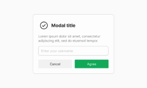
Modals are large UI elements that overlay an application's main window with a transparent layer, requiring user interaction to return to the main interface.
Components
Modals are large UI elements that overlay an application's main window with a transparent layer, requiring user interaction to return to the main interface.
Modals (also known as modal windows, overlays, and dialogs) are designed to sit on top of an application's main window. They interrupt the main interface to capture the user's full attention for critical tasks or information. This makes them ideal for notifications, forms, or alerts that require immediate user interaction.
Modals are often used to provide a focused interaction point within an application. With a layer of transparency behind them, modals allow users to glimpse the main app while keeping the attention on the modal content. This setup ensures users do not get distracted by other elements of the interface, making it easier to complete tasks such as filling out forms, confirming actions, or reading important messages.
To return to the application's main interface, users must interact with the modal layer. This interaction could be in the form of clicking a button, filling out a form, or dismissing the message. This requirement ensures that users acknowledge and address the content within the modal before proceeding, which is crucial for tasks that demand user confirmation or input. Our UI kit includes a variety of customizable modal components to suit different needs, ensuring a seamless and effective user experience.
 Free
Free
8 Variants
 Free
Free
16 Variants
96 Variants
 Free
Free
1128 Variants
 Free
Free
36 Variants
 Free
Free
340 Variants
336 Variants
 Free
Free
960 Variants
86 Variants
70 Variants
 Free
Free
128 Variants
 Free
Free
100 Variants
 Free
Free
2404 Variants
 Free
Free
16 Variants
 Free
Free
256 Variants
 Free
Free
12 Variants
 Free
Free
20 Variants
 Free
Free
50 Variants
 Free
Free
896 Variants
196 Variants
 Free
Free
784 Variants
 Free
Free
840 Variants

149 Variants

22 Variants
 Free
Free
50 Variants
 Free
Free
1792 Variants
 Free
Free
64 Variants

6 Variants
256 Variants
 Free
Free
64 Variants
580 Variants
 Free
Free
144 Variants

36 Variants

7 Variants

441 Variants

8 Variants
 Free
Free
14 Variants
 Free
Free
12 Variants

16 Variants

32 Variants