Components
Button
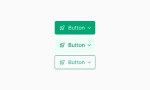
Buttons are essential interactive elements in any UI, available in various shapes and sizes, used for actions like forms, sign-ups, and log-ins.
Components
Buttons are essential interactive elements in any UI, available in various shapes and sizes, used for actions like forms, sign-ups, and log-ins.
Buttons are crucial for driving user actions on a website or app. They prompt users to complete forms, make purchases, sign up for newsletters, log in to accounts, and more. Their prominent and clickable design makes them easy to spot and interact with, ensuring that users can easily perform key actions that drive engagement and conversions.
Buttons come in various shapes and sizes, making them versatile components in UI design. They can be styled to fit the overall aesthetic of your site, whether you prefer rounded corners, sharp edges, large buttons for emphasis, or smaller buttons for subtlety. This flexibility allows designers to create a cohesive look while ensuring buttons stand out and are easy to find.
Well-designed buttons enhance the user experience by providing clear, actionable prompts. They guide users through the interface, indicating what to do next. Effective use of color, size, and labeling can make buttons more intuitive, reducing confusion and helping users navigate your site or app effortlessly. Our UI kit includes a variety of button styles and configurations, allowing you to create a user-friendly and visually appealing interface that meets all your interactive needs.
 Free
Free
8 Variants
 Free
Free
16 Variants
96 Variants
 Free
Free
1128 Variants
 Free
Free
36 Variants
 Free
Free
340 Variants
336 Variants
 Free
Free
960 Variants
86 Variants
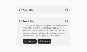
70 Variants
 Free
Free
128 Variants
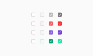 Free
Free
100 Variants
 Free
Free
2404 Variants
 Free
Free
16 Variants
 Free
Free
256 Variants
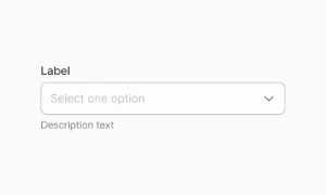 Free
Free
12 Variants
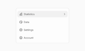 Free
Free
20 Variants
 Free
Free
50 Variants
 Free
Free
896 Variants
196 Variants
 Free
Free
784 Variants
 Free
Free
840 Variants

149 Variants

22 Variants
 Free
Free
50 Variants
 Free
Free
1792 Variants
 Free
Free
64 Variants

6 Variants
256 Variants
 Free
Free
64 Variants
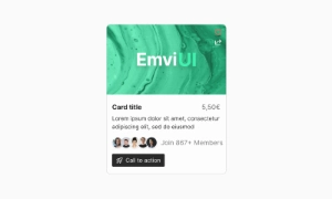
580 Variants
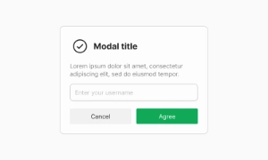 Free
Free
144 Variants

36 Variants

7 Variants

441 Variants

8 Variants
 Free
Free
14 Variants
 Free
Free
12 Variants

16 Variants
32 Variants