Components
Select
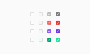
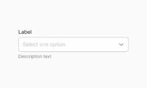
The UI-select component enables single or multiple selections from a collection of items. It can be configured in single mode (no checkboxes) or multiple mode (checkboxes displayed).
Components
The UI-select component enables single or multiple selections from a collection of items. It can be configured in single mode (no checkboxes) or multiple mode (checkboxes displayed).
The UI-select component offers flexible selection options by enabling both single and multiple selections from a collection of items. This versatility makes it suitable for various use cases, from choosing a single option in a form to selecting multiple items from a list.
The UI-select component can be configured in two distinct modes to cater to different needs. In Single mode, users can select one item without checkboxes, providing a clean and straightforward interface for single selections. In Multiple mode, checkboxes are displayed next to each item, allowing users to select multiple items at once. This dual functionality ensures that the UI-select component can adapt to various application requirements.
The UI-select component extends all abstract configuration, making it highly customizable and adaptable to specific design needs. Developers can configure the component to match the look and feel of their application, ensuring a seamless integration. Our UI kit includes customizable UI-select components that can be easily tailored for single or multiple selection scenarios, providing a user-friendly way to handle item selection.
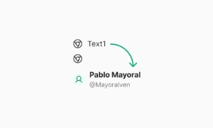 Free
Free
8 Variants
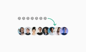 Free
Free
16 Variants
96 Variants
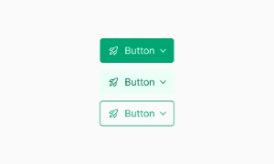 Free
Free
1128 Variants
 Free
Free
36 Variants
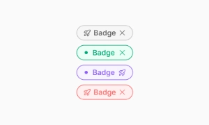 Free
Free
340 Variants
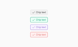
336 Variants
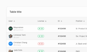 Free
Free
960 Variants
86 Variants
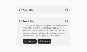
70 Variants
 Free
Free
128 Variants
 Free
Free
100 Variants
 Free
Free
2404 Variants
 Free
Free
16 Variants
 Free
Free
256 Variants
 Free
Free
12 Variants
 Free
Free
20 Variants
 Free
Free
50 Variants
 Free
Free
896 Variants
196 Variants
 Free
Free
784 Variants
 Free
Free
840 Variants

149 Variants

22 Variants
 Free
Free
50 Variants
 Free
Free
1792 Variants
 Free
Free
64 Variants

6 Variants
256 Variants
 Free
Free
64 Variants
580 Variants
 Free
Free
144 Variants

36 Variants

7 Variants

441 Variants

8 Variants
 Free
Free
14 Variants
 Free
Free
12 Variants

16 Variants

32 Variants