Components
Error
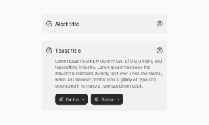
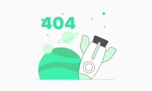
An error state is a UI element that informs users something went wrong, playing a crucial role in UX by communicating issues between the system and the user.
Components
An error state is a UI element that informs users something went wrong, playing a crucial role in UX by communicating issues between the system and the user.
Empty states help explain the situation to users when there is nothing to display. For instance, a new Dropbox screen with no files or folders informs the user that they haven't added any content yet. This clarity helps users understand the current state of the application and what they need to do next.
Empty states are an opportunity to encourage user action. They can include prompts or suggestions to guide users on what to do next, such as adding their first file in Dropbox or creating a new task in a to-do list manager. These prompts can make the empty state feel more purposeful and engaging, motivating users to interact with the app.
Empty states enhance the user experience by preventing confusion. Instead of displaying a blank screen, a thoughtfully designed empty state provides context and direction. This improves the overall usability of the product, ensuring users know what to expect and how to proceed. Our UI kit includes customizable empty state components to fit various scenarios, making your application more user-friendly and intuitive.
 Free
Free
8 Variants
 Free
Free
16 Variants
96 Variants
 Free
Free
1128 Variants
 Free
Free
36 Variants
 Free
Free
340 Variants
336 Variants
 Free
Free
960 Variants
86 Variants
70 Variants
 Free
Free
128 Variants
 Free
Free
100 Variants
 Free
Free
2404 Variants
 Free
Free
16 Variants
 Free
Free
256 Variants
 Free
Free
12 Variants
 Free
Free
20 Variants
 Free
Free
50 Variants
 Free
Free
896 Variants
196 Variants
 Free
Free
784 Variants
 Free
Free
840 Variants

149 Variants

22 Variants
 Free
Free
50 Variants
 Free
Free
1792 Variants
 Free
Free
64 Variants

6 Variants
256 Variants
 Free
Free
64 Variants
580 Variants
 Free
Free
144 Variants

36 Variants

7 Variants

441 Variants

8 Variants
 Free
Free
14 Variants
 Free
Free
12 Variants

16 Variants
32 Variants