Components
Navbarr app
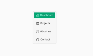
A bottom navbar is a UI element in mobile apps that displays navigation controls in a responsive row at the bottom of the screen.
Components
A bottom navbar is a UI element in mobile apps that displays navigation controls in a responsive row at the bottom of the screen.
A bottom navbar is a crucial UI element that provides the structural architecture for mobile applications. Positioned at the bottom of the screen, it offers easy access to in-app navigation controls, allowing users to move seamlessly between different sections of the app.
Bottom navbars enhance the user experience by keeping essential navigation controls within easy reach. This placement is especially ergonomic for mobile users, as it aligns with natural thumb movements. The responsive design ensures that the navbar adapts to different screen sizes, maintaining functionality across various devices.
The bottom navbar helps organize app content by providing a clear and consistent navigation structure. Each icon or button in the navbar represents a primary section of the app, such as Home, Search, Profile, or Settings. This organization allows users to quickly find and access the main features, improving overall usability. Our UI kit includes customizable bottom navbar components, enabling you to create an intuitive and visually appealing navigation experience for your mobile application.
 Free
Free
8 Variants
 Free
Free
16 Variants
96 Variants
 Free
Free
1128 Variants
 Free
Free
36 Variants
 Free
Free
340 Variants
336 Variants
 Free
Free
960 Variants
86 Variants
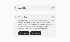
70 Variants
 Free
Free
128 Variants
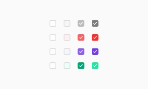 Free
Free
100 Variants
 Free
Free
2404 Variants
 Free
Free
16 Variants
 Free
Free
256 Variants
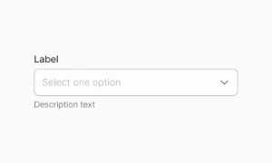 Free
Free
12 Variants
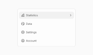 Free
Free
20 Variants
 Free
Free
50 Variants
 Free
Free
896 Variants
196 Variants
 Free
Free
784 Variants
 Free
Free
840 Variants

149 Variants

22 Variants
 Free
Free
50 Variants
 Free
Free
1792 Variants
 Free
Free
64 Variants

6 Variants
256 Variants
 Free
Free
64 Variants
580 Variants
 Free
Free
144 Variants

36 Variants

7 Variants

441 Variants

8 Variants
 Free
Free
14 Variants
 Free
Free
12 Variants

16 Variants

32 Variants