Components
Stepper
A Stepper is a UI component that guides users through a sequence of numbered steps, providing a clear indication of progress and facilitating a wizard-like workflow.
Components
A Stepper is a UI component that guides users through a sequence of numbered steps, providing a clear indication of progress and facilitating a wizard-like workflow.
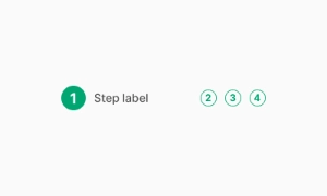
The Stepper component is essential for breaking down complex processes into manageable steps within user interfaces. It visually represents progression through a series of logical and numbered steps, ensuring users have a clear understanding of their current position and the overall workflow.
Beyond progression, Steppers can also serve as a navigation aid, allowing users to backtrack to previous steps or skip ahead to subsequent ones. This flexibility accommodates varying user needs and preferences, providing a seamless and intuitive navigation experience.
Modern Stepper components offer customization options such as step labels, icons, animations, and progress indicators. This allows designers to tailor the appearance and behavior of the Stepper to match the overall visual identity and usability requirements of their application.
 Free
Free
8 Variants
 Free
Free
16 Variants
96 Variants
 Free
Free
1128 Variants
 Free
Free
36 Variants
 Free
Free
340 Variants
336 Variants
 Free
Free
960 Variants
86 Variants

70 Variants
 Free
Free
128 Variants
 Free
Free
100 Variants
 Free
Free
2404 Variants
 Free
Free
16 Variants
 Free
Free
256 Variants
 Free
Free
12 Variants
 Free
Free
20 Variants
 Free
Free
50 Variants
 Free
Free
896 Variants
196 Variants
 Free
Free
784 Variants
 Free
Free
840 Variants

149 Variants

22 Variants
 Free
Free
50 Variants
 Free
Free
1792 Variants
 Free
Free
64 Variants

6 Variants

256 Variants
 Free
Free
64 Variants

580 Variants
 Free
Free
144 Variants

36 Variants

7 Variants

441 Variants

8 Variants
 Free
Free
14 Variants
 Free
Free
12 Variants

16 Variants

32 Variants