Components
Button group
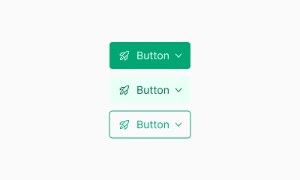
Button groups combine multiple buttons into toolbars or split buttons, useful for creating complex components and mini “tabs” in the UI.
Components
Button groups combine multiple buttons into toolbars or split buttons, useful for creating complex components and mini “tabs” in the UI.
Button groups help in organizing multiple actions into a single, cohesive toolbar. This makes it easier for users to access and perform different tasks without having to navigate through separate sections. By grouping related buttons together, you create a more streamlined and intuitive interface, enhancing the overall user experience.
Button groups enhance functionality by enabling complex components like split buttons or dropdowns. These elements can provide additional options or actions related to a primary button, making your UI more versatile and powerful. This is particularly useful for tasks that require multiple steps or for offering secondary actions that complement the main action.
Button groups are also great for acting as mini “tabs” within the UI. For instance, they can be used to switch between different date ranges in a calendar app or to toggle between various data views. This allows users to quickly and easily switch contexts without leaving the current screen, improving efficiency and usability. Our UI kit includes customizable button group components that can be tailored to fit any design, ensuring both functionality and aesthetic appeal.
 Free
Free
8 Variants
 Free
Free
16 Variants
96 Variants
 Free
Free
1128 Variants
 Free
Free
36 Variants
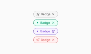 Free
Free
340 Variants
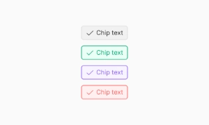
336 Variants
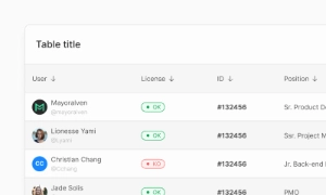 Free
Free
960 Variants
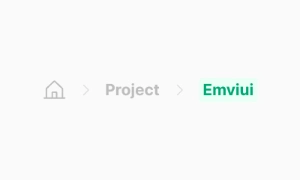
86 Variants
70 Variants
 Free
Free
128 Variants
 Free
Free
100 Variants
 Free
Free
2404 Variants
 Free
Free
16 Variants
 Free
Free
256 Variants
 Free
Free
12 Variants
 Free
Free
20 Variants
 Free
Free
50 Variants
 Free
Free
896 Variants
196 Variants
 Free
Free
784 Variants
 Free
Free
840 Variants

149 Variants

22 Variants
 Free
Free
50 Variants
 Free
Free
1792 Variants
 Free
Free
64 Variants

6 Variants
256 Variants
 Free
Free
64 Variants
580 Variants
 Free
Free
144 Variants

36 Variants

7 Variants

441 Variants

8 Variants
 Free
Free
14 Variants
 Free
Free
12 Variants

16 Variants
32 Variants