Components
Card
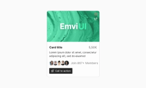
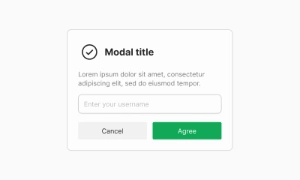
A "card" is a UI design pattern that groups related information in a flexible-size container, visually resembling a playing card.
Components
A "card" is a UI design pattern that groups related information in a flexible-size container, visually resembling a playing card.
Cards are excellent for organizing content in a visually appealing and structured way. They can contain various types of information such as images, text, and links, making them versatile components. By grouping related information, cards help users quickly understand and interact with the content, improving the overall user experience.
Cards offer great flexibility in design. They can adapt to different screen sizes and layouts, ensuring your content looks good on any device. This responsive nature makes cards ideal for modern web and app designs, where users might access content from a variety of devices. You can use cards for anything from product listings to blog posts, adapting their size and content as needed.
Cards improve the visual appeal of your site or app by breaking up content into manageable, attractive sections. The card layout is easy on the eyes and helps prevent information overload. By using cards, you can create a clean, organized, and engaging interface that encourages users to explore more. Our UI kit includes a range of customizable card components to suit various needs, enhancing both the functionality and aesthetics of your design.
 Free
Free
8 Variants
 Free
Free
16 Variants
96 Variants
 Free
Free
1128 Variants
 Free
Free
36 Variants
 Free
Free
340 Variants
336 Variants
 Free
Free
960 Variants
86 Variants
70 Variants
 Free
Free
128 Variants
 Free
Free
100 Variants
 Free
Free
2404 Variants
 Free
Free
16 Variants
 Free
Free
256 Variants
 Free
Free
12 Variants
 Free
Free
20 Variants
 Free
Free
50 Variants
 Free
Free
896 Variants
196 Variants
 Free
Free
784 Variants
 Free
Free
840 Variants

149 Variants

22 Variants
 Free
Free
50 Variants
 Free
Free
1792 Variants
 Free
Free
64 Variants

6 Variants
256 Variants
 Free
Free
64 Variants
580 Variants
 Free
Free
144 Variants

36 Variants

7 Variants

441 Variants

8 Variants
 Free
Free
14 Variants
 Free
Free
12 Variants

16 Variants
32 Variants