Components
Shadow
Drop shadows create the illusion of an element lifting off the background, providing a subtle sense of elevation and a three-dimensional effect.
Components
Drop shadows create the illusion of an element lifting off the background, providing a subtle sense of elevation and a three-dimensional effect.
Drop shadows are used in UI design to create visual depth by giving the illusion that an element is lifting off the background. This effect is achieved by casting a shadow in the direction opposite to the light source, which helps to highlight the separation between the element and its background.
By casting shadows, drop shadows enhance the separation between elements. This subtle distinction helps users understand the layering and hierarchy of different UI components. For instance, buttons or cards with drop shadows appear more clickable and interactive, improving the overall user experience.
Drop shadows generate a three-dimensional effect, making flat designs appear more dynamic and engaging. This added dimension can make interfaces feel more realistic and tactile, providing a more immersive experience for users. Our UI kit includes customizable drop shadow options, allowing you to adjust the intensity and direction to perfectly suit your design needs and create the desired visual impact.
 Free
Free
8 Variants
 Free
Free
16 Variants
96 Variants
 Free
Free
1128 Variants
 Free
Free
36 Variants
 Free
Free
340 Variants
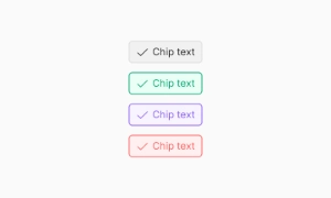
336 Variants
 Free
Free
960 Variants
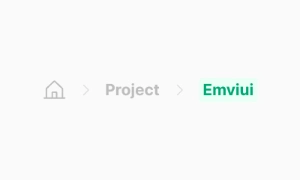
86 Variants
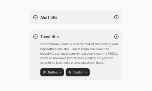
70 Variants
 Free
Free
128 Variants
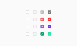 Free
Free
100 Variants
 Free
Free
2404 Variants
 Free
Free
16 Variants
 Free
Free
256 Variants
 Free
Free
12 Variants
 Free
Free
20 Variants
 Free
Free
50 Variants
 Free
Free
896 Variants
196 Variants
 Free
Free
784 Variants
 Free
Free
840 Variants

149 Variants

22 Variants
 Free
Free
50 Variants
 Free
Free
1792 Variants
 Free
Free
64 Variants

6 Variants

256 Variants
 Free
Free
64 Variants

580 Variants
 Free
Free
144 Variants

36 Variants

7 Variants

441 Variants

8 Variants
 Free
Free
14 Variants
 Free
Free
12 Variants

16 Variants
32 Variants