Components
Chip
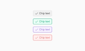
Chips are compact UI elements that represent inputs, attributes, or actions, allowing users to enter information, make selections, filter content, or trigger actions.
Components
Chips are compact UI elements that represent inputs, attributes, or actions, allowing users to enter information, make selections, filter content, or trigger actions.
Chips are ideal for representing small pieces of information in a compact format. They can display user inputs, such as tags or selected items, making it easy to visualize and manage data. This is especially useful in applications where users need to add multiple tags or categories to an item, keeping the interface tidy and organized.
Chips allow users to make selections quickly and efficiently. They can be used to filter content, such as selecting categories in a list or toggling options on and off. Their small size and clear design make them easy to interact with, providing a seamless way to refine search results or preferences without cluttering the interface.
Chips can also be used to trigger actions, adding an interactive element to your design. Whether it’s initiating a search, applying a filter, or executing a command, chips offer a versatile way to enhance user interaction. Their intuitive design ensures users understand their function at a glance, making your application more user-friendly. Our UI kit includes customizable chip components that can be tailored to suit various needs, ensuring both functionality and aesthetic appeal.
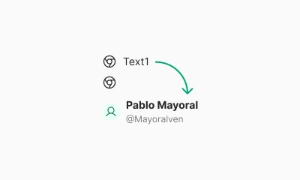 Free
Free
8 Variants
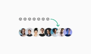 Free
Free
16 Variants
96 Variants
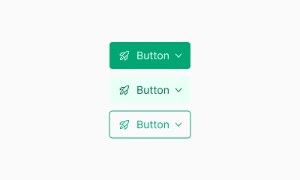 Free
Free
1128 Variants
 Free
Free
36 Variants
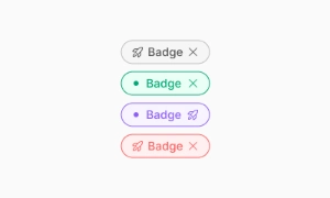 Free
Free
340 Variants
336 Variants
 Free
Free
960 Variants

86 Variants
70 Variants
 Free
Free
128 Variants
 Free
Free
100 Variants
 Free
Free
2404 Variants
 Free
Free
16 Variants
 Free
Free
256 Variants
 Free
Free
12 Variants
 Free
Free
20 Variants
 Free
Free
50 Variants
 Free
Free
896 Variants

196 Variants
 Free
Free
784 Variants
 Free
Free
840 Variants

149 Variants

22 Variants
 Free
Free
50 Variants
 Free
Free
1792 Variants
 Free
Free
64 Variants

6 Variants
256 Variants
 Free
Free
64 Variants

580 Variants
 Free
Free
144 Variants

36 Variants

7 Variants

441 Variants

8 Variants
 Free
Free
14 Variants
 Free
Free
12 Variants

16 Variants

32 Variants